LG Watch Urbane Review: Formal attire
Formal attire
Fresh new Android Wear with extra tricks
The LG Watch Urbane is powered by Google's latest Android wear - making its debut on the wearable. The Watch Urbane is the very first device to run the Android 5.1.1 based OS, which does add a certain level of exclusivity.
This, however, will be short-lived, as the said version will start seeding to other eligible devices pretty soon. So, if you are considering picking up the Urbane just for its software superiority, you might want to reconsider. Furthermore, there are still some kinks to iron out. They will surely be sorted in the future but, at the moment, bugs are to be expected.
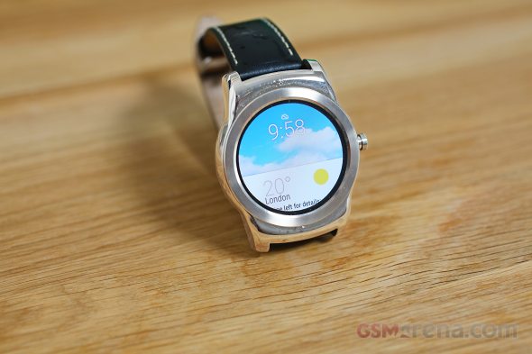
Among other things, the new OS version enables screenshots straight off the device, a feature that was missing in previous versions. Thanks to this, we can provide you with some visual aids as we go about the review. The feature, however, is far from perfect. Screenshot are triggered from the smartphone, only one at a time and do not get automatically saved. It is still a kind of a hassle, but better than nothing.
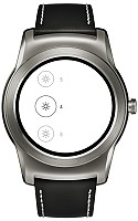
The UI itself, although far from a major overhaul, brings a few changes. Most of them are pretty subtle and might even go unnoticed. The color scheme is slightly updated and animations have been improved. There is a lot of fine detail, like for example, when you enter the main menu, the top shows three small icons that signify the different screens. A few seconds later, they transform into dots to finally disappear altogether.
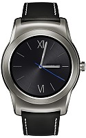
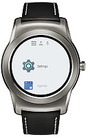

Subtle animations in the tabbed main interface
Android Wear is still based on the same basic navigation concept, but is better organized. The UI is still card-based, much like Google Now. You generally have to swipe right to dismiss a screen and left to open contextual options and go deeper.
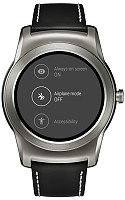
A swipe from the bottom brings up all the notification cards that are pending on your phone and your Google Now activity. Swiping from the top still pulls down a notification shade of sorts, which contains a few screens with quick toggles and a shortcut to the settings menu.
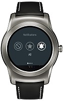
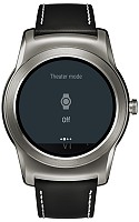
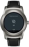
Top shade toggles and shortcuts
Tapping once still brings up the main menu, where a lot has changed. The old mess of various screens and menus has been cleared up and your apps are now neatly organized in a single list along with other watch functions.
The top of the screen contains the three most often used applications, which is definitely convenient. Swiping left from here brings you to your contacts and an additional swipe pulls up Google Voice Search, as well as a list of useful command suggestions. The menu structure is now a lot cleaner and much more orderly, which is a definite plus, as any saved tap or scroll counts on such a small screen.

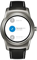
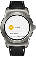
The main menu is now logically arranged in tabs
At first glance, Android Wear users won't really notice anything new, that is, until you get your first notification while browsing the menus. Notifications can now appear on top of other interface items and you can deal with them from anywhere in the interface, much like you would on your phone. This may not sound like much, but takes user-friendliness to a whole new level - not without a sense of multi-tasking.
Speaking of new UI dynamics, Android Wear now has hand gestures, which are reasonably intuitive. You just flick your wrist up or down to scroll through notifications. Sadly, this doesn't work in the menus or any apps, but it is quite convenient for reviewing your notifications almost hands-free.
Accessibility is also improved with the new Android Wear. There is even a separate menu for it, which currently only contains a toggle for triple-tap magnification. There is also an option to edit font size and more may come in the future.

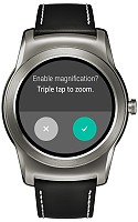
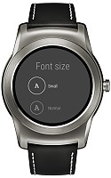
More accessibility options are now available
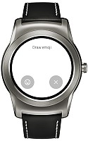
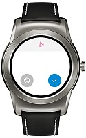
Another cool new feature Google has thrown in is Draw emoji. It is distantly reminiscent of Apple's feature. Doodle a simple shape on the screen and Wear will suggests a few emoticons that might match what you're trying to achieve.
The whole process works fairly well and does a pretty good job of recognizing basic shapes, like a single line, a tick or a rectangle. Even a thumbs up wasn't a challenge, which is great. But we find it awkward that instead of sending the other party directly your doodle - like the Apple Watch, for instance, - Android Wear will try to convert it to a standard Emoji. In the same time, there is no way to access the list of built-in Emojis and pick straight from there instead of doodling them.
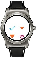
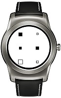
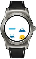
Recognition works fairly well, but the concept is still questionable
Wi-Fi is another big addition to Android Wear. The new hardware feature is sure to catch along quickly in the wearable niche, as it opens room for a whole new set of possibilities and use cases. Having a separate wireless connection allows the Watch Urbane to be a lot more independent from your phone. It can even receive notifications from the handset it is synched with even outside Bluetooth range, as long as both have a working internet connection.
Reader comments
- JP
- 02 Nov 2018
- 0E}
Another pointless watch that is less use than having an analogue watch and mobile phone as it wont work without the phone nearby and the very limited battery life makes it far less useful than a standard watch. bought this to provide on wrist ca...
- liton debanth
- 27 Jun 2015
- w43
watch ....verry verry nice
- Anurag Sinha
- 17 Jun 2015
- U@H
I have like watch .thanks

