Meizu MX3 review: Eastern connection
Eastern connection
Retail box inside a retail box
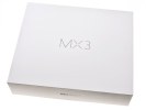
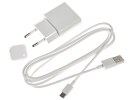
The retail box has always been an eye catcher. Meizus are typically shipped in booklet-style packaging, with the good stuff hiding inside the pages. What's different this year is that the booklet is placed within a bigger box. Size doesn't translate to a greater set of accessories, though - the MX3 comes with a charger only - not even a headset.
The charger consists of an A/C adapter and a separate USB cable to be used for computer charging or data transfer. The only other thing in the bundle is the peculiar back cover opener. The tool's pointed end is to be pressed against the pin that locks the back cover in place. The panel is raised just enough to insert the flat side of the tool in the tiny crevice and go all the way around until the back panel is fully undone.
It's a finicky task but one that, hopefully, you'll need to perform on very rare occasions. To place the microSIM card in its tray, that is, the phone has no memory card slot.
Meizu MX3 360-degree spin
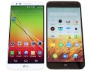
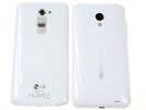
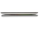
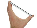
The Meizu MX3 measures 139 x 71.9 x 9.1mm, which is within millimeters of the LG G2's impressively streamlined body. The MX3 does have a smaller screen but the difference is negligible.
Weight has been kept in check and, at 143g, we'd say the Meizu MX3 is quite comfortable to carry for a 5-incher.
Design and handling
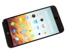
The Meizu MX3 hasn't changed much - almost any at all. Three generations in a row, this doesn't sound particularly exciting and, honestly, while the Chinese manage to keep up in terms of specs, the Meizu MX3 will struggle to make an impression next to the likes of the Sony Xperia Z and HTC One.
Maybe that's never been the point actually - Meizu continue to insist on emulating the iPhone in an Android environment, and the MX3 is arguably the one that gets closest. The good thing is the peculiar 15:9 aspect ratio may as well keep them out of trouble.
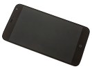
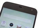
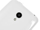
Anyway, it's the same entirely black front - regardless of what color you choose for the rear. The back panel is made of plastic to which Meizu has applied some hyperglaze finish - a transparent layer above the coat of paint. Speaking of which, the MX3 comes in a variety of color options for the back cover. Now, that's one more scenario where users will need to go through the particularly difficult routine of removing the rear cover.
Below the screen is the home key, which started off as a proper hardware button and has since been reduced to a tiny circle of a capacitive key with a LED border that lights up in response to taps - and serves as a breathing light too. Comparisons to the iPhone aside, evoked yet again by the single key on the front, the Home key can have vibration feedback enabled and will lock the screen upon a tap and hold. To unlock, tap and hold and then swipe up.
To make up for the missing Task Switcher key, the Meizu has another clever swipe-up gesture from the bottom of the screen that will pull up a strip with the icons of the currently running apps. Each of those can be swiped up to dismiss. And it doesn't end there - swipe that multitasking strip to the right and you'll unveil another set of extra five quick shortcuts, along with a brightness slider.
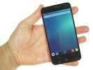
With the impressive edge-to-edge screen with almost no bezel, Meizu managed to first deliver something LG has been getting a lot of praise for lately. The Meizu MX3 is almost identical in size to the LG G2, with a 5.1" screen of 1080 x 1800 resolution against the 5.2" 1080 x 1920 unit on the South Korean flagship. The difference in screen real estate is offset by the fact that the G2 uses on-screen virtual buttons, which Meizu side-stepped by using gestures and different Home key routines. All in all, you can navigate the phone exclusively by touch, if you choose to do so.
The back of the MX3 is nicely rounded, but it's a bit too slipper for a perfectly snug fit in hand. The flat front with minimum screen bezel nicely balances that so the handset is reasonably comfortable to operate single-handedly.
We love edge to edge screen designs and always appreciate a smartphone that offers the most screen for the available space. The MX3 delivers handsomely there and earns deserved bonus points for the Home key commands and nice gestures.
Reader comments
- Anonymous
- 22 Nov 2013
- HI%
1800*1080
- JL
- 06 Nov 2013
- Uvy
Meizu is getting better and better now. Maybe next year it will set retail stores in USA. I know its products are selling well in Russia.
- AnonD-131593
- 05 Nov 2013
- vL5
Mx3 is all about appearance than the performance . Design - 5star Performance - 3 Camera - 2 ( very slow focus ) Battery -3 Price - 2 Advertisement - 5 ( i wish there is english version of Meizu’s MX3 Beijing Water Cube conference bec...
