Meizu MX3 review: Eastern connection
Eastern connection
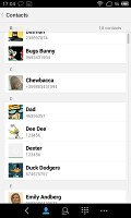
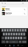
Minimalist phonebook
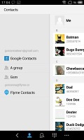
At its core, the phonebook on the Meizu MX3 is a list of all contacts but you can view only a specific group or filter where contracts come from - phone contacts, email account or a Meizu account.
You can't add Facebook or Twitter or any social network out of the box. Installing the Facebook or Twitter app will allow you to sync your contacts from there. You can link contacts, but the functionality is annoyingly limited.
The phonebook will automatically link contacts with the same name, but that's it. You can't manually link or unlink contacts.
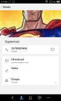
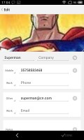
Viewing a contact's info shows you all the available details and that's about it. We liked how phone numbers are listed though - the whole line is a button that will dial the number, but there's a message icon to the right to send a text message instead.
The phonebook integrates with the phone app and the call log. The only new addition to the phonebook is the search field at the top of the contact list in addition to the alphabetical scroll.
Telephony
We had no reception issues with the Meizu MX3 - in call sound quality was top notch and loud enough. The call log is the first tab of the telephony app and it keeps a list of all your recent calls.
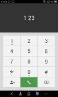
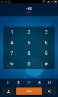
The dialer lacks smart dialing but there's a handy search shortcut below it. While you're in a call you get controls to access the numpad, mute the audio and you can even take a note.
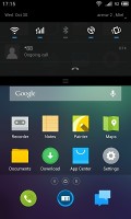
Calls will display in the notification area if you leave the dialer app. During a call, the proximity sensor will lock the screen when you lift the phone up to your face. There's an option for the phone to vibrate when the call is connected, so you won't miss it.
To set a custom track as a ringtone you need to copy it to the designated Ringtones folder, which will make it accessible in the Settings menu. You can't just use the music player like on most Androids.
We performed our loudspeaker test on the Meizu MX3 and it got a good result, meaning you're not likely to miss any calls with it. Here the full breakdown.
| Speakerphone test | Voice, dB | Ringing | Overal score | |
| 60.1 | 58.3 | 61.6 | ||
| LG G2 | 65.7 | 62.2 | 66.2 | |
| Meizu MX3 | 67.1 | 66.5 | 77.7 | |
| Samsung Galaxy Note 3 | 70.5 | 66.6 | 78.0 | |
| HTC One | 69.3 | 66.6 | 75.9 | |
| HTC One mini | 68.0 | 68.7 | 78.1 | |
| Samsung I9505 Galaxy S4 | 70.6 | 66.2 | 77.3 | |
| 72.7 | 66.6 | 78.1 | ||
| 74.6 | 71.3 | 82.7 | Excellent |
You can find more on how we test loudspeaker performance here.
Messaging is top notch
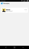
The messaging department is quite straightforward: there are no folders here, just New message, Search and Settings buttons. Above is a list of all your messages organized into threads.
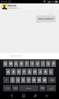
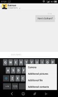
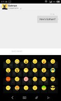
When composing a message, the input field starts out at only one line tall, but will grow to up to seven lines if need be. Left of the text box is a button that handles attachments and smileys.
To add message recipients, just start typing the corresponding name or number and choose from the contacts offered.
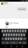
When you add multimedia content to the message, it is automatically turned into an MMS. You can either quickly add a smile, a photo or an audio file to go with the text or compose an MMS using all the available features (like multiple slides, slide timing, layout, etc.). The multiple slides are all shown inside the compose box.
Batch operations are enabled for multiple threads - Mark as spam and Delete are available.
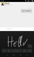
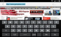
The keyboard looks pretty much like the Google keyboard. You can also enable handwriting but in our case we only got support for Chinese. Interestingly the keyboard will not turn to landscape in the messaging app, like it would in the browser for example.
Digging deeper into Settings you'll come across the so-called Flyme Messages. If you turn this on and log in with your Flyme OS account, you'll be able to send free messages (text or multimedia) to other Flyme-enabled devices - just like the iOS iMessages.
Moving on to email, we were surprised to find the default Gmail app is missing. You could always download it from the Play Store though (if you live outside China, where the Play Store is not available).
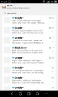
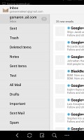
Meizu have tweaked the generic email client instead and decided it would be enough for all your email accounts. It supports multiple Exchange, POP or IMAP inboxes and you have access to the original folders that are created online, side by side with the standard local ones such as inbox, drafts and sent items.
Switching between accounts is pretty easy. Just swipe out the side-placed menu and you get all your folders plus your accounts.
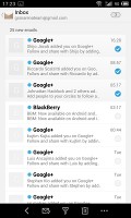
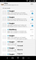
There's support for batch operations - Mark, Filter and Delete are the available options. Filter acts against spam to weed out unwanted email addresses. There's also the option to switch to threaded view in which case an icon appears alongside the name of each thread, giving you the number of messages inside.
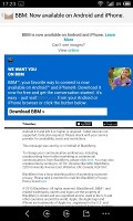
Viewing an email is a pleasure on the spacious and wide screen of the MX3.
Reader comments
- Anonymous
- 22 Nov 2013
- HI%
1800*1080
- JL
- 06 Nov 2013
- Uvy
Meizu is getting better and better now. Maybe next year it will set retail stores in USA. I know its products are selling well in Russia.
- AnonD-131593
- 05 Nov 2013
- vL5
Mx3 is all about appearance than the performance . Design - 5star Performance - 3 Camera - 2 ( very slow focus ) Battery -3 Price - 2 Advertisement - 5 ( i wish there is english version of Meizu’s MX3 Beijing Water Cube conference bec...
