Meizu Pro 5 Ubuntu Edition review: Cute clumsy penguin
Cute clumsy penguin
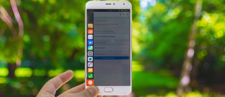
Ubuntu Touch
But let's not beat about the bush any longer - after all, Ubuntu is the reason why we're reviewing the Meizu Pro 5 all over again. We have already established that the Pro 5 is still an exquisite piece of hardware even a few months after its release, but how well does it mix with Canonical's ambitious but very much experimental platform? The short answer is that it's a disappointing experience from a user's friendliness point of view. "Unpolished" is perhaps the more accurate description of our initial feelings, but upon further observation, Ubuntu Touch just seems too ambitious for its own good and not very well though out from a user's standpoint.
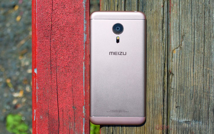
But, let's not get ahead of ourselves, as this is not just another Android-based OS and perhaps some extra back story is needed. The Meizu Pro 5 is one of the very few devices, and currently the most powerful one, that runs Ubuntu Touch. The OS is also referred to as Ubuntu Phone and sometimes even Ubuntu Mobile, although the latter is an old inactive project. As already mentioned, it is developed by Canonical - the guys behind Ubuntu, which is still the most popular end-user Linux distribution, mostly because of its approachability.
In its essence, Ubuntu Touch is a touch-optimized interface that runs on top of a regular Ubuntu build - v15.04 at the time of this review. The idea behind such a design, as you might have guessed it, is to have one common platform for which you can develop applications using the same set of tools and then have them run on any device. Sound familiar? It should, as it is basically what Microsoft has done with Windows 10 and the Universal apps platform. However, it is worth noting, that Canonical has been working on the idea way before Microsoft sunk its teeth into it, but, sadly, it hasn't gotten any love from third-party developers so far.
After quite a few years of development, the system does seem to work, with a few core apps like the Browser, Calendar, Clocks, Gallery, Notes, Reminder, Weather and even the Terminal, practically sharing the same code between desktop and mobile. The list, however, is very short and popular online apps and services are missing, which is one of our other main beefs with the OS in its current state as a daily smartphone driver. The rest of our frustrations lie with the Ubuntu Touch UI itself and some of its odd design and navigation choices.
Before we kick off the guided tour of Ubuntu Touch, we have to stop and appreciate its appearance. Despite its many faults, the interface is truly gorgeous. Animations are slick and smooth as well as abundant. The color scheme, fonts and control graphics just flow together naturally and create a really different experience, quite unlike your average Android or Apple device.
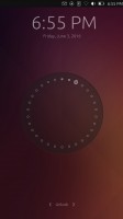
The first thing you encounter on the Ubuntu model of Meizu Pro 5 is the lock screen. It shows a summary of the user's recent events and the current status of the device and features a memorable circle design that represents activity since the beginning of the month. It is likely what most users associate Ubuntu Touch with.
But, once you unlock the device, things get a little bit confusing and unfamiliar. There is no conventional home screen or app locker, which one would naturally attempt to search for. A core part of Ubuntu Touch is what Canonical has dubbed Scopes. They can be best described as interactive screens, intended to present information and functionality from apps. Some group many relevant apps together under categories like News, Music or Photos, while others are only generated and populated with data from a single app. These tend to get overcrowded and often hard to swipe in-between due to the sheer number of on-screen controls that can be accidentally hit.
Yet, this is the main unit of organization Ubuntu Touch has to offer. The whole system gets even more confusing since there are a few special Scopes that are definitely more vital than other. One is the Today screen, which you can customize to show a mixture of most core apps within the phone, including cellular features like calls and messaging. Then there is the apps Scope, which is about as close as you will get to an app drawer.
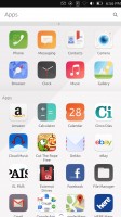
The apps Scope houses all your currently installed apps with the most important core system ones separated on top and the rest arranged alphabetically below. Creating folders or rearranging stuff is not possible, which is a definite minus, but at least there is a search bar. More apps can be downloaded through the Ubuntu Store with a very limited selection. But more on that in a bit.
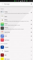
Let's talk about basic navigation. As already mentioned, Scopes are a big deal here and they can come from various places - some are system specific, others stem from core apps and then there is also the occasional third party app that has gone the extra mile and has one. Ubuntu Touch allows you to select and rearrange the swipe-able list of Scopes that serve as your main interface any way you like. This is done through a menu that appears by swiping up. This gesture often pulls up config menus across apps as well. Still, you might want to keep the Apps or Today one close at hand. It also looks like Ubuntu Touch allows developers to implement an app with only a Scope, which means it appears in the aforementioned config, but not the App screen...
And if you thought things were confusing up until this point, the rest of the gestures don't help either. Swiping down lowers a notification and quick toggle shade, which looks familiar. However, Canonical's tab arrangement is somewhat odd.
The rotation lock toggle, for instance, gets its own tab for some reason, and so do the time and date. Also, brightness settings are placed under Battery and there is a constant media player control just sitting there in the Sound tab. Quite a mess, but still beautifully executed and animated.


Notifications and quick settings shade
But swipe gestures don't stop there. In its attempt to simplify navigation, Canonical has definitely went overboard with gesture input. Swiping one from the left brings out a menu most desktop Ubuntu users will be familiar with. It can be best described as a task bar with quite a few pinned apps by default and a view of what apps are currently active. It is definitely convenient for quick switching, however, what is not immediately apparent is that this is not the only thing hiding behind the left swipe. If you start on the left side and simply continue past said menu once it appears, you minimize the current app. This might sound like nothing you would ever use, but since, as already mentioned it, Ubuntu does not support the tap input on the Meizu Pro 5's home button. Effectively, there is no easy way of backing out of an app or settings screen, without pressing the actual button and going to the Today scope as there is no dedicated Back key on the phone.
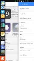
Left swipe menu and app minimizing
Thus it's clear that the Meizu Pro 5 is not equipped well enough to allow user-friendly Ubuntu operations - it's missing a proper key navigation arrangement. Things get even worse once you consider that minimized apps don't tend to close themselves and linger working in the background, which can't be good for the battery life.
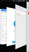
What about swiping from the right you ask? Well, you are going to love this one. We already explained the difficulty one can experience while scrolling through the Scopes, which will typically be done from right to left. If, however, you start from the edge of the display and do a fuller swipe in the same direction, you unveil a 3D task switcher interface. Yet again, like most other UI elements in Ubuntu Touch, it looks visually stunning. The animations are smooth and the effect just looks great. You can also swipe up or down to close apps from here, but no mass close option is available.
And just when you thought it was over, turns out a quicker swipe from the right edge of the screen inward works like Alt + Tab on a PC - switching between your last two apps, while skipping the abovementioned interface.
Reader comments
- AnonD-559729
- 14 Jul 2016
- r3H
Nice specification I've seen here today
- Anonymous
- 21 Jun 2016
- Kgf
Tbh, the main problem with Ubuntu Touch right now isn't its incomplete feature set (that's a given for any WIP OS revamp), it's the direction that Canonical is taking Ubuntu, with using Mir instead of building up Wayland, stirring up useless BS contr...
- AnonD-551020
- 20 Jun 2016
- fu%
You are very right. Majority of smart phone 📱 users use their phones for communication and games
