Moto G4 Plus review: Tuned up
Tuned up
Hardware
The Plus version of the Moto G4 is more of a feature upgrade than anything else. As for appearance, you would be hard-pressed to tell the two handsets apart (fingerprint reader aside, of course). They share the same body, measuring 153 x 76.6 x 9.8mm and both tip the scale at 155 grams. That is still an impressive improvement over the previous generation G3, which weighs the same, but has half an inch less in screen real estate.
Admittedly, the G4 Plus does feel a bit wider than most. The numbers reaffirm this feeling since it does add a good 4 mm over the third generation handset. However, Motorola has managed to shave a few inches from its girth (9.8mm vs. 11.6mm), while still managing to fit a bigger battery (3000 mAh vs. 2470 mAh).
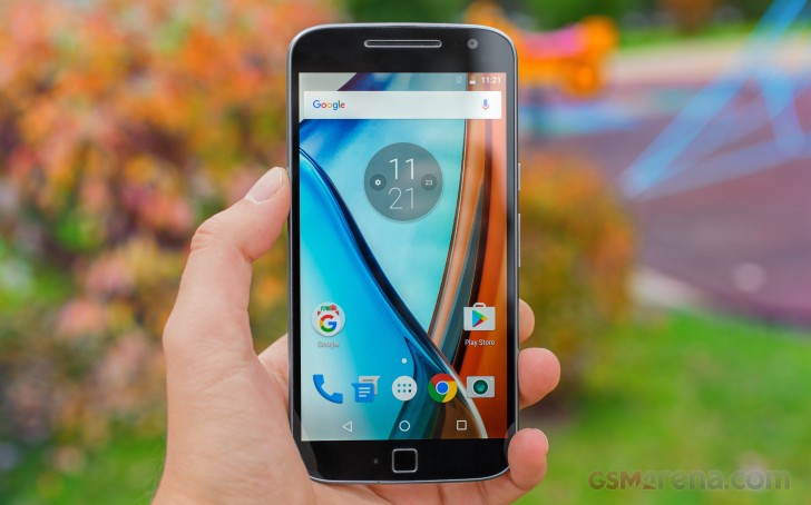
Subjectively, we found the new distribution of volume to be perfectly fine, perhaps even a bit better. Of course, to each their own and that is just as true for Motorola's design and materials of choice in the Moto G4 Plus.
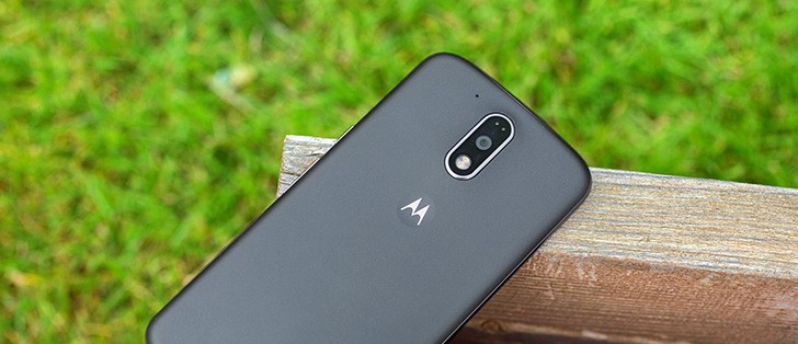
When you look at the Moto G4 and thus G4 Plus design, and you can instantly recognize it as a Motorola. You don't even need to see the iconic M on the back. For us, it's probably the way the top side of the frame curves around the 3.5mm headphone jack, just the way it did on the original Moto X from 2013 as well as the Moto G3 from last year. Or it could be the small dimple where said M resides.
Carrying on the design language is important for brand recognition, but it's also great that the company has maintained the build quality as well. The Moto G4 feels rock solid and you wouldn't have a hard time to pass off the side frame as metal (it isn't, though).
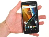
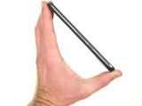
Motorola Moto G4 Plus in the hand
And, as we have said many times before, that is not necessarily a bad thing. On the contrary. Now, we would never go so far as to devalue the aesthetic appeal of premium materials, such as aluminum and glass - the building blocks of choice for most flagships for a while now. But there is still a lot to be said about the merits of good old plastic. Even putting the obvious durability bonus aside, this traditional substance typically provides more grip and is often easier to maintain and clean. Plus, you get some other extras like easily detachable parts.
Speaking of which, the removable back panel has remained a staple of the Moto G design. A delightful remnant from the old way of doing things. Removing said cover reveals a convenient and just as an old-school placement for the two SIM cards and dedicated microSD slot. This move alone has enabled a slicker design for the side bezels with a lot fewer components. Sadly, the battery pack is not user serviceable yet again, but that should come as no surprise nowadays.
Anyway, let's put the cover back on. Much like the Moto G3, there's an "island" that holds the camera and flash that's vertically oriented along the center line. It's smaller now, made of glass with a metallic accent. This island is a hump, protruding slightly from the back. The way things are positioned, it is unlikely to cause scratches on the camera glass or too much wobble on flat surfaces.
Speaking of the back panel, the G4 Plus features a textured, soft and grippy finish. However, it is oddly not the very same texture as the one on the G4. This time around it is a bit slicker. It is arguably a bit less grippy and just as prone to smudging so that you could consider it sort of a downgrade. Still, you can always count on Motorola for replacements and other designs.
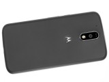
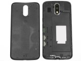
Nice rubbery, removable back cover
The Motorola.com site (still the home of Moto phones) promises you'll be able to customize the front, back and accent colors using Moto Maker where that's available.
The front is a choice between Dark Moon (deep blue) and Metallic Silver (white front/silver sides), the back has a wider choice of colors, eight, plus an extra real wood one, and there are five options for the accent around the camera. Additional customization is available too - such as engraving the phone or changing the greeting message. These are options that long-time Moto fans have come to expect, and they do provide a nice extra incentive to pick one up as an extra personal gift.


Some design combinations we tried out
On the front, the side frame sticks out above the Gorilla Glass 3. It means the screen glass will never touch a flat surface and if you happen to drop the phone, it will be the frame that absorbs the initial impact.
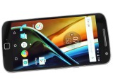
Gorilla Glass 3 above the 5.5" IPS screen
Carved into the glass above the screen is a pretty chunky hole for the earpiece. It's also the loudspeaker, so you can enjoy a front-firing speaker (back or down-firing speakers aren't great for watching videos and occasionally get muffled).
We also like the metallic rim accent, which breaks up the monotony of the black glass. Although, it is more of an acquired taste.
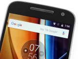
The earpiece/loudspeaker above the screen
The Moto G doesn't come with any notification LED. Instead, it relies on Moto Display to alert you of any new notifications. Moto Display is a monochromatic clock, which is visible even when the screen is off. This is one of the few proprietary features Motorola has added to the otherwise vanilla Android experience. It activates for a bit when a new notification arrives and again when you move the phone (you can also trigger it with a double-tap), but keep in mind this isn't what is known as an Always On screen.
The mouthpiece is below the screen and, of course, there aren't any keys here. Motos have long adhered to the on-screen button design. However, this is where the G4 Plus breaks the cycle quite noticeably with its front-mounted fingerprint reader.
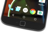
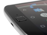
Quite unsightly and not entirely functional fingerprint reader
Unlike the aforementioned speaker, the look of this particular module Is a lot less polarizing, but sadly not in a positive way. It just looks foreign and out of place. Like something artificially added after the fact, rather than an organic extension of the design. We are willing to attribute at least some portion of this negative attitude to preexisting assumptions and conditioning to Moto's signature design. However, with its odd square shape on an otherwise overall rounded handset, weirdly elevated edges and what appears to be a slightly different and more smudge-prone finish, it is a hard thing to stomach.
Looks aside, however, the fingerprint reader is very accurate and fast. Not to mention it is always on. However, we have another grudge with Moto's implementation in this respect. We can live with the non-tactile nature of the control. OnePlus and even Apple get away with it perfectly fine, so why shouldn't Motorola?
Well, the problem is that the reader does not double as a home button like on the handsets above and it really should. Unlocking the device from said location just instinctively leaves you wanting to do more with it rather than just unlocking the phone.
The Moto G4 Plus has two wired ports - a 3.5mm headphone jack on top and a standard microUSB 2.0 on the bottom. The USB port is USB On-The-Go enabled, so you can hook up USB storage and accessories. It also supports TurboPower charging, but more on that in the battery life section.
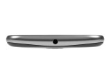
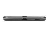
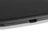
3.5mm headphone jack on top • microUSB 2.0 port on bottom
The right side of the phone is home to the two sole hardware buttons that the phone has. The Power button has a nice grooved texture, which makes it easily distinguishable from the volume rocker below it. The two are, however, a little bit too low for our taste.
Reader comments
- Sanjay m
- 20 Oct 2020
- X{Y
Best mobile till now for me its working without problem since june 2016. still running like new phone.
- Jones Kirubakar.
- 08 Mar 2020
- U@3
Best Mobile in Motorola, Dual Flash, Laser Autofocus, Front Fingerprint, Center in Headphone Jack Present, Turbo Power Battery Charging, 5.5" , 77mm(width) Broad Large Screen, very cheap Price, All is well, Good Budget Smartphone @ Motorola History, ...
- Amit
- 20 Dec 2019
- t1{
Change the charging cable.. use the good quality cable

