Motorola Moto G Pro / G Stylus review

Design and build quality
Motorola has taken a slightly different approach with its Moto G Pro in terms of build quality. While most mid-range phones come with plastic backs and frames, or at least plastic frames, the G Pro has an aluminum alloy 6000 frame and a plastic back. The back, however, feels pretty close to the glass so it's a build that feels sortof premium.
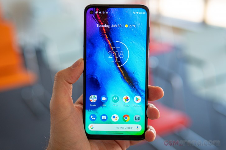
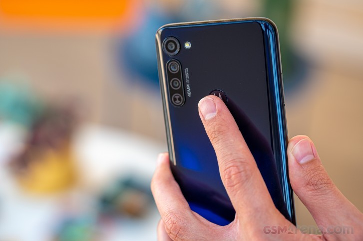
The Moto G Pro follows a familiar design language, which we saw with previous Motorola devices. The rear cameras are vertically stacked in the upper-left corner with minimal protrusion and the main sensor is positioned separately from the rest of the cameras. The rear-mounted fingerprint reader with the Motorola logo is placed a little bit higher than we would like as we often found ourselves reaching a finger for it.
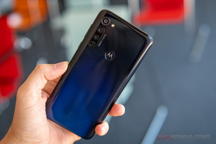
We are also happy to report that the color of the back we got makes the fingerprints and smudges hard to spot. It's also the only available color - Mystic Indigo. It's mainly black and fades into dark blue at a certain angle. Motorola is definitely betting that you would like that one.
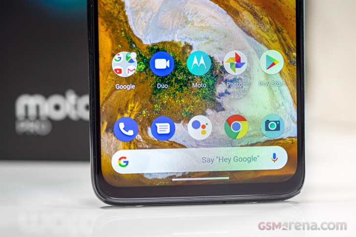
Going around the metal frame, you can feel the edges where it transitions into the back panel while the front glass offers a subtle curvature and overlaps with the side frame. Still, the display is flat by today's standards, offers fairly thin side bezels while the top and bottom ones are a bit on the thick side. Not that we were expecting razor-thin bezels at that price anyway.
We were happy to see the super small punch hole selfie cam. It's perhaps one of the least obtrusive cutouts of the kind.
Another cool small detail we liked is that the power button has a textured surface so you can easily feel if you are pressing the right button. It's placed conveniently enough but we can't say the same for the volume rocker. It's way up on the right side of the frame right next to the upper-right corner of the device. So finger gymnastics are inevitable when you need to use this one.
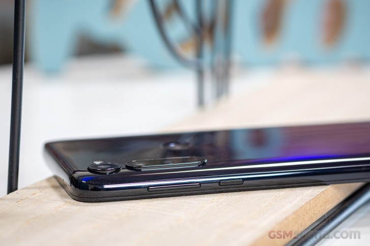
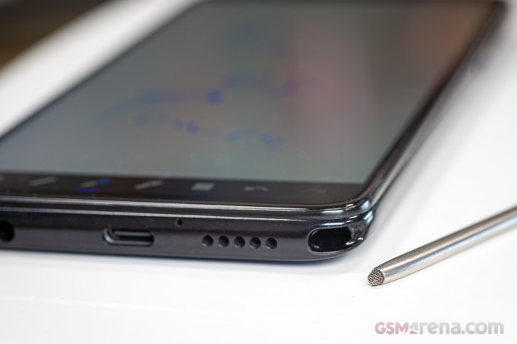
We suspect that the stylus is to blame here. It inserts on the right side of the phone and takes away precious space for the buttons. Which brings us to the stylus itself. It's a small, thin pen mostly made of metal. There are no buttons or any advanced hardware features that it offers but it does have a nice weight to it.
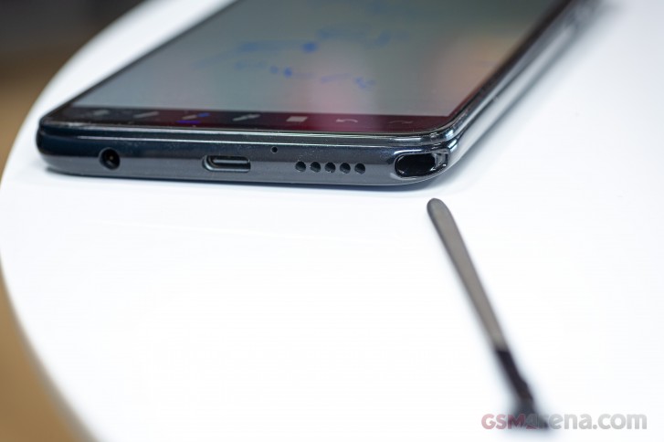
All in all, the design of the phone is okay with some small drawbacks to consider. The ones that you will most probably notice from the start are the high positions of the volume rocker placement and the fingerprint reader. We are also surprised by the weight of the device as it tips the scale at 192 grams, which is a little bit on the hefty side for a phone that has a 6.4-inch screen and mostly plastic back. Probably the stylus is once again the culprit.
Reader comments
- Toad
- 16 Dec 2023
- kZZ
I've had a Moto g stylus 2020 for about 3 years. I love it because it's a great phone. But it's time to get a new one. I've been faithful to the Motorola brand since my Droid X which I purchased in 2010. I'm very disappo...
- Tim
- 15 Dec 2022
- pLe
Mine doesn't, battery lasts a few days for me. I used to have a Samssung Note that got hot and needed charging daily, the Moto is a vast improvement.
- Kayce
- 29 Nov 2022
- kXA
Just purchase a data transfer cable