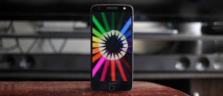
Moto Z Droid review: Birth of a new successor
Birth of a new successor
Unboxing
The Moto Z Droid comes in a pretty standard box. For the first time since the Lenovo acquisition, we find the Lenovo label in the corner of the box's package. Sliding the paper sleeve of the box lets us open it and we are greeted by the phone itself. Under the phone are a few items: Documentation, SIM tray tool, 15W Turbo Charger, 3.5mm headphone jack to USB-C adapter, and a rubbery holder for your headphones.
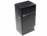
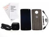
Moto Z Droid box • Contents of the box
It's worth noting that the Turbo Charger included does not have a detachable cable. This means if you want to be able to plug the phone into your computer or power bank, you'll need to find another cable or a USB-C to microUSB adapter to use with older charging cords.
There's also a rubber 'thingy' which looks like it's used to wrap your own pair of earbuds so they don't get tangled in a bag, purse, or pocket.
The phone does come with a default "style shell" or back plate which is used to protect the back of the phone when you are otherwise not using a Moto Mod at that moment. Moto will sell more of these style shells in different colors for about $20 each for fabric or 'wooden' materials, genuine leather style shells will be $25.
Hardware and design
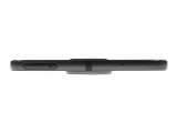
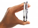
There's no tiptoeing around it, the Moto Z is amazingly thin and that's the first thing that strikes you when you see it. But we feel like Motorola did this on a technicality. The phone IS thin, there's no argument there. The dilemma is that the phone does not feel comfortable in the hand if you aren't carrying it with a style shell. Once the back plate is on, the camera lens no longer protrudes.
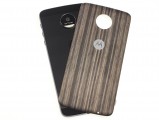
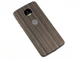
'Style shell' included with the Moto Z
This style shell in particular is made of a faux-wood and feels amazing in the hand. This 'wood' finish gives the phone a wonderful grip and the subtly curved edges blend perfectly into the cool-to-the-touch metal frame. The decision to use it really depends on the user's preference and whether or not they care about throwing this phone into a case.
The truth is, a protective case may completely defeat the purpose of quickly swappable style shells and Moto Mods.
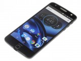
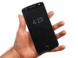
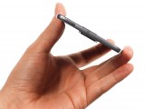
Moto Z: from above • in the hand
If you decide to carry the phone around naked, you might want to consider at least using the style shell. It will protect the backside of the phone from exposed surfaces and keep your camera ring and frame from coming in contact with erosive surfaces.
You may not want to put this phone in a case, though. The Moto Z feels like it can take quite a beating. If you've ever owned a Motorola Nexus 6 or any of the Moto X's that came since then, that's a couple of ways we can describe the feeling of holding this device in your hand. Think of the Moto Nexus 6, then picture it with a 5.5-inch screen, and flatten it out. Even the metal frame and the way it reflects light is quite reminiscent of the Nexus 6 and Moto X devices of the past few years.
Gone is the dimple on the back which had many fans and was even rumored to be a rear-mounted fingerprint scanner at one point. The introduction of Moto Mods is the major cause of decisions to introduce the fingerprint scanner on the front of the device as well as the decision to flatten out the ergonomically curved backside that has been around since the original (2013) Moto X.
The Moto Z's right side is home to three hardware keys. These are the only physical buttons since the phone uses on-screen navigation buttons. The placement of the buttons is quite new. They are pretty far up and may take some time getting used to. A nice touch is the ruffled-texture on the power button which lets you differentiate the keys by feel alone.
These keys are quite satisfying. No complaints here with the travel, clickiness, or sturdiness of the keys at all. They aren't too hard to press or too soft to accidentally fire off. The volume keys even have a nice bevel that goes around them - a great touch for attention to detail.
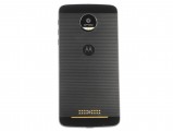
The backside (without the style shell) doesn't look like it has a lot going on but there's actually more going on than meets the eye.
Let's start from the top: There are two glass "windows" on the top and bottom ends of the phone which are there to let signals pass through for various antennas and connectivity features like NFC and Bluetooth.
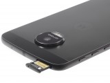
The rear camera is here too and it combines the dual-LED flash into the camera ring with the Verizon-Exclusive "Droid" branding just between the camera sensor and flash. This is very nice as it's the only clue that this is a Verizon device (as the Droid branding is exclusive to Verizon). There is otherwise no Verizon branding anywhere on the body of the phone itself, the logo appears in the boot animation with along with the Droid branding, but there are no traces of Verizon's iconic red.
The back metal plate also features a pin-striped pattern not really seen on devices before and it gives our 'Lunar Gray' review unit a professional and formal appearance. This metal backing is really hard to keep clean, though. It shows fingerprints like nobody's business and we think Lenovo should have gone for a different colored Moto 'batwing' to let it stand out more. But Lenovo feels you'll be carrying it around with the included snap-on style shell which has a better contrasting batwing.
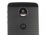
Upper-backside of the Moto Z Droid
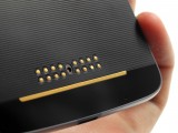
The lower backside of the phone has a bunch of pogo pins, connectors and magnets which allows the handset to expand its functionalities by simply snapping on a Moto Mod (more on these Moto Mods later).
The left side is empty, there are no buttons or trays. Moving onto the top and bottom edges of the phone, the top houses a noise-cancelling mic and the nanoSIM/microSD card tray while the bottom only has a single USB-C cable. Remember, there's no 3.5mm headphone jack anywhere, but there is an adapter included if you want to pop in your more expensive, noise-cancelling headphones during a long flight.
Finally, we arrive to the front of the phone. It has the same motion sensors around the display like the Moto X had which wakes up Moto Display to check your missed notifications. More on that in the UI section.
Then there's the beautiful 5.5 inch QHD AMOLED screen, two microphones at the bottom (there are a total of four around the phone for improved listening of a Moto Voice command).
The earpiece over the screen doubles as the loudspeaker and this is the only speaker on the phone.
Then last, but not least, there's a 5MP selfie camera with a corresponding LED flash on the opposite side of the earpiece. Remember, there's no LED notification since the phone uses the entire screen to display your notifications via Moto Display.
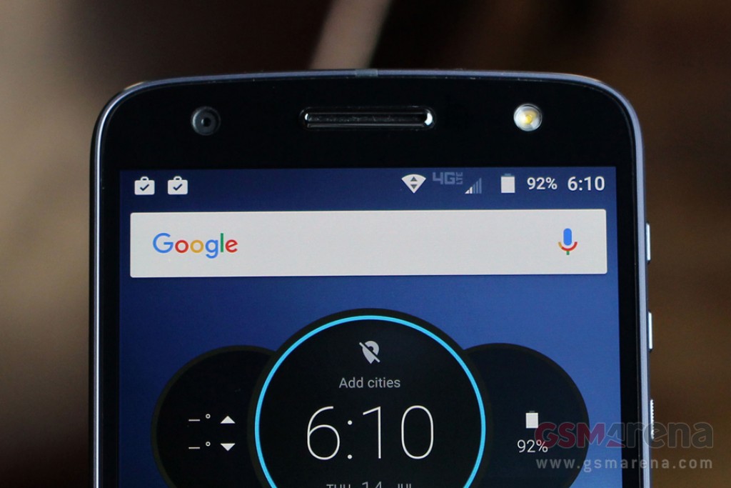
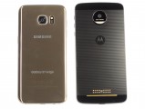
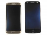
Here are a few shots of the Moto Z next to another 5.5 inch competitor, the Samsung Galaxy S7 edge. The phone is significantly thinner than the Galaxy S7 edge, but the Moto Z is also taller and wider than the S7, despite having a smaller battery.
Reader comments
- LucaZ
- 02 Dec 2020
- mTh
hi, I have many of them (z, z play, z force) they all works great in a different speed, sorry to say but most of negative post on it are because I guess most of them don`t use the right cover when unplugging the phone, I had the same problem but I re...
- Anonymous
- 16 Jul 2019
- jsI
Z4 has a 3.5mm jack again....so who was right?
- Stihy
- 23 Nov 2018
- m1c
After using this phone for 8 months this is what i know. -Phone i fast -Camera is good -Durability is not good -Batery is horible. U can't use phone for 4-5 hours withouth charge. For a price of battery pack addon you can buy Xiaomi A...

