Motorola BACKFLIP review: Back and forth
Back and forth
User interface: Android in a BLUR
The Motorola BACKFLIP comes with the version 1.5 of the Android OS, which seems a bit outdated now that version 2.1 is already available on several handsets. However, the MOTOBLUR UI that comes preinstalled is quite a nice add-on and some (social-networking addicts mostly) might even prefer the BACKFLIP software to, say, the MILESTONE package (Android 2.1 and no MOTOBLUR).
Of course, having them both would be getting the best of both worlds but this is still not an option as MOTOBLUR isn’t available for Android 2.1 just yet.
The homescreen of the Motorola BACKFLIP is pretty much stock Android at first sight but the MOTOBLUR custom widgets make it even easier than before to stay on top of your favorite social networks and emails. Facebook, MySpace and Twitter all have their reserved spots by default on one of the five homescreen panes.
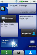
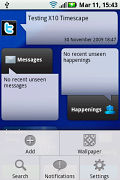
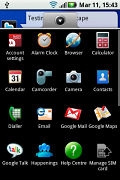
The MOTOBLUR UI comes on top of Android 1.5
There’s also a happenings icon in the main menu to bring all the events from those networks in one place. You can further choose to filter the notifications from only one of the social hubs.
There is also a new icon added at the bottom, right next to the the arrow button that pulls up the main menu. It takes you to the reskinned phonebook, which is also in the social-network integration game with a few new tabs.
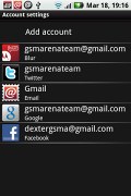
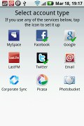
Another novelty brought by MOTOBLUR in terms of general interface is the account manager which allows easier management of all your email and social-network accounts by gathering them in one place. This time you don’t need to go to the each app to set up an account or delete it.
A really cool security feature of the MOTOBLUR UI allows you to remotely lock your phone and wipe all the information in case it gets stolen or missing. It can then be recovered by simply entering your MOTOBLUR account details. Once its unlocked all the erased data is automatically restored and you can continue using the phone as you did before.
A new battery management tool allows you to make your battery last longer by picking one of the three usage plans. Those can automatically turn off your Wi-Fi and Bluetooth radios when idle for a certain period and decrease the brightness of your screen when the battery level drops under a certain level.
In addition to all those extra goodies, you also get the traditional Android OS perks. The notification area gets pulled down from the top and gathers all the events requiring your attention. The task switcher is launched by holding the home menu key and holds shortcuts to the six most recently used apps.
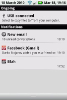
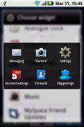
The notification area and the task switcher
Then there are also the traditional Android widgets, shortcuts and folders that can be used to populate your homescreen and have all your frequently used apps a click away.
A pretty unique feature of the Motorola BACKFLIP is its clock, which gets activated when you fold the handset about half-way while it’s on the idle homescreen. In addition to displaying the clock it also gives you information about the weather and gives you shortcuts to starting a slideshow or activating an alarm. You can switch the backlighting off to save battery and use it as a dedicated alarm clock (or picture frame if you go the slideshow way).
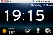
The BACKFLIP in alarm clock mode
There are no living wallpapers here (as in the Google Nexus One) and the homescreen estate is only 5 panes, instead of 7 (Sense UI HTC handsets) but those are things you can live with. Besides, you can always go for a different homescreen by simply downloading it off the ever expanding Google Market.
Another good part about the Motorola BACKFLIP is that the handset feels reasonably snappy with not too many lags. There’s no 1GHz Snapdragon inside but the HVGA screen is less demanding so the less powerful CPU does well most of the time.
To get a better idea of the BACKFLIP performance you can check out the video below that we snatched from our blog.
The phonebook is also BLURred
The phonebook is another part of the Motorola BACKFLIP software package that was tweaked by the MOTOBLUR UI.
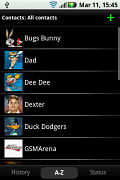
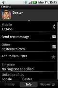
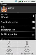
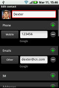
The phonebook has been updated as well
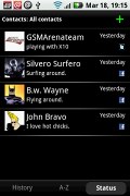
Once inside, you are presented with three tabs. The contact list is the middle one and it’s the default to start. You are free to filter your contacts by groups, favorites, or by any of your social networks. So it’s pretty easy to see only the contacts that you have added to your Facebook, for instance.
The right tab holds the status of all your contacts that have a social network profile of some kind linked to their contact info.
The left tab is History and it holds all your recent communications, including social network updates, calls and emails. That creates somewhat of a mess with all the contacts going into the mix but luckily you can check out the history and social-network updates of each contact individually in their profile.
Contact profiles also use a three-tab layout with their details in the default, middle one. Happenings go to the right and history goes to the left. Quite the app to have if you hate being off Facebook and Twitter even for a minute, right?
Reader comments
- JTree
- 13 Apr 2015
- 4K7
Don't throw out that old BackFlip, not just yet. I was in the market for a cheap, but, high capacity MP3 player when I remembered I had this old BackFlip laying around. By today's standards the camera isn't very good and the Qwerty pad has a glitch...
- 38240
- 10 Jan 2013
- m1P
5mp front camera is better than any other front phone camera, even Xperia Z's 2.2mp. That said, it is also front camera.
- Banana
- 29 Jul 2012
- e6E
Can u pay as u go? Buy card at store for monthly service?
