Motorola Edge 30 Neo review
Design and ergonomics
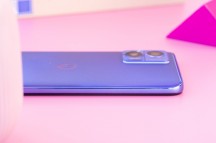
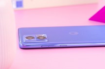
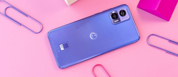
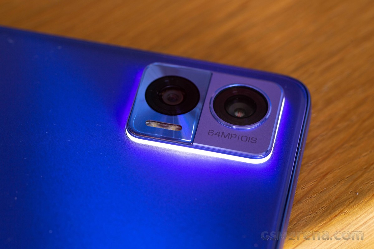
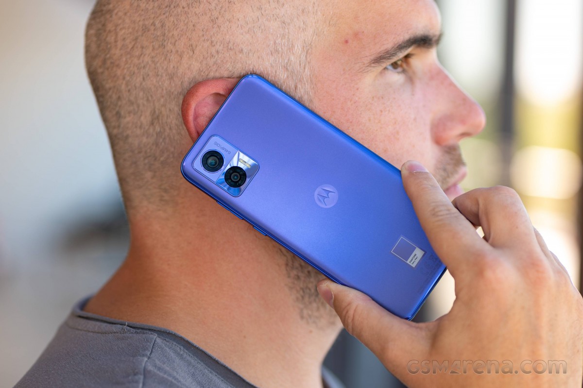
The new Edge 30 trio sports a different design from the first duo released earlier this year, with the camera bump being the most notable change. It's now rectangular-shaped with oval edges. The main camera sits on a matte surface, while the ultrawide camera sits behind glossy glass. The bump isn't obtrusive, either.
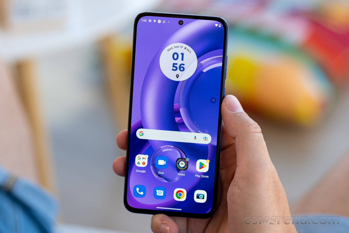
Notably, the camera island has an LED strip around it, serving as an LED notification light. It's also indicating the charging status of the phone. That's pretty neat, and paired with the transparent case in the box, the LED illuminates the sides of the phone, so the LED is visible from the front too.
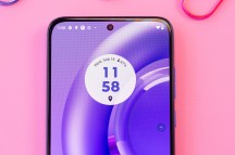
The Neo comes in four colors - Black Onyx, Ice Palace, Aqua Foam and Very Peri Purple, which is the color we got. Since this is the most affordable of the bunch, it's not made of glass or metal, but the back side features a pleasant matte finish. It makes it obvious that it's not glass, although we doubt that this was Motorola's intent in the first place. The OEM went for a grippy surface more than anything else, and we like it. The phone sits securely in the palm, and it's decently grippy.
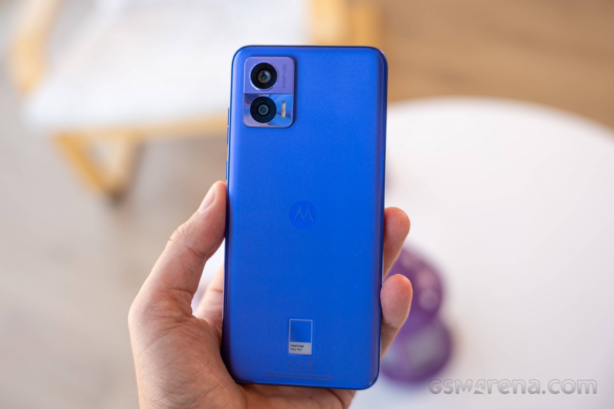
Moreover, the device has manageable dimensions, to put it mildly. The device's chassis is just 7.8mm thick; it's only 152.9mm long and 71.2mm wide and tips the scale at just 155g. It's so lightweight and easy to handle that it's the first thing we noticed as soon as we grabbed the phone. Sure, the back panel forms a noticeable ridge where it meets the side frame but let's not get too picky.
The front panel, on the other hand, is flat with sharp edges around the side. The bezels are impressively thin, given the price tag of the device. The top and side bezels seem almost identical, while the bottom one is ever so slightly thicker. The cutout for the selfie camera is unobtrusive.
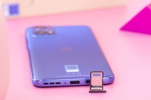
Moving over to the side frame, we find the volume rocker and the power button placed on the right side, with the latter being just within the thumb's reach while the former requires just a little bit of stretch. The bottom houses the USB-C connector, SIM card tray and the loudspeaker grille.
We didn't like the fingerprint reader placement, though - it's too close to the bottom edge of the screen, and you have to do some awkward finger gymnastics to place your thumb properly.
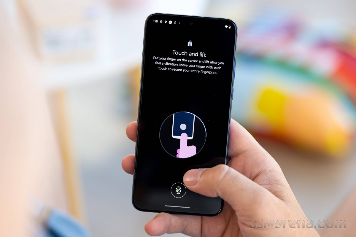
Still, we think the overall design and ergonomics are great. The handset may not have the best choice of materials, but it's lightweight, compact and has a nice, grippy surface. It's a great device to hold and operate with just one hand.
Reader comments
- Anonymous
- 09 Jul 2024
- 0U2
Camera is really bad. Pixel 3a runs circles around this. Plus, camera app toggles maximum brightness and there's no way around it. Wouldn't bother with GCam ports - 90% of the times they don't work and when they do they are unreliable ...
- Nutbuster
- 03 Oct 2023
- 6jh
It's ok, depends on how picky you are and what you're gonna use it for I guess. Photos taken with the stock camera app look fine, but with GCam I can't really tell much of a difference between 3a/Neo when looking at the photos directly...
- kucsatax
- 02 Oct 2023
- pqq
and how about the camera. iam also a pixel 3a user.
