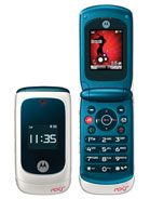
Motorola EM28
- f
- fabio
- P72
- 28 Aug 2008
wow.. big hour numbers.. that's just essencial in a phone today.. open the mobile for see the hour it's terrible.. and less people use watch for see the hour..this idea i think it's great
- f
- forest
- PBR
- 24 Aug 2008
i think is not a rokr family because i can't see some special in this phone...it's so bad...please make it better...
- t
- tyler
- RXV
- 21 Aug 2008
I'm gonna get this phone, tear the housing off it, then place the "guts" into the housing of a Motorola W510 (don't worry I know what i'm doing) I like the features on this phone but I REALLY HATE the design, so IF I get this phone, I'm definitely going to change it's housing.
- ?
- Anonymous
- Y2W
- 20 Aug 2008
this would be a good phone if the screen weren't so small and if the inside wasn't blue........
- G
- G
- mc3
- 11 Aug 2008
I think Moto need to go back to the drawing board with this phone. The EM25 and EM30 are good looking but this one looks too plastic and it does look like a toy. The shape is nice, but the screen size looks very small compared to the rest of the phone. Some metal and new colours are needed, plus a different coloured music key. That button sticks out like a sore thumb.
- ?
- Anonymous
- 2SU
- 11 Aug 2008
nothing great as i have thought
- ?
- Anonymous
- Er2
- 11 Aug 2008
Anonymous, 08 Aug 2008puhhhleasee... it looks so 80sSo exactly which phone(s) from the 80's looks like EM28?
- ?
- Anonymous
- RA}
- 10 Aug 2008
ROKR EM28: Sonic Performance
ROKR EM28 offers easy access to a genuine music-player experience in a familiar clamshell design and allows users to control their music using touch-sensitive keys that appear only when they’re needed. The front of the phone shows the name of the artist and song without even opening the flip.
ROKR EM28 has sonic features that enhance the music’s performance. A 3D sound effect gives music a surround-sound quality and an audio equalizer provides 11 pre-set music genres, including rock, reggae and pop for optimal listening. Consumers also can boost the bass up to nine decibels.
Source: http://www.motorola.com/mediacenter/news/detail.jsp?globalObjectId=9995_9924_23&pageLocaleId=2026
- ?
- Anonymous
- mX3
- 10 Aug 2008
lawl
soo funny looking
looks more like a toy phone that i would give to my niece to play with, right enough, even then, she wouldnt play with as ugly a phone as this
lawl
- ?
- Anonymous
- RA}
- 08 Aug 2008
Every brand has class. Low End, Middle End and High End. Motorola EM28 for Low End User. For Low End User; the most important is cheap price, can call and can messaging.
- ?
- Anonymous
- uC4
- 08 Aug 2008
puhhhleasee... it looks so 80s
- ?
- Anonymous
- ib7
- 07 Aug 2008
change the colour and a big size screen ,this colour so ugly!!
- ?
- Anonymous
- v0g
- 07 Aug 2008
the kind of phone even sagem would be ashamed of :P
- B
- Bo
- wra
- 06 Aug 2008
I hate the colour! Why can't they just colour it red instead of this hideous blue.
- ?
- Anonymous
- mX3
- 06 Aug 2008
one word sums it up... UGLY!
- t
- tyler
- RXV
- 06 Aug 2008
awesome phone idk whether to get this or the rokr em25, what do you ppl think?
- s
- sorin
- 3c4
- 06 Aug 2008
i see a great future for this phone!
- f
- first
- nTZ
- 06 Aug 2008
design is poor...
