Motorola Flipout review: Fair and square
Fair and square
Eclair with a side of MOTOBLUR
The Motorola Flipout comes with Android 2.1 Eclair and Motorola’s MOTOBLUR custom interface, which is heavy on SNS integration. It’s very similar to previous Moto droids save for a few differences.
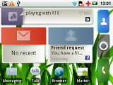
Motorola have kept the cornerstone of Android – the homescreen – but they’ve laced it with social networking integration. This is done mostly through widgets, so if you’ve used Android before you’ll get the hang of it in a minute.
There are seven homescreen panes so you have plenty of room for widgets, even on the relatively small display. When scrolling the homescreens, dots appear on the top of the screen to assist navigation. The thumbnail overview we saw on the Motorola MILESTONE XT720 is missing however.
A few handy shortcuts are available through the Home key – a single tap brings you to the center screen and if you’re already there, it launches the main menu. A double tap can launch an app – which one you can choose from the settings (browser, camera, etc.).
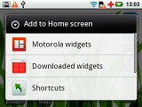
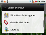
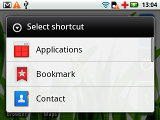
Some of the homescreen inhabitants: shortcuts and content shortcuts
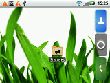
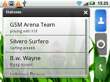
The Statuses live folder brings your social stuff on the homescreen
Widgets are the bread and butter of the homescreen. And Motorola have worked some of their mojo to add excellent social networking and make the widgets resizable. Tap and hold on a widget and four handles will appear in the corners – you can drag them to resize the widget, which will change its appearance to fit the new size.
For example, the Date and Time widget can be expanded to show a clock and a calendar or shrunk to time and date or even all the way down to just a clock. With this much flexibility, you can take the most out of what initially seems like a small and limiting screen.
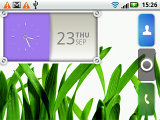
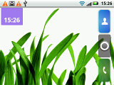
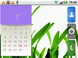
Sizing up the Date and Time widget
There are the standard crop of calendar, music player, weather widgets and switches for Wi-Fi, airplane mode. etc.
There’s also an RSS reader, the Social status widget (which lets you post status updates) and the Happenings widget (this one displays status updates from your contacts). We’ll cover them in more detail later on in the social networking chapter of the review.
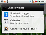
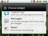
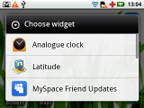
Some of the homescreen inhabitants: widgets
The notification area is intact. It shows status info about battery, signal strength and others such as Bluetooth or missed events.
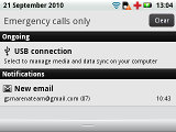
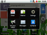
The notification area is one of Android's key assets • The task switcher
To bring up the task switcher on the Motorola Flipout you press and hold the Home key just like on any other Android phone. The "task switcher" is a shortcut to access six of the most recently used apps but it’s not a task manager per se.
In fact, Android automatically opens and closes applications. When resources start to run out, it might close a currently inactive app but it will restore it back to just how you left it. It's more like the system puts the app to hibernation instead of closing it.
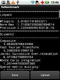
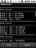
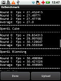
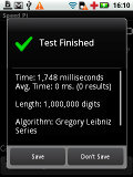
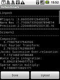
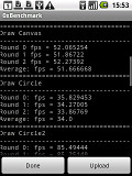
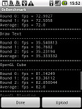
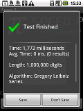
Here is how the Motorola Flipout compares to Samsung I5500 Galaxy 5 in terms of performance. We used the free 0xBenhcmark and SpeedPi apps from the Android Market for the test and the results are here for you to see.
Reader comments
- Anonymous
- 30 Oct 2016
- t7X
now it cost only 30 to 32 us dollars here in Philippines
- Anonymous
- 08 Nov 2014
- pYj
It is super cool me and my friends think it is reali adoribal
- lulu
- 05 Jul 2012
- 3sE
Battery life can be extended by disabling motoblur use 2G and install battery saver you will charge on the 3rd day if screen.is set to 20percent bluetooth, wifi. gps,vibration,animations,haptic and un necessary warning sounds are set off.
