Motorola KRZR K1 review: It's all about the looks
Solid bottom
Along with the battery, hidden behind the back panel, is also the SIM card bed. Above it you will also find an untraditionally positioned microSD memory card slot. The SIM card can only be picked out if the battery has been removed first, while the memory card is fully hot-swappable.


SIM card bed • the microSD memory card is inserted above the SIM card
The joint of the clamshell looks solid enough to ensure long-lasting usage. Both opening and closing are facilitated by springs, which push the top half down to its lock position. An interlock located beneath the keypad is meant to protect the display from scratches when the phone is being closed, but partly fails to do so, as imprints of the keys are visible on the display anyway. Fortunately, a bit of polishing is enough to make them disappear.


The joint of the KRZR clamshell is solid and precisely elaborated
Another element Motorola KRZR has inherited from its forerunners is the expressed bottom, the „chin“, into which the top half of the clamshell interlocks when the phone is closed. It is no wonder Motorola has once again used this element as it allows for a far longer body than in the case of standard covering of the keypad and the display areas. Besides, when one speaks, a little bit more of solid material in front of their mouth feels more natural. Parts of the overall elegant design of the phone are two decorative end caps on either side of the joint in the form of two silver circles with blue stones. The band covered with dots around the above mentioned “chin” is another interesting detail. To sum up, in terms of construction, comfort and solidness Motorola KRZR is undoubtedly one of the best mobile devices on the market (not only clamshells).


The expressed “chin” has been used again • decorative edges of the joint • decorative band
Fingers will be grateful
Motorola has once again chosen the etched keypad, perfect for slim phones. In front of me I have both V3 and KRZR, so let’s compare them. The keypad of Motorola KRZR appears to be remade a bit in order to make typing even more comfortable. Keys’ uplift is slightly higher than in the original RAZR, while distribution is more practical, not to say moderate. A shortkey for instant opening of the web browser as well as a correction back-key are available too, just like in Motorola V3x. This new Motorola keypad is comfortable indeed. Its deep blue backlighting is superb and perfectly even.
On the right side of Motorola KRZR there is a voice control key, which also opens the voice recorder after a longer press. Records duration only depends on the available free internal memory. A bit lower you will see a miniUSB connector with an attached soft plastic cap. On the opposite side are the dual volume-control key and the so called “Smart Key”, to which any function from the menu can be assigned.


Activation of the voice control and the voice recorder • the Smart Key with the dual volume-control button • miniUSB connector
The size of the main display has changed in accordance with the modifications of the entire phone body. It has a resolution of 176 x 220 pixels on a surface of 30 x 38 mm and supports 256K colors. Both contrast and legibility are superb. The lower resolution is hard to notice, unless one focuses on the smoothness of the menu font. On the other hand, there are certain sections in the menu, like the camera application for example, where text aliasing is unpleasant.


Display surface has been modified • main display in the dark
There is place for improvement
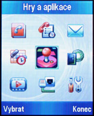
I am going to repeat myself, but I cannot skip one important fact: Motorola is one of the manufacturers who stubbornly refuse to modify (read improve) the years-old interface of its models. I do not want to say it is the worst of all, but there are plenty of details that cry for improvement, the menu structure in particular. Interface design is another questionable matter; on one hand Motorola provides users with numerous options for menu configuration, on the other hand, however, designers could have done better job with the respective icons, references and logs.
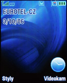
The wallpaper on the main display can be of any type, incl. animated. Further, you can choose between an analog and a digital clock, or simply none. The operator’s name as well as the current date could be centered or aligned to right. The center of the display can also be occupied by graphic icons of the functions assigned to the ways of the navigation key. The context keys and the above mentioned “Smart Key” could also be assigned any function.

My keys (settings)
The main menu is user-configurable. It can be visualized as a list or as a 9-element matrix. Items’ order is also configurable. What the phone will not allow you is to move in the menu by using numeric shortcuts. The speed, with which Motorola KRZR responds to orders, is rather average; it sometimes makes you wait even longer than a smartphone would, Motorola V3x was faster, for example. Graphic themes for modification of the menu looks are available too.


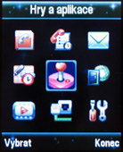
Three preset themes
Reader comments
- AnonD-754891
- 26 Apr 2018
- 2SJ
i want buy this mobile
- Dawn
- 20 Mar 2015
- 3sE
I have forgotten my unlock code what are my options can't access or use my phn pls advise


