Motorola Moto G review: Little big G
Little big G
Android 4.3 purely stock
The Moto G is a step up from the Moto X at launch, sporting Android 4.3 (and not 4.2.2), and it's going get the latest Android build available (Android 4.4 KitKat) next month. The interface has been almost entirely left to stock, which we kind of like as it's more fluid and less testing on the hardware.
Here's a quick video rundown of the Moto G running un-skinned Android Jelly Bean.
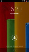
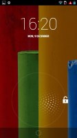
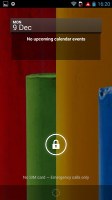
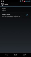
The lockscreen in Android 4.3 Jelly Bean features the same large dotted circle around the center-placed padlock button. Lockscreen widgets are present on the Moto G. They are full-screen, resizable tiles, one of which is always visible at the top of the main lockscreen, above the padlock icon. The rest are a swipe to the right away. The one on the main lockscreen is collapsed to make room for the padlock button, but can be expanded to display additional information.
Google Now can be accessed straight from the lockscreen too.
There are multiple unlock patterns to choose from: simple slide, pattern, pin or password, and face unlock. The lockscreen could even be skipped altogether.
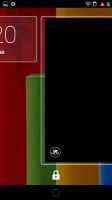
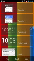
There's a large variety of third-party lockscreen widgets and a few stock ones: Messages, Calendar, Gmail and Digital Clock. The camera shortcut, previously located at nine o'clock on the unlock circle is now a stand-alone widget, a left swipe from the lockscreen.
Unlike on the Moto X, the Motorola's Active Display notification system where you could see the clock and notifications icons on the screen even when the phone is in stand-by, isn't available on the Moto G. The chipset isn't as sophisticated and being an LCD, the display would drain much more battery if the feature was present.
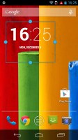
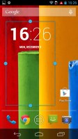
Lockscreen widgets are resizable - tap and drag down to expand and show more content, if available. Lockscreen widgets can also be reordered by tapping and dragging, so you can choose which one is visible on the main lockscreen. They can also be dragged up to discard.
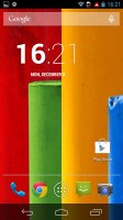
Once unlocked, you're welcomed with the familiar homescreen interface introduced in Ice Cream Sandwich.
The dock is customizable and features two shortcut icons on either side of the app drawer key. You can have folders there, each with multiple shortcuts.
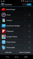
Android 4.3 Jelly Bean isn't just business and no play. Google's Daydream is a fun twist on the screensaver concept. Once turned on, you can set it up to show photo albums or the latest news from Google Currents when the device is either docked or idle.
In the notification center you'll find Quick toggles. They're accessible via an icon in the top right corner of the notification area. You get access to key device settings such as brightness, Wi-Fi, Bluetooth and Battery. Some toggles are directly accessible shortcuts to their respected functions in the settings menu.
The quick settings menu can be accessed by a two-finger swipe down from the top of the screen.
Google has added a bit of personalization to the Quick Toggle panel in the notification area. Your name and photo are displayed but only after you've logged in to Google+ or after you've manually set them yourself.
Notifications can be expanded and collapsed with a two-finger swipe, and the top one is expanded by default (if the app that put up the notification supports it, of course).
The homescreen consists of five panes to fill with shortcuts, folders and widgets. More often than not, the latter are resizable in all directions in order to fit any tight space. To resize a widget, you tap and hold a bit longer and then release. Four handles will appear on its sides, allowing you to change the widget's size in the direction you want.
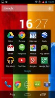
The app folder function hasn't been changed since Ice Cream Sandwich so they function as you'd expect. A folder is created by dropping a shortcut on top of another and can be named by tapping on the "Unnamed folder" label. Opening a folder expands it only as much as needed to fit the icons inside.
The folders themselves are circular with the shortcuts inside drawn as if they are in a line One behind the other and you're looking at them at an angle (complete with perspective). They are lined up so the first shortcut in the folder will be the only one unobscured - the rest of the icons are nearly impossible to tell apart.
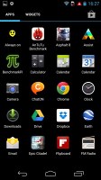
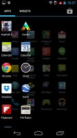
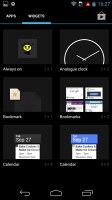
The app drawer of the Moto G consists of four rows of icons. It features two tabs - Apps and Widgets, each with side-scrollable pages. If you scroll past the available apps you move into the Widgets tab. There's also a Market shortcut next to the tabs, for quicker access to Android's app repository.
Apps and widgets are ordered alphabetically and there's no other sorting option. Placing a shortcut or widget on the homescreen works as you would expect: press and hold to grab it and then position it on the homescreen pane of choice. Two more options appear at the top of the screen while you're dragging an app's icon - Uninstall (to quickly remove apps from the phone altogether) and App info, which opens the application's entry in the Manage applications list. You can drop the app or widget on either one to activate it.
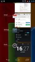
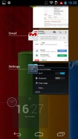
Last but not least, the Recent Apps list has remained virtually unchanged, save for some optimizations in loading times and a few neat animations here and there. It all adds up as a really polished user experience and feels fantastic. It would be nice if Google adds a kill/close all option though.
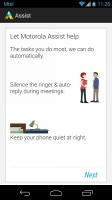
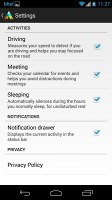
Motorola has implemented its own version of a Do Not Disturb feature via their Assist app.
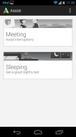
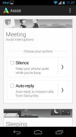
It will keep the Moto G quiet while you're in a meeting or sleeping. Meeting options are to silence the smartphone and to send auto-replies.
While the sleeping option lets you configure the time interval, allow calls from a favorite contact or list of contacts and put through calls from the same person if they call twice in the interval of 5 minutes.
It's a good way to silence all those annoying notifications that come through in the middle of the night when you're trying to get some rest.
Stock Android has always been easier on the chipset and we didn't find the Moto G to be any slower than its more powerful bigger counterpart, the Moto X. Overall this is a great smartphone experience and on par with the entire midrange segment and just a tad slower than the top range of devices like the Samsung Galaxy Note 3 or LG G2, or even the purely-stock Nexus 5. And that's a pretty tall order for a $200 smartphone, which adds credit to Google.
Reader comments
- zayyad
- 04 Nov 2024
- r3b
Very much portable phone to be with always and forever. But please indicate to me where SIM slot is?
- Jay
- 07 May 2024
- thg
how to block contacts with this phone
- Anonymous
- 02 Jul 2023
- 7$q
Still using mine. No problems.
