Motorola Moto G review: Little big G
Little big G
G-reat phonebook
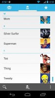
The Moto G phonebook is the stock Android app People, which hasn't been changed since its major redesign in Ice Cream Sandwich.
It's made up of three tabs that you can switch between with sideways swipes. The middle tab is the default one, listing all of your contacts. Contacts are listed with a name and a picture to the right. They can be sorted by first or last name, and viewed as first name or last name first.
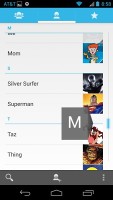
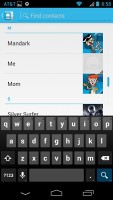
There's a permanent scroll bar available that you can grab and jump straight to contacts starting with a certain letter. There's regular search as you type too.
The quick contacts feature triggers on tapping a contact image to bring up a tabbed popup window. The tabs are phone and email with a list of the available numbers or addresses. These tabs can be navigated with sideways swipes as well.
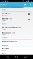
The single contact view displays the contact's name along with a star to make a contact favorite and a Settings button that lets you edit, share or delete a contact, as well assign custom ringtones to them or set the phone to redirect calls from that contact straight to voice mail.
Under that is a list of all contact info sorted by category - phone numbers, emails, events, notes and so on.
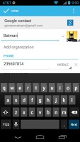
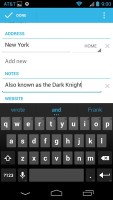
While editing a contact, you can add new fields of different types to fill in more info for the contact. You can link contacts too, if you've added the same person on multiple services.
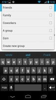
The contacts that the phonebook displays can be filtered by service (e.g. hide all Facebook contacts) and even group (so you can hide all contacts that don't belong in a group, for example).
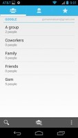
The other two major tabs in the phonebook are Groups and Favorites. Groups are listed by service (e.g. your Gmail account), while favorites are a listed as a grid of large contact photos, which is readily thumbable.
Telephony is stellar
In-call quality of the Moto G was great. Voices come out loud and clear and the device held on to signal without issue.
The dialer features the neon-blue on black theme, but hasn't grown any new functionality since the Moto X. There's still no smart dialing, which is a real shame and frankly getting annoying.
The dialer is the first tab of the phone app, the other two being the Call log and the Favorites tab (you get the same in the Phonebook). In the Call log, you can't delete individual entries, which is mind-boggling.
We ran the Moto G through our dedicated loudspeaker test and it may be the loudest handset we've tested in our office. It smashed the boards and was actually almost painful to listen to it up close.
| Speakerphone test | Voice, dB | Ringing | Overal score | |
| 65.5 | 62.0 | 65.8 | ||
| 65.3 | 61.7 | 75.7 | ||
| 66.8 | 64.6 | 75.7 | ||
| 66.6 | 74.4 | 62.3 | ||
| 64.3 | 66.3 | 75.7 | ||
| 68.5 | 66.6 | 80.7 | ||
| 74.1 | 66.2 | 76.0 | ||
| 81.6 | 75.7 | 82.7 | Excellent |
You can find more on the testing procedure here.
All you can eat messaging
The messaging section is business as usual but with some improvements. All SMS/MMS communication is organized into threads - each thread consists of all messages between you and one of your contacts. A cool new feature is that you can select multiple threads to mass delete them.
Each thread is organized like an IM chat session, the latest message at the bottom. You can manage individual messages (forward, copy, delete) and even lock them (to prevent deletion). You can use search to find a specific message in all conversations.
Quick contacts work here too and there's a call shortcut at the top of the screen when viewing a thread.
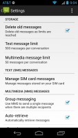
You can set the Moto G to delete older messages (by default, it keeps 500 texts and 50 MMS). You can activate delivery reports and read reports too (they are notifications that the receiver has read the message).
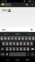
Composing a text is still frustrating as the text box starts off as a single line and grows only up to three lines, which makes working with longer texts hard. We mostly let it slide on previous versions, but with a 4.5" screen there's no excuse not to make the text box a tad bigger.
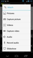
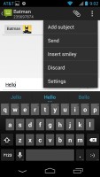
You can add multimedia (photos, videos, sounds, etc.), which will convert the message to an MMS. If you need multiple slides or multiple attachments, you can go to a full-blown MMS editor as well.
Even with the presence of the stock Messaging app Google is set on retiring it to the bench and setting Hangouts as starter. For now the app asks for the spot but by adding SMS support it clearly means business and will gradually be taking over, just like Chrome did with the Browser of old.
In its defence Hangouts offers a pretty sweet interface. On the left you have your conversations - tapping on one will show you a threaded view. A Swipe to the left reveals a mashup of your Google+ and phone contacts along with a search box.
If the other person has Hangouts on their handset and an active connection then you can text away freely - you even get a little shadow under the contact photo to let you know the other person is active.


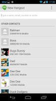
Hangouts
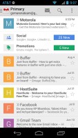
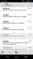
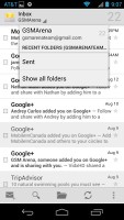
The Gmail app now features color coded sender images, based on the first letter of the sender's name. This lets you easily see who your most popular email correspondences are with. The default app supports multiple Gmail accounts, but there's no unified inbox.
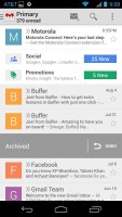
A cool new feature in Gmail is that you can swipe left or right to move between messages in your inbox.
A recent major update of the app also automatically sorts out your incoming messages into three inboxes - primary, social, and one for promotional emails. We found it to work like a charm - it makes sorting through email messages much easier.
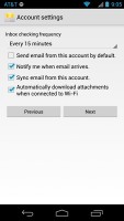
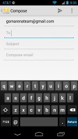
There is also a generic email app for all your other email accounts and it can handle multiple POP or IMAP inboxes. You have access to the messages in the original folders that are created online, side by side with the standard local ones such as inbox, drafts and sent items.
Unlike its Gmail counterpart, this app supports a combined inbox view. It color codes the inboxes so you can easily tell where each message came from. Unfortunately, there's no moving between messages with sideways swipes here.
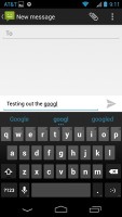
The keyboard has plenty of room to stretch its legs on the 4.5" screen and typing is very easy. Keys get even bigger when you switch to landscape mode - the long screen becomes very comfortable for two-thumb typing.
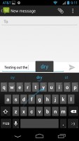
In Jelly Bean 4.3 Google introduced a new typing method called Gesture typing. It works in a manner very similar to Swype - you just Swipe your finger over the letters you want to type, lifting after each word is complete. Naturally, the Gesture Typing feature benefits from the already existing Android word prediction, so you can just click on the words the keyboard suggests.
A tap on the text area will reveal a "handle" attached to the text cursor - it's easy and more accurate, which makes correcting mistakes easier. A double tap will bring up the select options - select word and select all - with two handles to adjust the start and end of the selection.
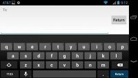
The keyboard in landscape mode
If a word has a typo, it will be underlined in red and when you tap it, the phone will offer a number of suggested corrections along with options to add the word to the phone's dictionary or just delete the word.
Reader comments
- zayyad
- 04 Nov 2024
- r3b
Very much portable phone to be with always and forever. But please indicate to me where SIM slot is?
- Jay
- 07 May 2024
- thg
how to block contacts with this phone
- Anonymous
- 02 Jul 2023
- 7$q
Still using mine. No problems.
