Motorola Moto G10 review
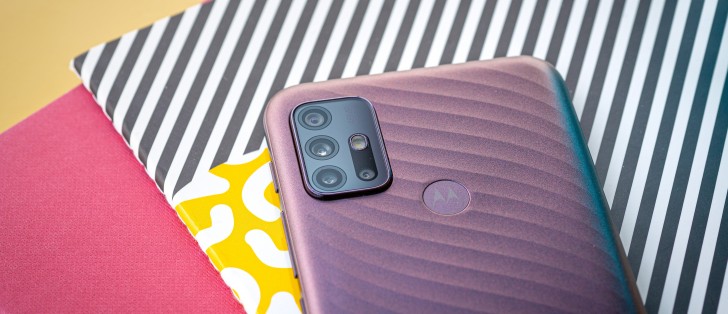
Design and ergonomics
Yes, the Moto G10 is all-plastic, and we don't expect it to be made of glass or metal anyway. But Motorola is trying to break the mold with this one and introduces a rather different design than what we are used to. What's more, the phone inherits that water-repellent coating that most Motorola phones have, which is a really nice bonus to be had in a sub-€200 category.

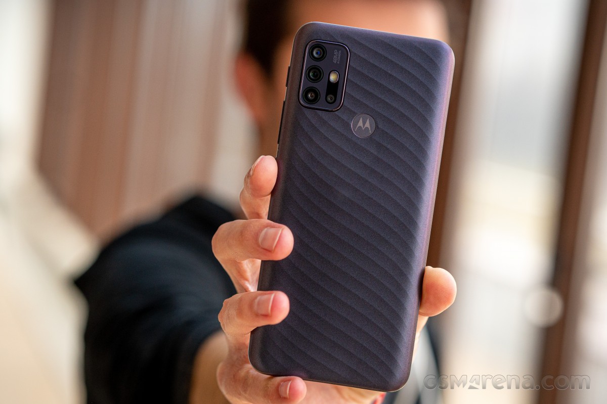
Let's start with the back. It's made of matte, satin-like plastic, and the whole panel is patterned in the shape of waves. That doesn't really help with the grip but makes the phone feel nicer and less cheap too. Fingerprints and smudges are also less visible. We got the Iridescent Pearl color with a subtle color shift towards the edges of the phone.
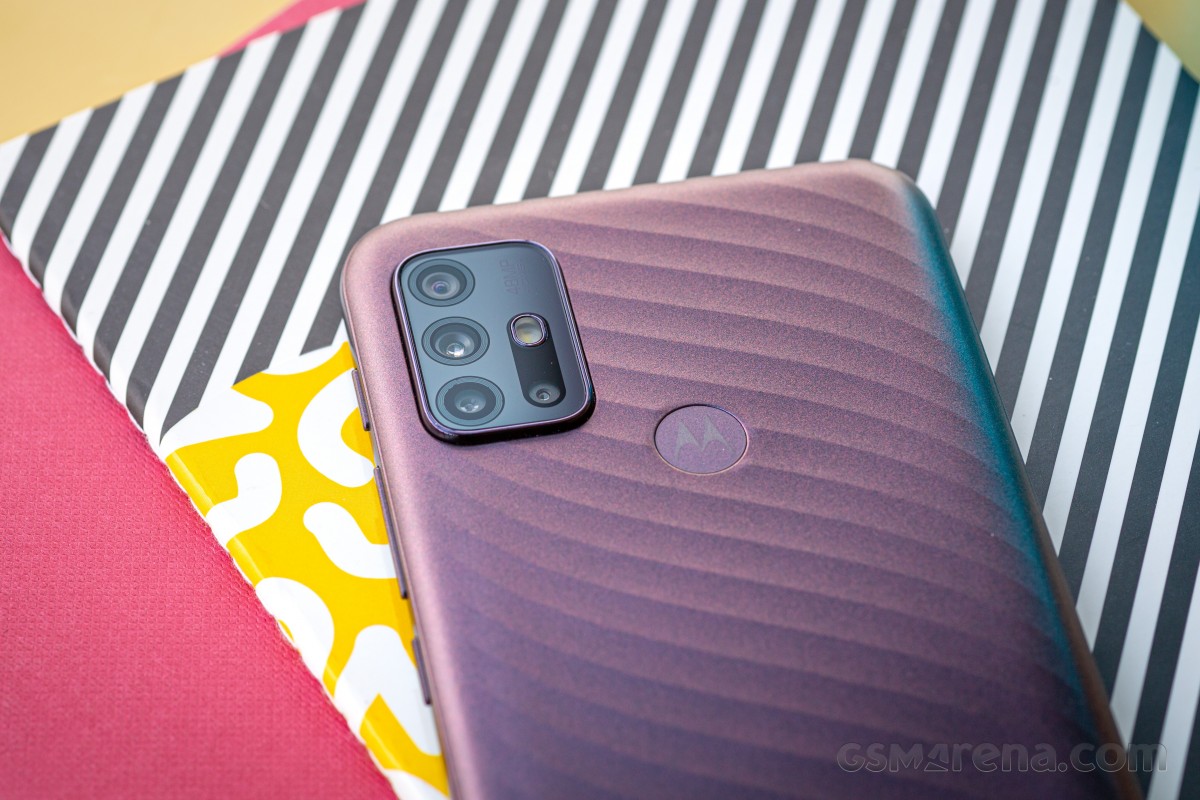
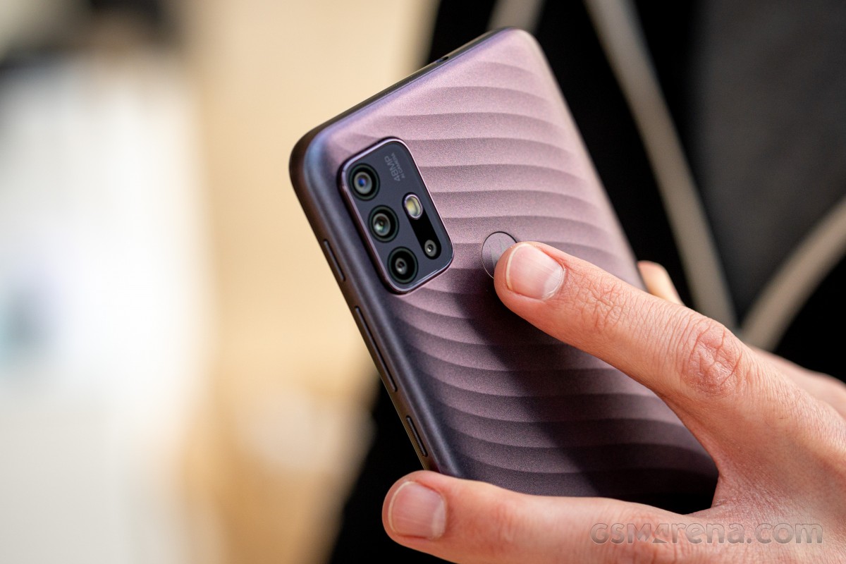
The camera module in the upper-left corner sticks out just a little, and it follows the current design trend with an oval, rectangular piece housing all the lenses.
The fingerprint reader is close by. It sits almost flush with the back of the phone, and sometimes it's hard to feel it with your finger. The texture on the back isn't helping either. Additionally, the scanner is placed slightly higher than you expect it to be, so even users with average-sized hands will struggle to reach it from a natural hand position. The handset is rather tall, and it would have been nice if the fingerprint reader was adapted to accommodate that.
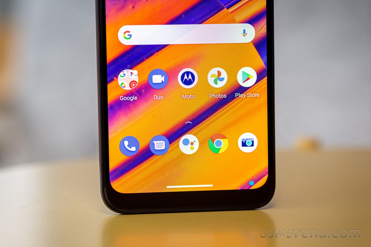
Flipping the Moto G10 reveals a set of rather thick bezels, especially the bottom one. Not that we were expecting a razor-sharp frame, but it makes an impression, nonetheless. On the other hand, the notch is unobtrusive and doesn't really get in the way of the content as it doesn't cut deep into the display.
The side frame, although plastic, feels somehow grippier than the back. Interestingly, all the buttons are on the right side of the frame, which makes it feel "overcrowded" to some extent. The power button is textured, adequately placed, and the volume rocker sits right above it. Then comes the dedicated Google Assistant button, which used to be on the left side of the frame. Needless to say that it's hard to reach with your right thumb. The 3.5mm audio jack is placed on the top of the phone - yet another unconventional placement.
On the left, you will find the hybrid SIM and microSD card slot, the latter takes the place of the second SIM, so you have to choose to go with double SIM or SIM + microSD combo.
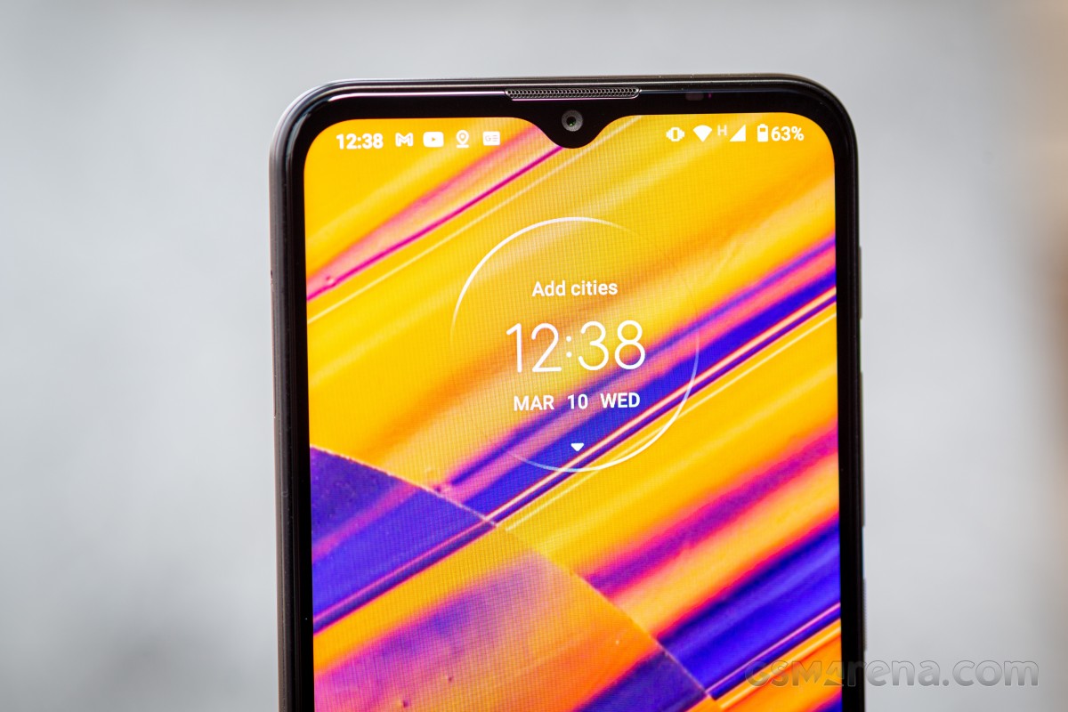
We found the design overall fresh, and the side frame makes the phone a tad less slippery. However, some small annoyances like the button and fingerprint reader positioning, along with the rather thick display bezels, keep us from giving this phone a great usability score.
Reader comments
- murdock
- 27 Feb 2024
- mpy
after using this phone over 2 years now I can only say, yes it hasn't got the best camera (not one Moto I owned had), can be a bit sluggish at times, but it's been over 2 years and i can't count how many times it fell down to the groun...
- Anonymous
- 26 Jun 2023
- Bkf
The Motorola G10 get really sluggish if you have too many apps installed. What "too many" means is not readily available, but it's a number that doesn't give the Samsung S10 Lite any pause. I may be down to the amount of RAM, but ...
- DoneOver
- 27 Oct 2021
- 0U4
No specs or price worth Xiaomi MIUI, after experience with Redmi9 - mandatory permissions, inc location, monitoring, tracking, harvesting your personal information, recording calls(turn off data, before making phone calls!) Other 100%Chinese company ...


