Motorola Moto G30 review
Design
The Moto G30 has a fairly conventional design, livened up with two different color schemes and finishes, and then spiced up with a signature Moto touch.
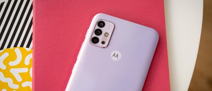
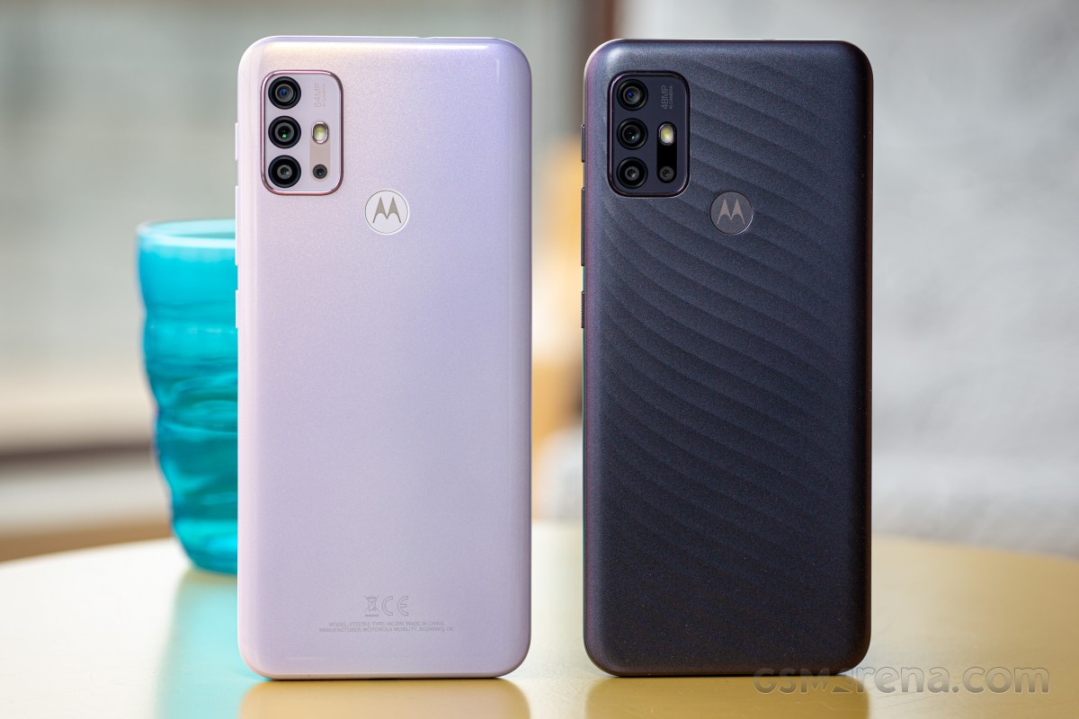
The unit we spent the most time with for this review is in the Pastel Sky colorway. Naturally, it's not one color but a pearly pool of hues ranging from white through faint pink to lavender. That variant is glossy, and while it does pick up fingerprints, it doesn't really advertise them thanks to the light paintjob.
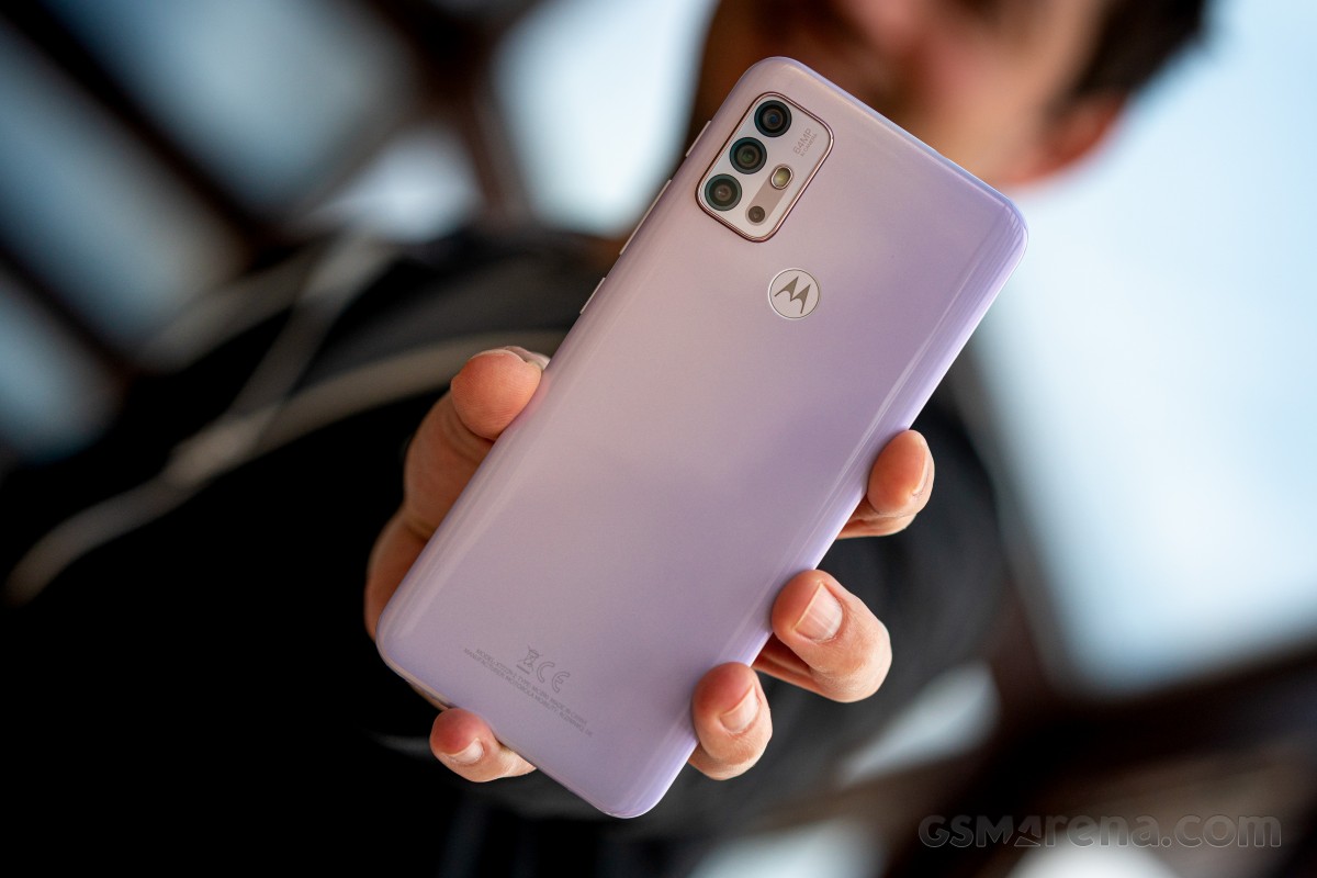
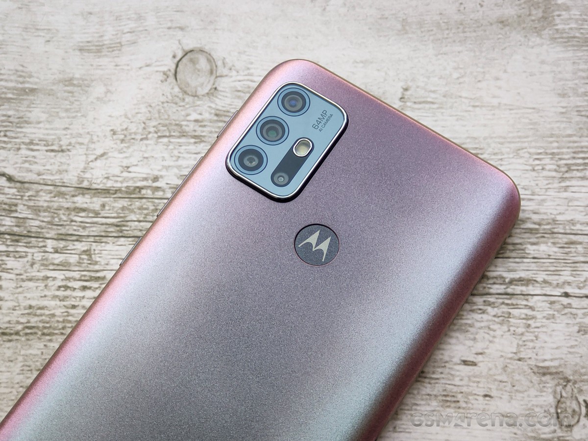
The other available color option is called Phantom Black (or Dark Pearl in different regions), and that one substitutes the gloss finish with satin - we'd say it's classier. It, too, plays with light, its hues ranging from petrol green to copper with maybe some magenta in between.
Regardless of color and finish, the Moto G30's rear panel is plastic and wraps around the handset's periphery, forming a unibody build with no exposed frame.
The glossy Pastel Sky feels a bit cheap in hand, and while we couldn't compare both units with the same hand on account of them being on opposite ends of the world, we're inclined to give the Dark Pearl one the nod for more upmarket feel.
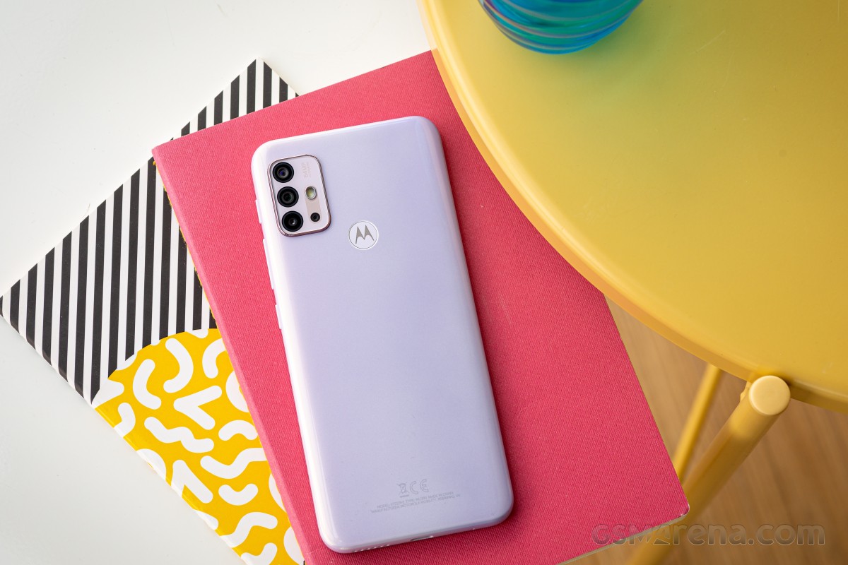
Neither has the wavy textured back of the Moto G10, and that one is quite unique, if not necessarily posh.
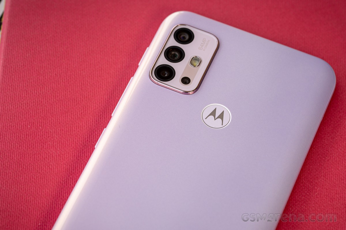
The two handsets' backs share another common trait and that is the fingerprint reader. Fitted inside a very slightly recessed circle, the capacitive sensor is covered by the company's bat logo - so it serves for both authentication and as a design accent.
Advanced as underdisplay sensors have become, there is something inherently easy and effortless about just extending your index finger on the back of the phone to touch a plain capacitive sensor. The slow fade-in of the display waking up sort of robs some of the speed, so the perception isn't that of blazing fast unlocking, but it's okay.
Another small point we'd like to make is that the sensor doesn't offer much tactile feedback as to its location, so it takes some getting used to. The included case helps a lot with that.
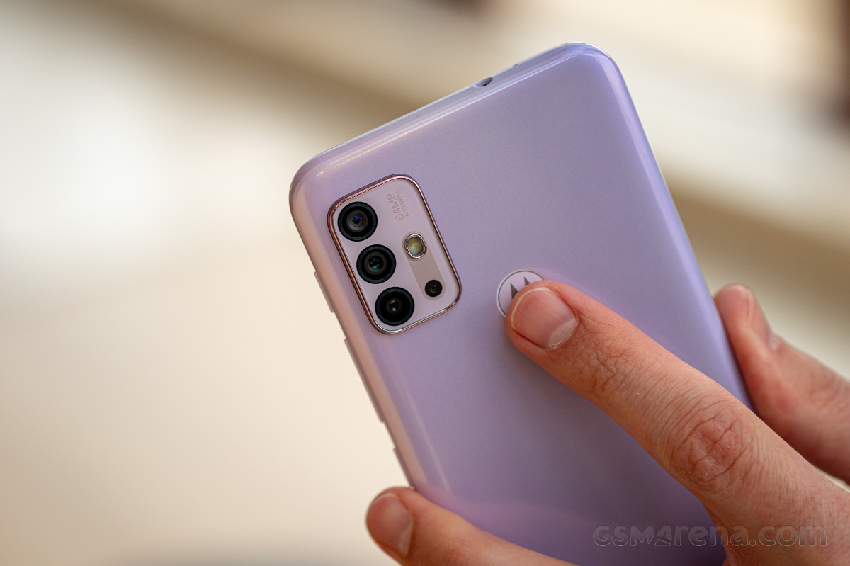
The sort-of quad camera is grouped in a cluster in the top left corner, and the engineers did manage to fit everything together, even the LED flash. The assembly sticks out by about a millimeter, so it will introduce a slight wobble if you try to type on the phone when it's lying on a table. The included case fixes that, of course.
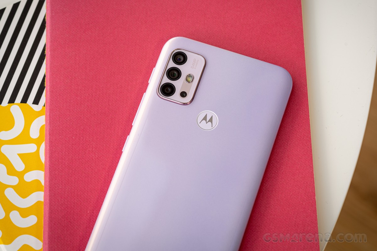
The black camera modules make for a stark contrast against the pale pink cover of the camera island on the Pastel Sky phone. Again, the alternative paintjob looks better, we'd say, with the black-on-green being a lot less in your face.
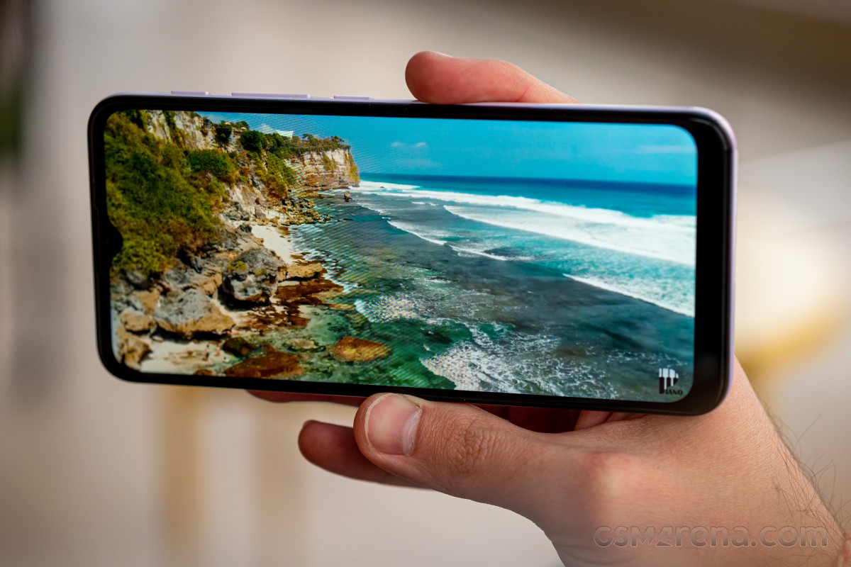
Both look the same on the front, however. The 6.5-inch display is slightly notched to accommodate the selfie camera, and the earpiece is directly above, behind a mesh. Both this mesh and the top bezel are on the thicker side, even if we account for the Moto's not-so-premium segment.
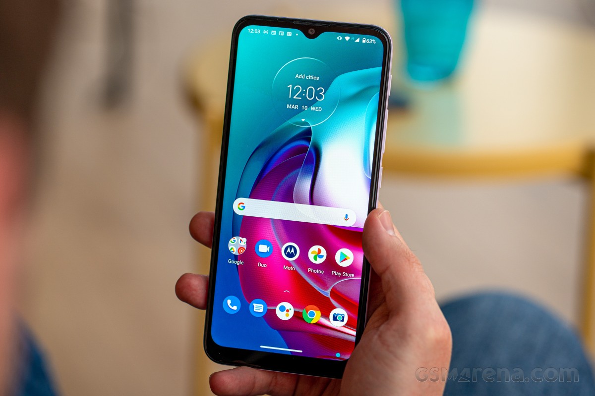
The bottom bezel is even thicker, yes, but the baseline for these is different, and the Moto G30 is about on par with every other budget-conscious offering in this respect.
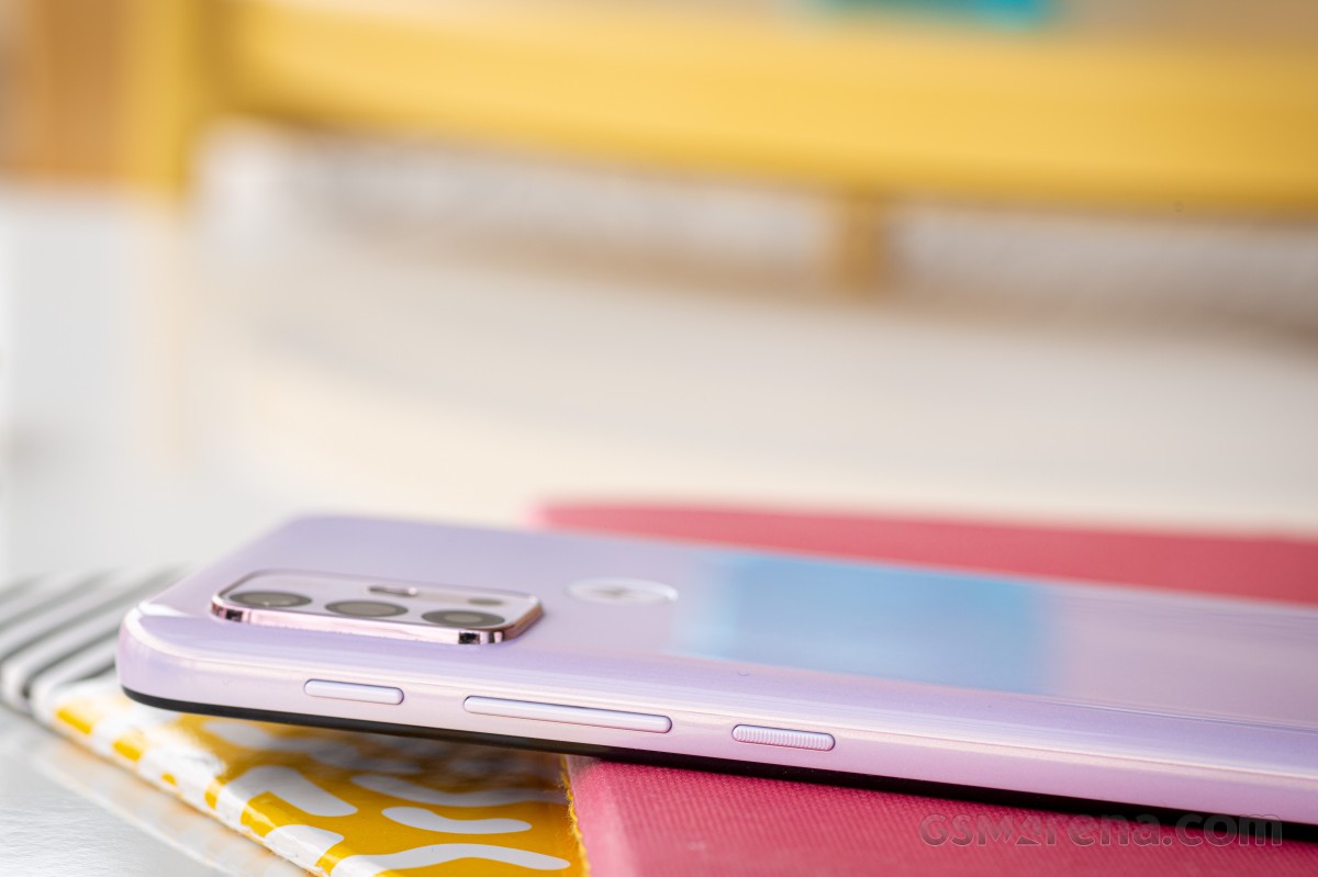
The Moto G30 has a relatively unusual control layout. Both the power button and the volume rocker are on the right, and there's little special about them. What's out of the ordinary is the Google Assistant key high up near the top of the phone's right side.
Previous Motos would have that button on the left side, and a lot lower, where it's more easily accessible - a boon if you use it, a minor nuisance if you don't. On the G30 (and the G10, for that matter), it's placed such that you're unlikely to press it by accident, yet it's way out of reach if you do enjoy using Google Assistant. Oh, well.
We haven't really debated whether bottom or top works best for headphone jack placement, but judging by previous experiences, opinions will be polarized. The Moto G30 opts for what is seemingly the less common top position. In any case, the jack is present. A secondary mic pinhole keeps it company.
One thing fewer to see on the bottom then, where the G30 has the USB-C port, the loudspeaker and the primary mic.
Meanwhile, on the left side of the phone, you'll find the card slot. While you do a microSD slot in the tray, it's shared with the second nanoSIM forcing you to choose either one. Dedicated slots are better.
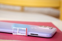
Headphone jack up top • USB-C on the bottom • Hybrid microSD slot on the left
The Moto G30 measures 165.2x75.7x9.1mm and weighs in at 200g. It doesn't stand out in any way in terms of size or heft for what it is - 6.5-inch midrangers with 5,000mAh batteries are all in the same ballpark. That said, it's a substantial phone and will not disappear in a pocket, even less so with the case on. But then again, that's mostly the norm, particularly for the class.
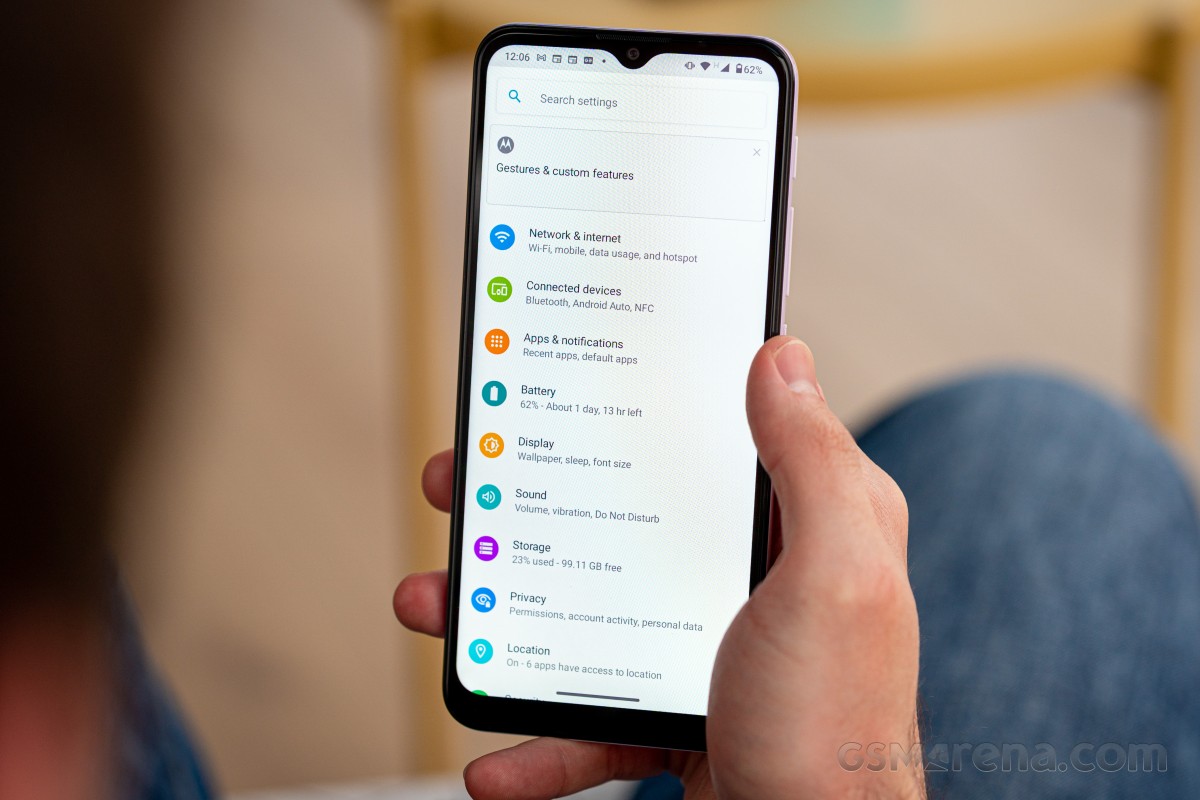
Reader comments
- Sotiris
- 02 May 2025
- iAE
The most disastrous purchase i ve ever made.... 2months kept it and throw to the basement. Stucking always dysfunctional apps, battery last only for 10 hours fully charged
- tmayubtharshi
- 05 Jul 2024
- v{u
My motorolag30 phone if I press it on it's won't on blue pad come then phone off. If on pluck the charger then on take time phone on working.
