Motorola Moto G7 Plus review
Design, build and 360-degree view
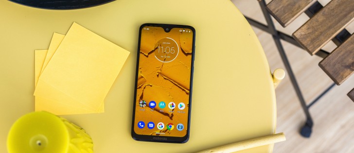
The Moto G7 Plus might be a bit more expensive than other competing handsets, and it shows. The build quality on this thing is excellent and incorporates high-quality materials like glass on the front and back. To be exact, Motorola says Gorilla Glass 3 has been used for both sides, but it didn't mention anything about the frame. We can confirm that it's made of plastic, but that doesn't take away the premium feel of the phone.
And since we are talking on the subject of protection, we should mention the p2i water-repellent nano-coating that has been used in Moto G phones since the first generation came out in 2013. Note that this makes the Plus and the vanilla versions just splash resistant, not water and dustproof.
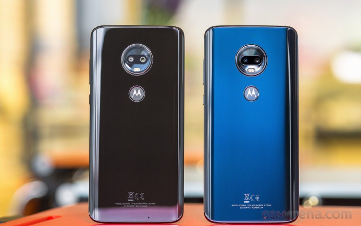
Also, the design hasn't changed a lot since the previous generation, so it retains the rather sleek appearance. The new colors spice things up a little - the red one looks stunning in person while the subtle blue version goes well with the overall premium appeal.
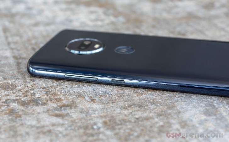
As we go around the sides, we see the volume rocker and the power button on the right side. The on/off button has a textured surface so you can easily reach for it.
All the keys are clicky and responsive. The top is where the dual SIM card slot is located along with the microSD card bay.
The left side remains clean while the bottom holds the second speaker grille along with the 3.5mm audio jack and the USB-C connector.
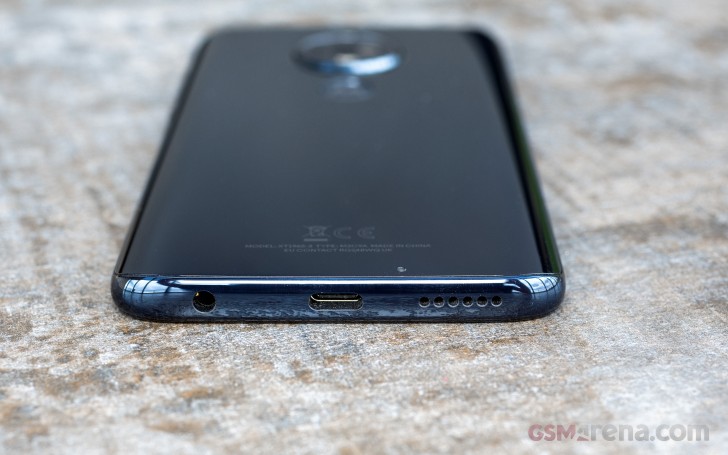
As we've already pointed out, the back panel is made of glass, and it's slightly curved to the sides seamlessly flowing into the side frame. There's a small gap in between, but you have to look for it to see it. The rounded back helps with the grip although all-glass phones will always be slippery.
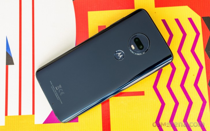
The fingerprint scanner can be found in the middle of the back with Motorola's logo on it, and since it's slightly recessed and the surface has a different texture, it's easy to feel your way to it without looking.
Right above the reader sits the dual cameras in the Motorola's trademark circular camera bump. The latter is slightly protruding and holds a dual-tone LED flash as well.
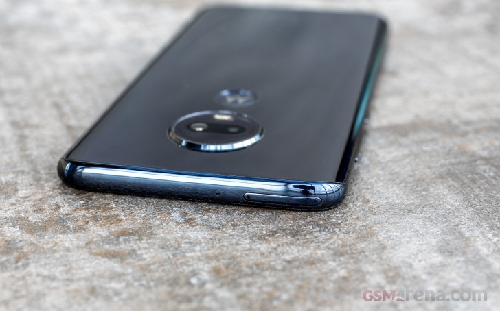
A little design quirk that stood out was the secondary noise-cancelation microphone. It's located on the lower back. It's quite prominent, and it's also not centered but that may or may not bug.
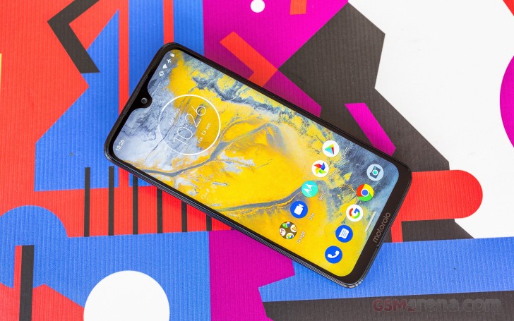
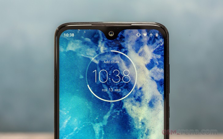
The front 6.2-inch screen is also protected by a Gorilla Glass 3 but misses on the rounded edges. Bezels appear to be a bit thicker than we would like - particularly the side ones and the top. The chin, on the other hand, is quite alright and it's just big enough to accommodate the Motorola branding. Speaking of the chin, there's also the main mic under the Motorola inscription.
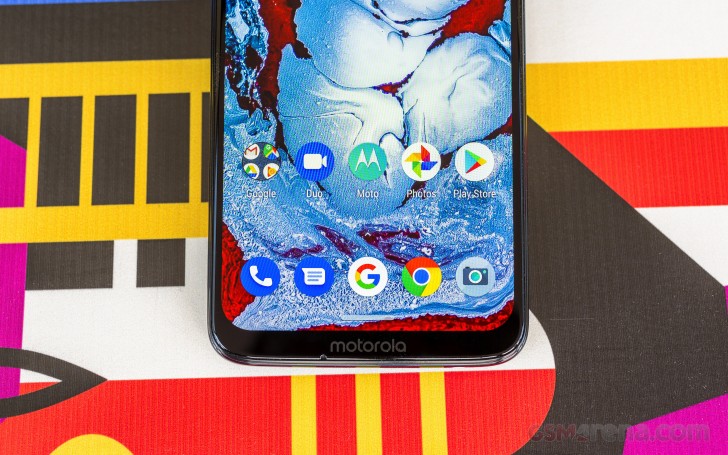
Some may argue that the top bezel is big because of all the hardware there. After all, Motorola had to fit the earpiece that doubles as a loudspeaker. We also have the proximity sensor placed on the notch along with the ambient sensor, which answers the question of why this waterdrop notch is a bit bigger than we are used to seeing.
To be honest, the Moto G7 Plus isn't the easiest one to handle with one hand, and the tall 6.2-inch display doesn't help with the situation too. However, the phone retains a solid feel in hand.
Here's how it looks from all sides.
Reader comments
- packersfan036
- 08 May 2021
- kpH
it comes with a case
- Mhcal73
- 28 Jan 2021
- r$B
This phone is 120. right now, which makes it a great deal (only problem is trying to find a case for it).
- adnan
- 09 Aug 2020
- ama
How long are you getting now? Also, any slowness or breakdown happened since day 1?