Motorola Moto G8 Plus review
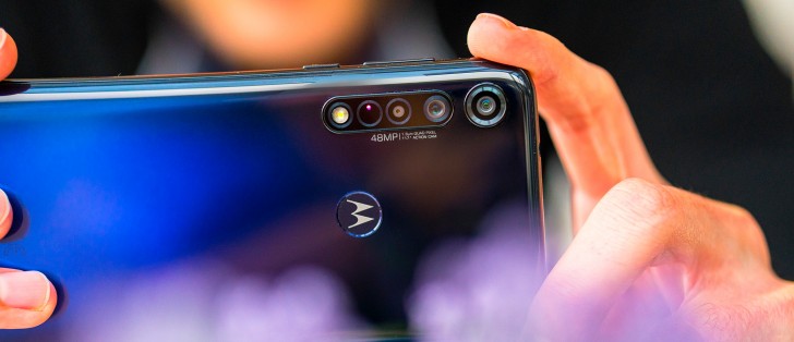
Design and 360-degree view
The Moto G8 Plus' design marks a departure from the last several generations of G-series handsets and their big, circular, centrally placed camera clusters. Instead, it adopts the aesthetic we've been seeing on recent One series units with cameras in the top left corner, and the G8 Plus looks, in fact, just like the One Macro.
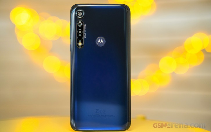
That means an oversized separate camera module and a joint assembly where the rest of the cameras are clumped together with some auxiliary camera-related elements.
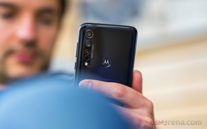
We must point out that the Moto G8 Plus' rear poses for a five-camera setup at first glance. You'll easily dismiss the flash and bring the count to four, which is still not the case. The autofocusing laser emitter and receiver pair are accented with a circle making this impostor harder to spot.
In fact, it's a trio of cameras, if that. The lone module up top is the video-only ultra wide-angle module. The 48MP main camera is the top module in the cluster, with the depth sensor right below it.
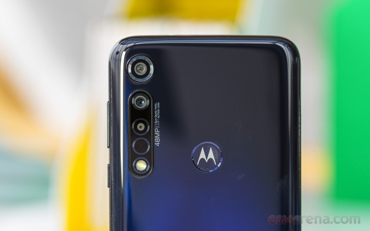
Our review unit is in the Dark Blue colorway, which starts as nearly black on top fading to a deep purple towards the bottom. The Dark Red color scheme is nowhere as dark but still sports a gentle gradient.
Regardless of your choice of color, the Moto G8 Plus has a glossy plastic back that accumulates fingerprints as glossy plastic backs do. This one, however, thanks to the particular colors tends not to display grease too prominently - it's there, it's just not all that visible.
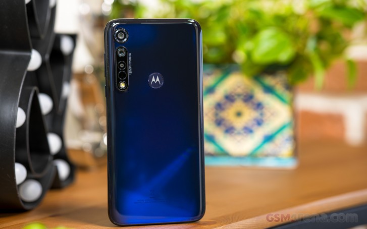
The M-logo, on the other hand, is quite visible. As Motorola likes to do it when it gets a chance, it's stamped on the fingerprint reader, a most natural pairing of design and functionality. The sensor itself is nicely placed, so you'll likely need no finger gymnastics to operate it. So top scores for ergonomics on the Moto G8 Plus.
The same goes for the other hardware controls on the Moto - the textured power button on the right side of the phone is where your thumb expects to find it, and the less frequently used volume rocker is above it.
Other key bits along the plastic frame include the card slot on the right, which takes two nano SIMs or a nano-SIM and a microSD card. The primary mic flanks the USB-C port and one of the loudspeakers on the bottom of the phone, while the secondary mic is up top keeping the headphone jack company.


Controls on the right • Card slot on the left • USB-C on the bottom • 3.5mm jack up top
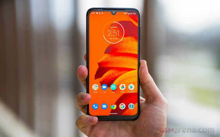
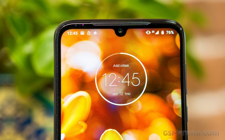
Over on the front, the 6.3-inch display is surrounded by some reasonably sized bezels - for a phone in this segment, that is. The chin is meatier, and it'll likely bug some folks that there's more material on top than there is on the sides, but such is life.
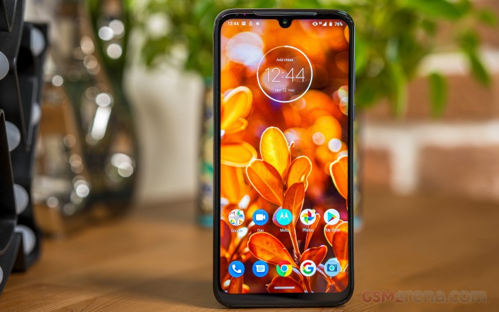
On a positive note, the top bezel houses a proper second speaker that's also an earpiece if you're still using your phone as an actual phone. To its right is the ambient light and proximity sensor window, which you can see if you look closely.
The front-facing camera eats into the display a little, placed into a U-shaped notch. Is anyone still bothered by notches?
The Moto G8 Plus measures 158.4x75.8x9.1mm and weighs in at 188g, making it quite a chunky unit. It is, indeed, one of the thicker phones we've had in a while - both going by the numbers and subjectively in hand.
In terms of footprint and weight, it's virtually identical to key rivals like the Realme X2 and the Redmi Note 8. Lighter options are available, like the 166g Galaxy A50, and the P30 lite is both lighter and more compact (159g, 5.5mm shorter, 3mm narrower and 1.7mm thinner).
Reader comments
- Xd
- 07 May 2024
- Pu0
Is the moto g8 plus more resistant than the moto E7i power?
- Moto man
- 15 Oct 2020
- NuN
Sums it up very well.
- Manik barma
- 13 Oct 2020
- D0Y
What is tha stok Motorola moto g8 plus?