Moto G 5G review
Design and ergonomics
As we already pointed out, the non-Plus model's design is quite similar to the Plus with some minor differences. The Moto G 5G is still built entirely of plastic, which has its upsides. For instance, the back panel doesn't feel as slippery as your standard glass back would, the side frame strongly mimics anodized aluminum, and it's really nice to touch, and the use of plastic brings the weight down. Although, the phone is still pretty hefty at 212g. Then again, it's a large 6.7-inch device with an ample 5,000 mAh battery on board.
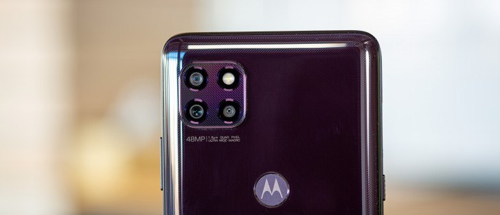
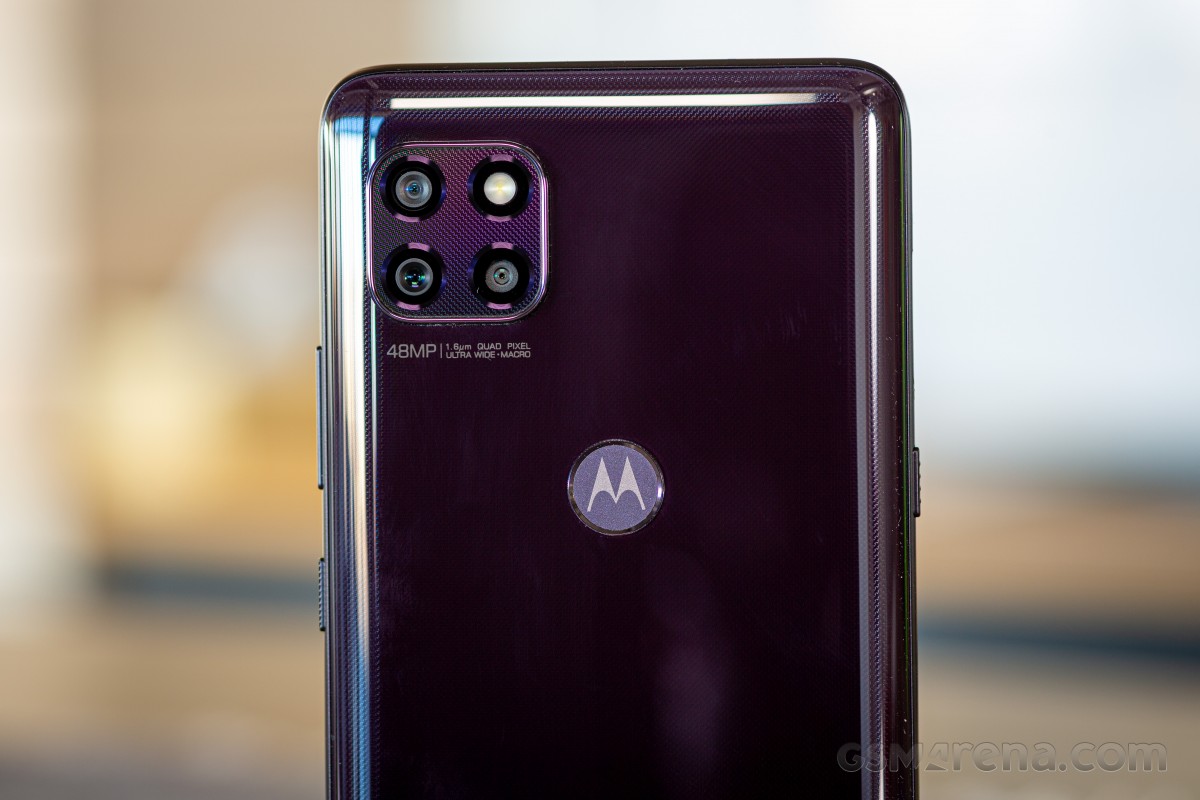
We received the Volcanic Gray color, which at certain angles looks more like a really dark purple. The same dotted pattern from the Mogo G 5G Plus can be observed here as well, but it's harder to notice in most lighting conditions. Unfortunately, the fingerprints and smudges are much more visible.
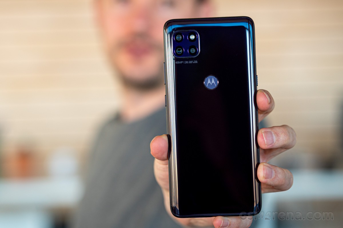
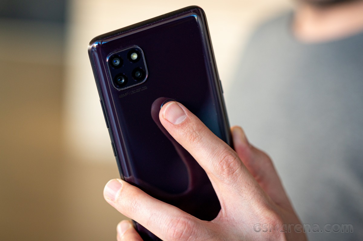
The camera bump is again placed in the upper-left corner, and it resembles the one found on the Huawei Mate 30-series (those had it in the middle) and the current iPhone generation. It makes the phone stand out, it's not protruding as much, and to maintain the symmetry, one of the lenses (the macro one from the Plus configuration) is swapped for the LED flash. The fingerprint reader has also been moved to the back, keeping the power button nice and simple.
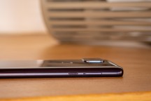
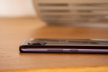
The Power button is subtly textured, while the Google's assistant button has a more noticeable texture. This makes sure that you always know which button you are pressing without having to look. The positioning of the power button and the rear-mounted fingerprint reader isn't ideal. Since it's a big phone with a relatively tall screen (20:9 aspect ratio) too, the average user would probably benefit from a lower placement.
The SIM card tray is located right next to the dedicated Google Assistant button and can either run two SIM cards or a SIM + microSD card.
Speaking of size, it's probably needless to say that the phone is hard to use with one hand. It's big and unwieldy, which goes both ways - some are drawn to the big screen, and some may find it hard to use. The well-rounded edges of the back panel and the seamless transition to the frame help achieve a more comfortable grip.
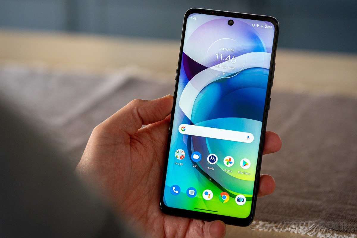
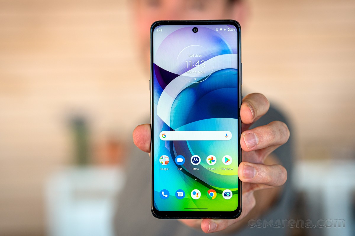
On the front, we have a centered cutout for the selfie camera instead of Motorola's usual approach with off-centered punch-holes. The side bezels are thin, but the top and bottom ones are a bit on the thick side. Nevertheless, we don't expect them to be razor-thin in this price category.
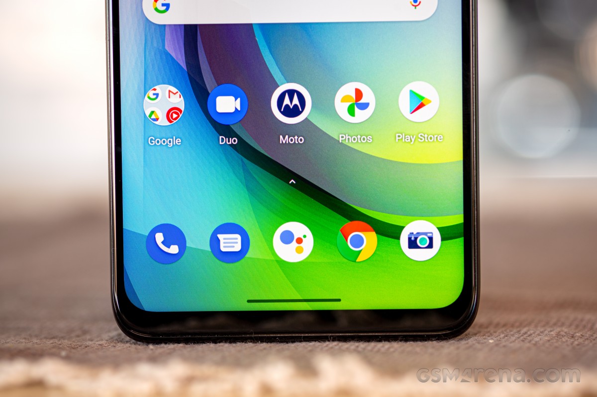
All in all, the Moto G 5G is a well-built device with no major flaws and offers pretty much the same build quality as its rivals. Only the button and fingerprint scanner positioning needs to be addressed. The non-Plus model skips the water-repellent nano-coating, which has been a stand-out Motorola feature for years now.
Reader comments
- Hello Howdy
- 01 Dec 2024
- Ib5
This is my 2 ND moto this year .First stylus was locked remotely by my Rx and his buddy right before my flight to Poland with my baby which didn't happen either. They stole my Gmail I had since 2003 with all the Google pictures I collected in th...
- Hello Howdy
- 01 Dec 2024
- Ib5
This is my second Motorola this year. First one was a stylus in March my ex and his friend almost drove me nuts by stealing my Google account together with my Gmail I had since 2003... so imagine guys not having a s
- Anonymous
- 25 Dec 2023
- PEq
BD prices in official phone


