Motorola Moto G 5G Plus review
Design
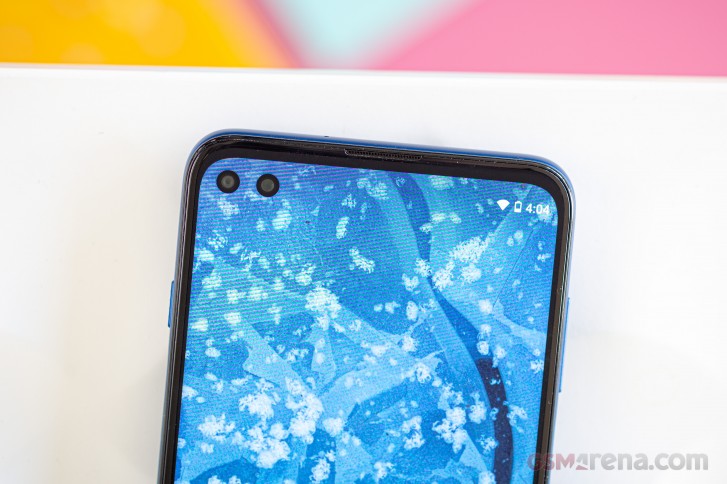
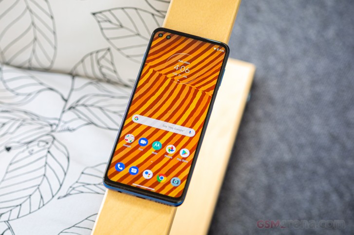
Although at first glance the Moto G 5G Plus doesn't really stand out, it has two distinctive visual traits - one on each side. On the front we have two punch-hole cameras that have their own cutouts rather than the usual pill-shaped common element. The gap is bigger than usual, but not big enough to be useful for anything so you are not getting any extra screen estate - in fact you are losing more than is the norm. It is an instantly recognizable feature of the phone, though.
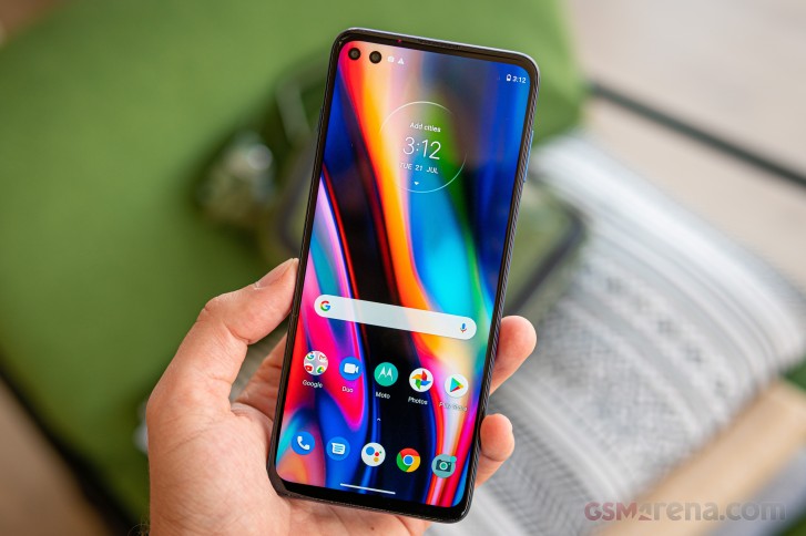
Moving on to the bezels, we have two thin ones on the sides and a slightly thicker top bezel housing the earpiece, the ambient light sensor and the proximity sensor. The bottom frame is the thickest one but we can't say we are bothered by it in any way.
Another interesting bit about the display is that it's extra tall with a 21:9 aspect ratio. This comes with its own set of handling peculiarities - it's slimmer than usual for the size which makes stuff like reaching the entire keyboard easier, but it's also very tall, so reaching for the top is more of a stretch.
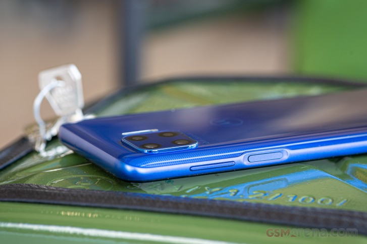
The power button that doubles as a fingerprint reader is located a bit too high on the side, meaning that you'll need to stretch your finger a bit to reach it if you don't have big hands. The volume rocker is higher still, so it's a two hand affair more often than not. The same goes for the dedicated Google Assistant button on the opposite side of the frame.
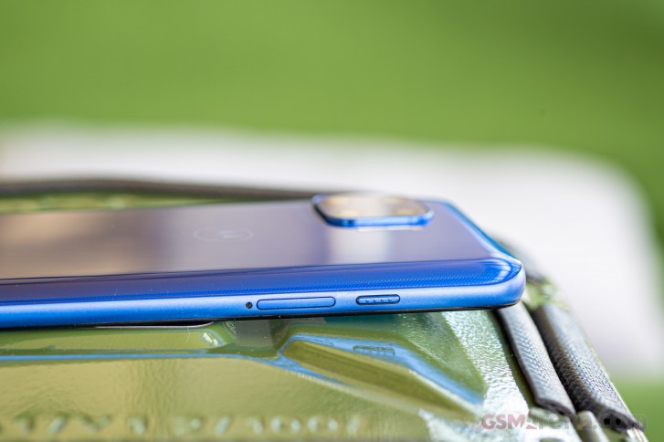
The frame itself, while made of plastic, does a decent impression of anodized aluminum, feels good in the hand and provides good grip levels too.
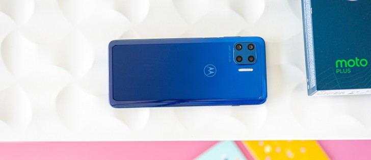
The back side of the phone is also made of plastic and maybe because of that, it feels a bit grippier than your average glass sandwich phone. And here's where the second distinctive design trait is - the square-shaped camera alignment.
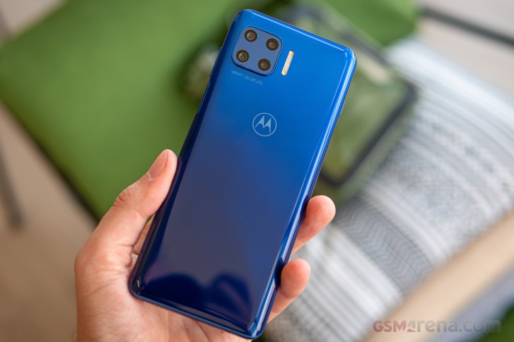
It's reminiscent of the Huawei Mate 30-series but it's placed in the upper-left corner, similarly to the iPhone 11. There's also a big dual LED flash module right next to the camera square.
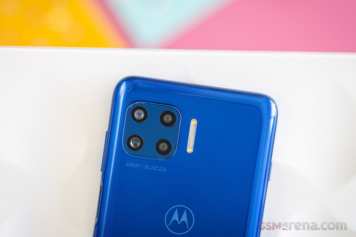
Sadly, there's only one color available - Blue. The good news is that it looks good with that subtle dot pattern and fingerprints aren't as big of an issue as on most other phones.
Despite all the plastic, the Moto G 5G Plus weighs 207 grams. Honestly, it doesn't feel like that much probably because of the good balance and even weight distribution across the chassis. And it's not too bad when you consider the big 6.7-inch display and ample 5,000 mAh battery.
It's probably important to note that the phone is splash resistant in typical Motorola fashion. Meaning, submerging the phone in water is definitely not advisable but any rain drops, splashes or even an accidental drop in a pond shouldn't be an issue.
Reader comments
- disappointed user
- 12 Apr 2024
- gxG
An extremely bad buy for the following reasons: 1. slow software updates 2. short life of updates, model released in July 2020, the last update is from July 2022 and it is not on Android 3. software bugs that were fixed extremely slowly 4. h...
- donofhalo
- 26 Nov 2023
- 4Zv
Custom ROM developments are ongoing and LineageOS is bringing up this device for official support on Android 13.
- Jjjjjjj
- 05 Jul 2023
- xPP
I think this phone is discontinued No android 12 update.