Motorola Moto X Play review: Crowd pleaser
Crowd pleaser
Retail package - victim to budget cuts
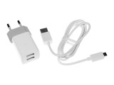
The Motorola Moto X Play arrives in a plain box made of thin cardboard. Other than the phone, you'll find a USB-to-microUSB cable and an AC adapter and... that's it. There's no headset, but the more expensive Moto X Style model didn't come with one either, so it's hardly a surprise.
We have mixed feelings about the supplied AC adapter. The smartphone supports fast charging, which would be great for topping up that huge 3,630mAh battery. However, the bundled unit outputs a modest 1,150mA.
On a more positive note, it has a pair of USB ports for charging a couple of devices at once, but then it would take ages since they have to share the current. We're guessing this adapter is perhaps specifically tailored to simultaneous overnight charging of a Moto X Play and a Moto 360 smartwatch.
Bear in mind that the retail package contents would most probably differ from market to market.
Motorola Moto X Play 360-degree spin
The Moto X Play measures 148 x 75 x 10.9mm which makes for a reasonably compact footprint. The OnePlus 2 and Asus Zenfone 2 ZE551ML are both 3-4mm taller. Actually even the premium-built Samsung Galaxy A7 is taller, and only the LG G3 is a couple of millimeters shorter.
Not so with thickness. At 10.9mm the Moto X Play is one of the thickest smartphones of late. Sure, that's the maximum number and it gets slimmer towards the edges, but it's still a pretty chunky device. Coincidentally, the aforementioned Zenfone 2 is the same thickness, but the OnePlus 2 is a millimeter thinner.
The Moto X Play weighs 169g, which is more or less the same as the Asus and OnePlus models. Higher-end smartphones like the LG G3/G4 hover in the 150s, while the Galaxy A7 is even lighter at 141g.
Hardware overview, controls, handling
The Motorola Moto X Play is a device for the budget-conscious and that means they had to use a polycarbonate body. Of course, that's not necessarily a bad thing and many users will favor it over a more fragile glass construction or a heavier metal one.
The plastic body has a shiny frame that goes around the sides. It's light gray on the black model and silver on the white model. It's supposed to look like metal but doesn't quite succeed in doing that and looks quite chintzy, especially on the white model.
Motorola is big on looks customization and in the case of the Moto X Play that's led to a peculiar decision. The back cover is removable, and removing it gives access to... nothing in particular.
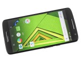
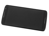
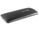
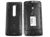
Polycarbonate body with removable back
On the Moto G (3rd gen) at least the card slots are tucked underneath, but the Moto X Play has them in a dedicated tray up top, accessible independently from the cover. Depending on where you look at, reactions could range from "whatever" to "best feature ever" as it doesn't get in the way of anything, but affords the option of customizability post purchase.
The fact that it's removable doesn't make it easy on the internals in terms of water and dust ingress. Motorola advertises the device as having a water repellent nano-coating. Spills, splashes and light rain shouldn't be an issue, Motorola says, so long as you don't submerge the whole thing in water.
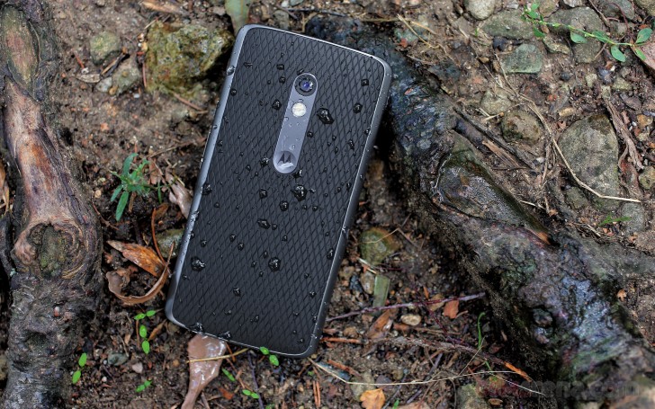
Now, we admit we're guilty of splashing a few water droplets on our review unit (all in the good cause of snapping this nice image above) and a few hours later we found water droplets sitting under the back cover. The phone lived through just fine, but the back panel clearly won't keep any liquids away from the internals. Let's hope the nano-coating on the internals can hold its own as advertised. Just to make it crystal clear, Motorola explicitly states that this phone is not waterproof.
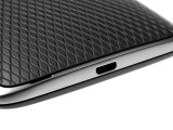
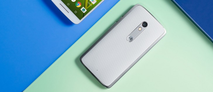
The cover itself is made of soft rubbery plastic and has a gentle weave, which adds character much appreciated for our otherwise nondescript black handset. Obviously the Motomaker (where available) will give you countless punchier options for the color combination of frame, cover and camera insert that best suits your taste. Or advertises its absence.
That camera insert is one of the main features of Motorola's design language this year and accents the back of all three models. It surrounds the lens and dual LED flash and ends further down with a Motorola M logo. The logo sits in a gently lowered circle and it draws the tip of your index finger like a magnet - we just couldn't stop caressing it. Ok, some of us.
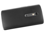

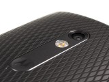
Patterned cover • camera accent • recessed lens
The camera module is a good millimeter or more recessed into the insert, which is two-fold. On the positive side it should keep that lens nice and safe, but being only about 5mm in diameter, the crater of sorts has to be cleaned with more care, when it does get dirty. We do appreciate the safety-first approach, though.
The facade is also shared between the three, in principle. It's only the Moto X Style that has actual stereo speakers, on the Moto G and Moto X Play the top slit is earpiece only, the bottom is the loudspeaker. It may be a single one, but is front-firing nonetheless - always a good thing.
We're more excited about a very subtle engineering decision on Motorola's part. The top and bottom edges of the frame create an ever so slightly raised lip. It should keep the (otherwise Gorilla Glass 3-covered) display at a distance from whatever flat surface you choose to rest the phone on face-down. The flipside is that the gap between the glass and the frame may be prone to accumulating dirt. Compromises.

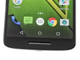
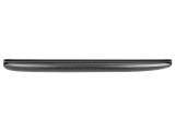
Earpice and sensors above the display • loudspeaker below • a look from the left revealing the raised edges
The glass gets marginally thinner towards the side edges though it's not as pronounced an effect as, say, the iPhone 6/6s. If we bend the 2.5D term, coined for such panels, to match the magnitude of the Moto X Play's case, it would be something like 2.3D. Also, the outer frame is not raised on the sides as it is top and bottom, making the whole swiping experience very pleasing.
On the top you'll find the 3.5mm headphone jack smack in the middle and the SIM/microSD card slot to the side. Mind you, there's just one tray, which accommodates a nano SIM card on one side and microSD on the other, we've just shown both sides in the same photo.
The secondary mic is actually on the back. It gets a half-circle cutout on the frame and the gap between the frame and the cover does the rest.
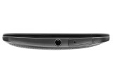
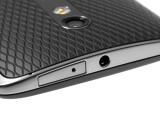
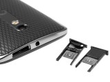
Top plate with 3.5mm jack and card slot
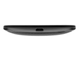
The microUSB port is the only thing on the bottom of the phone, the mic is housed behind the loudspeaker slit.
On the right side you'll find the volume rocker and power button above it. The latter is ribbed so you'll instantly know what you're touching without needing to look. However, both buttons have a lot of play in all directions and don't exactly scream "quality". There's nothing on the left.
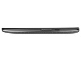
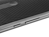
Volume rocker and power button on the right
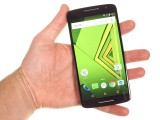
In the hand the Moto X Play feels lighter than expected, largely because the bulk of it creates a wrong first impression. Actually the thickness is nowhere near being a burden - the curvature of the back makes for a very natural grasp of the handset. The soft textured back provides plenty of grip, too.
Reader comments
- Gulab
- 01 Apr 2019
- v$A
I am using Moto x play from last about 3 years .The problems I an facing is Camera which frequently stops and specially when in need .The Torch stops opening .I gave it to Lenovo ( Moto)service centre twice but the problem still persists. I am really...
- rohit
- 18 Jul 2018
- 7ki
you should try to format your moto x play
- Anonymous
- 25 Jun 2018
- MZx
I had the same problem. It went away when I cleared cache memory...

