Motorola One review
Design and materials
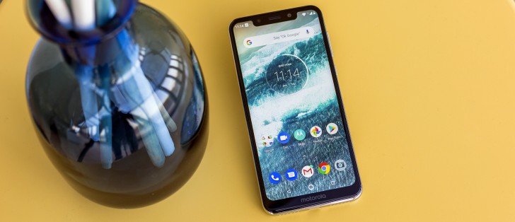
The new P30 family is clearly modeled after Apple's iPhone X/XS design. Lenovo isn't really being subtle about it either, from the arguably oversized display notch to the vertical camera arrangement at the back and the overall silhouette, curves and finish on the frame and back. Seeing how most of the smartphone industry copies Apple blatantly, there's no real reason to reprimand Lenovo for it. Though we can't understand why Lenovo has decided to jump on this particular copy-cap bandwagon so late, but, hey, perhaps it's the consumer vote driving them.
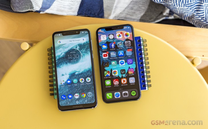
Regardless, Lenovo definitely nailed it with the design. Just like we already mentioned, the curves are just right, with the silver frame being particularly convincing.
Of course, we doubt anyone will actually mistake the Motorola One for an iPhone. We are even kind of impressed Motorola managed to pull the visuals off quite as good as they did, mostly because the actual bill of materials of the Motorola One couldn't be further from the one on the iPhone X. Which gets us to our second point about the Motorola One design - it's a phone which really feels cheap once you pick it up. The impression is further enforced by how light the device is.
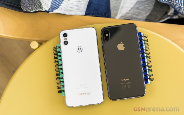
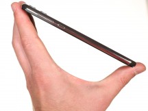
That middle frame we were just praising - it's entirely made of plastic. And, if we have to be perfectly frank, pretty flimsy feeling plastic. Definitely not the kind that instills confidence in its ability to survive a drop with only a minor scratch. Hence, our earlier remark about the included soft case - you're going to need it.
Hardware overview
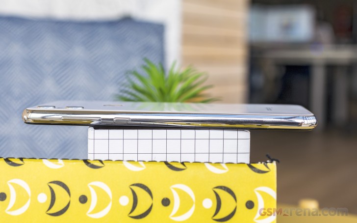
Since we are already on the subject of the frame, we might as well discuss controls. It's a pretty standard set up. On the right, a power button and a volume rocker above it. Both are pretty "clicky" and offer a satisfying tactile feedback. However, their plastic build doesn't instil too much confidence in their longevity either. At least not with their original level of shine.
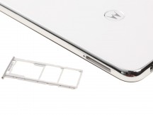
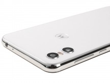
Left and right sides of the phone
On the left - a single tray sits flush with the frame, near the top end of the phone. It's actually a triple slot solution, which can house a pair of nanoSIM cards and a microSD card all at the same time. We definitely appreciate the extra flexibility.
The top of the Motorola One is mostly empty, except for one important port - a 3.5mm audio jack. Next to it is a tiny hole for the secondary noise-cancelling microphone.
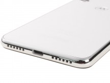
On the opposite side - at the bottom - there is the USB C port. We'd like to see more manufacturers move away from micro USB port in the midrange - just for user-friendliness and consistency. The USB port on this phone in particular also offers USB host functionality as well.
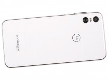
Just like the rest of the chassis, the back of the Motorola One definitely looks the part. It comes in either white or black, both classic options, and has a very glass-like appearance. There is a bit of depth to the surface as well since the actual color surface appears to be situated underneath a rather thick translucent layer.
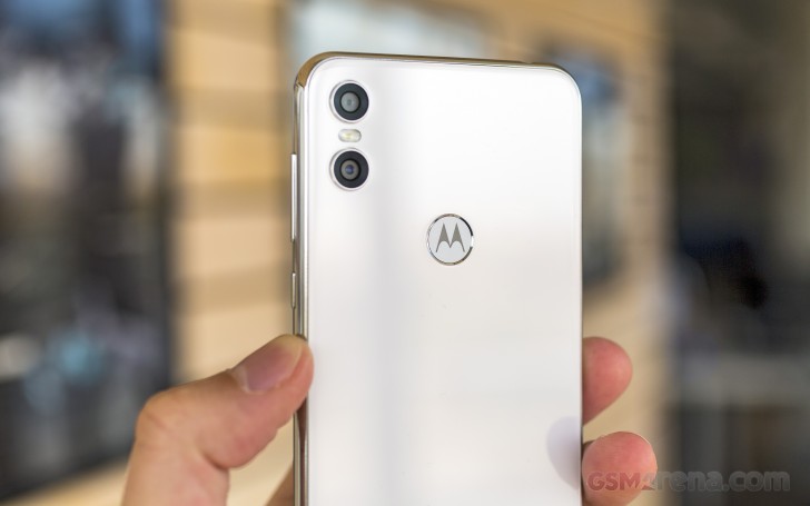
Unfortunately, no, it's not glass and has a very distinct plastic feeling to it. Even the accented rims around the camera lenses are plastic - again not the best material for durability. As we already pointed out, it would probably be a good idea to just keep the Motorola One inside a case.
On the flip side (see what we did there) Motorola claims there is a Gorilla Glass layer covering the display. This does provide some extra piece of mind, but it should be noted that our review unit had already picked up a few nasty scuffs near the top left of the display. You can even see them in some of the shots.
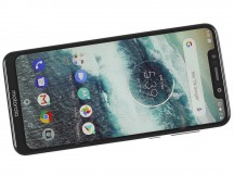
Speaking of the screen, Lenovo definitely nailed the overall shape of the display and its curves, matching Apple's work closely, but the amount of bezels definitely gives away the budget nature on the Motorola One.
Last, but not least, in case you were wondering, the sizeable notch was apparently enough to fit a dedicated selfie flash, but not a notification LED. Not a major grudge, but we don't really believe that Motorola's automatic display wakeup feature is a good enough of a substitute.
Reader comments
- Anonymous
- 24 Feb 2024
- dM0
2024 and still here baby! This phone's endurance is nasty. Badass.
- Bkrs
- 10 Jul 2020
- NRf
I also was with apple, and defected. Love my moto one. even in 2020 it still works great. I will definitely be getting another Motorola, have not missed apple in any way.
- Zibobo
- 07 Apr 2020
- Nu6
U damn right

