Motorola One Zoom review
Design
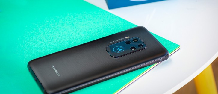
At first glance at the front, the Motorola One Zoom won't strike you as a particularly design-conscious device. A rather basic flat-screen design complete with a teardrop notch and rounded corners is already a pretty common sight in the midrange segment.
The chin on the One Zoom is a bit excessive by 2019 standards, which doesn't help in the looks department. However, it does make for better ergonomics and less thumb-stretching to reach to the bottom of the phone for navigation.
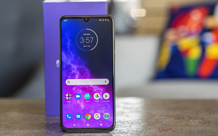
But a look at the back would show you a phone with a rather recognizable look. The back of the One Zoom looks like a strange blend of the OnePlus 7 Pro and the Huawei Mate 30 Pro. It has the frosted glass back of the OnePlus 7 Pro (the Nebula Blue version) and the square camera alignment from the Mate 30 Pro, but with a little Motorola touch.
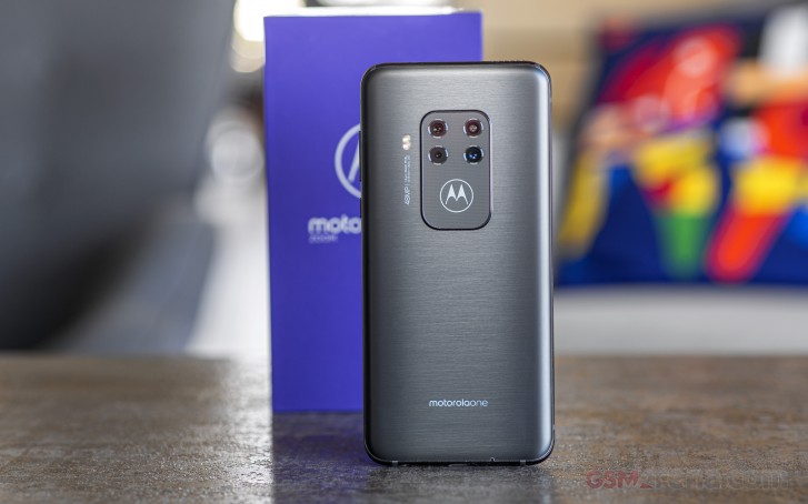
In this particular case, that little bit of Motorola brand recognition, aka the M logo lights up and doubles as a white notification LED. The camera bump does seem rather excessive in size. On the plus side, however, the large flat surface prevents the phone from wobbling when placed on a level surface.
The One Zoom is also surprisingly ergonomic in hand. Even though it comes up as a bit thick (8.8mm), the curved back glass, the rounded display corners, and the oval side frame make for a comfortable grip. The button placement also seems pretty convenient, and the power button has a textured finish, so you will easily find it in the dark.
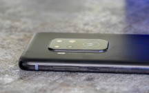
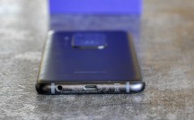
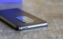
Motorola One Zoom from all angles
The One Zoom also feels very well made and put together. The bill of materials includes a 6000-series polished aluminum frame and a pair of reinforced pieces of glass on each side - a 2.5D curved Panda King glass sheet for the front panel and Gorilla Glass 3 for the rear panel. For those out there who still value scratch protection more than shatter resistance, Gorilla Glass 3 is still arguably a better bet than the newer generations.
However, there is one major hardware downside on the Moto One Zoom that we absolutely need to mention - it is very, very, very slippery.
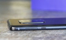
The controls on the Moto One Zoom are a standard affair. You get a nice textured power button at a convenient height on the right-hand side along with a volume rocker. Both are satisfyingly clicky.
The under display fingerprint reader is very snappy and accurate. Plus, we really like the how playful the Motorola reading and unlocking animations are.
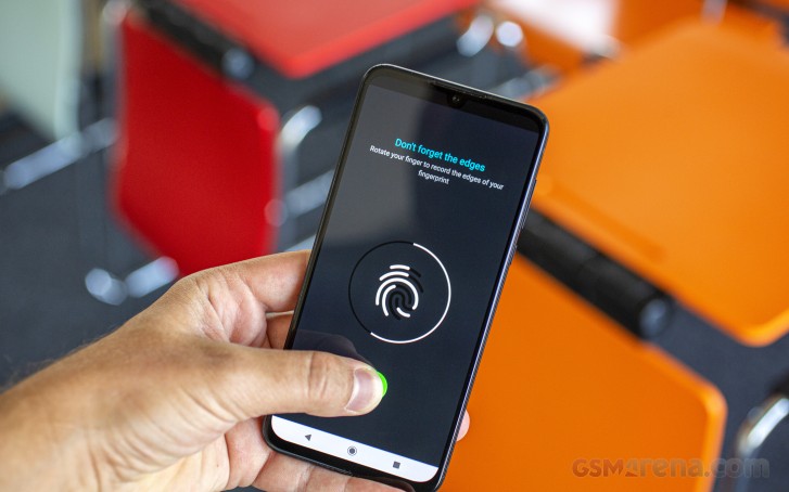
The left bezel is free of any controls. At the bottom, you will find the Type-C port alongside a good old 3.5 mm jack.
On the top bezel, we find the One Zoom's single loudspeaker, which is definitely out of the ordinary.
Reader comments
- Hus
- 14 Aug 2024
- srr
I'm still using it 8hrs a day in 2024. Best sound ever heard for music. Richest tones, like in Dolby digital. It keeps me 10-11 hrs on browsing. Only disadvantage is the sound volume on recording video, which is lower than others. Great ph...
- Fa14bi
- 08 Nov 2022
- skG
2 Years later and the 2018 chipset 675 does still beat the 695 since it can do 4K at 200 bit rate, meaning the phone can burst out Full sized 8MP pictures 30Times a secound. (Samsung 8K doesn't even reach a 200 bit rate, so the details on this ...
- Gdub
- 28 Oct 2020
- kXA
Are you kidding? Stock Android is the best. This phone isn't lagged down by an annoying skin like samsung s series. It also already has the newest version of Android thanks largely to the limited altered UI. It makes it nearly as quick as a fla...