Motorola XOOM review: The Big Bang
The Big Bang
User interface: Android goes tablet-friendly
No matter how impressive the XOOM hardware might be, the software will decide its fate. It just can’t help it, being the first to carry Honeycomb, the tablet-friendly version of Android.
And there’s a good reason why Honeycomb gets so much attention. Unlike Apple, who thought upscaling a phone OS to fit the size of tablets would be enough, Google designed a whole new interface for their slates. It’s of utter importance to put the extra screen estate to good use and get around the constraints that apply to smartphones.
So they revamped the whole interface to make best use of all the available resolution and the entire screen.
The first thing they did is remove all hardware buttons and replace them with software controls. Now, we are not hugely impressed with that move, but tablets don’t usually have too many buttons anyway.

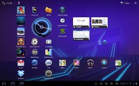
The new homescreen and lock-screen
The home and back buttons have been placed in the lower left corner, adding a dedicated task switcher key right next to them. It’s probably in part a move to emphasize the Honeycomb love for multitasking too.
The search key has been placed in the top left corner, while the app launcher is now accessed via a button at the top right. Next to it, there’s another dedicated button that the smartphone-friendly Android versions lack – homescreen edit.
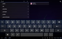
There’s a search shortcut on the homescreen too
Finally, we come upon the status icons, which are in the lower right corner. Pressing any of them will open the notification pop-up – in Honeycomb the notification area doesn’t take the whole screen.
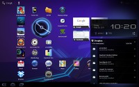
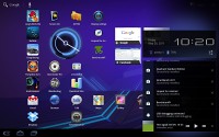
Notifications appear as a pop-up rather than fill the whole screen
The notification area features a shortcut to settings. That is more of a replacement for the connectivity switches that you find in some Android smartphones (such as the Samsung TouchWiz droids), than the real settings menu, which is accessible through the home screen.
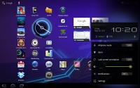
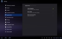
The settings pop-up and the settings menu
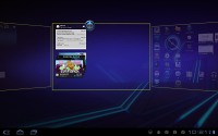
Editing the homescreen has also been modified to make better use of the larger screen. When you enter edit mode you get all five homescreen panes on top with four tabs available at the bottom - widgets, apps, wallpapers and “more”.
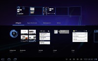
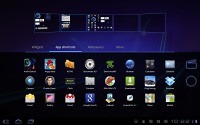
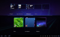
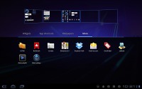
Editing the homescreen is much easier on a tablet
This way you can grab a widget from the bottom tab and bring it to the desired homescreen pane on top. With smartphones you need to scroll screens if you want to place a widget on any other screen but the currently selected one.
By the way, live wallpapers are supported here too but many of them seemed unsuited to the higher resolution and pixelated. Plus, they did tend to lag quite a lot, which we cannot quite explain.
The app launcher has seen some changes too – it’s now split in two tabs – All and My apps. The first one contains all the available apps, while the second one holds those installed by you. A press and hold on any of them will make the five homescreen panes appear so you can place a shortcut on whichever you might need.
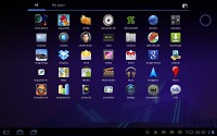
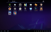
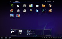
The app launcher now features two tabs • placing a shortcut on the homescreen
Generally, we are pretty pleased with the usability of the Honeycomb interface. It is obvious that a lot of thought went into its design and it really is a notch above the competition in terms of functionality.
However there’s a big issue holding Honeycomb tablets back that needs to be resolved – the performance. The XOOM lagged often – even with a static wallpaper and no user-installed apps to run in background. For some reason, the problems were particularly apparent in portrait mode.
The Motorola tablet really felt like an early test unit (and it’s not) that still needed its software tweaked to make best use of the hardware. After all, a dual-core chipset like Tegra 2 shouldn’t have had any trouble, never mind the higher resolution.
Plus the thing is getting some excellent benchmarks so no doubt the processing power is all there. We really believe Honeycomb is a few software tweaks away from becoming the best tablet OS out there. Unfortunately we couldn’t get our XOOM updated to 3.1 and see if that helps, but at this stage the handling is poor. With the performance so bad all those features make little sense really.

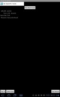
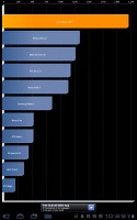
The XOOM benchmark results are impressive, but its actual performance is nowhere near
Reader comments
- AnonD-502814
- 18 Feb 2016
- 8KN
What is the latest android version it runs?... I saw a page to download rooms to upgrade for latest version, android marshmallow but the links doesn't work... any help, opinion please?
- har
- 06 Jan 2013
- t1$
hey m frm india..i hav a xoom with verizon..can i use a usb dongle in ma tab for surfing..?help me out!!thanks in advance..
- AnonD-18887
- 09 Nov 2011
- bC7
Xoom is very attractive. But no one buys it and everyone takes Galaxy Tab10.1 instead. It is because it lacks many features. There is no USB port(only micro-USB). Yet it costs high. When you buy a tablet please update it fully , download all the apps...
