Nexus 6 vs. Galaxy Note 4: A game of Battleships
A game of Battleships
User interface
The Motorola Nexus 6 was the first phone to launch with Android 5.0 Lollipop and it's Android the way Google had envisioned it.
The Galaxy Note 4 meanwhile started life on 4.4 KitKat but it is in the process of jumping over to Lollipop as we speak. Both versions represent Samsung's take on Android.
Despite many shared similarities, the two companies have taken their UIs in opposite directions. You only have to look as far as the notification area to see it.
Google has implemented a two pull system - the first swipe pulls out the notification and the second swipe brings out the quick toggles. During the first swipe you catch a glimpse of the toggles, a simple but effective hint to new users that shows them there's more. There are only a few toggles here, appearing with smooth animation.
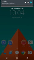
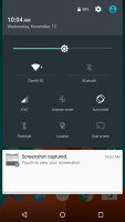
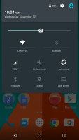
The vanilla Android notification area • first pull shows the notifications • second pull shows the quick toggles
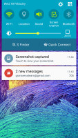
Where Google prefers simplicity and elegance, Samsung is keen on having an abundance of features. The notification area keeps the old one pull system, but always shows you a line of toggles, plus the brightness slider. One swipe with two fingers shows you the expanded view with all the toggles. There are so many of them and that's with some options hidden by default.
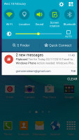
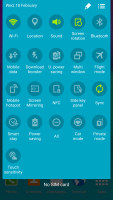
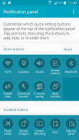
The TouchWiz notification area shows both notifications and quick toggles • more and more quick toggles
Let's back up a little and check out the lockscreen. With Lollipop notifications are now displayed on the lockscreen and the quick toggles are easily available as they show up with the first pull.

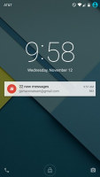
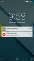
Notifications on the lockscreen
The Samsung Galaxy Note 4 offers the added security of the fingerprint sensor - you can set up multiple fingers that can open the device, like your index finger and thumb. This is a swipe sensor so you have to move your whole fingertip over the sensor in a fairly smooth motion or the scanning will fail. This is made more difficult by the size of the Note 4 and getting it right one-handed will take a few tries.
Overall, using it on a daily basis for each unlocking of the device can start feeling as a chore. More often than not, you need to do several swipes over the sensor, and in the end it's just easier to input a PIN or something. It's certainly not the best touch sensor implementation we've seen.
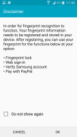

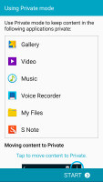
The fingerprint sensor can lock the Galaxy Note 4 and protect Private mode
The sensor offers other ways to secure your data and money. Private mode can be activated with your fingerprint and it reveals a folder that can store photos, documents or any other files. The folder is hidden and inaccessible when Private mode is off.
The Galaxy Note 4 can also secure your PayPal transactions and Galaxy Apps account with your fingerprint, to prevent costly purchases or app downloads without your approval.
Multitasking
This segment will be quite one-sided. While both devices have enough juice to run the toughest mobile apps, Google is still reluctant to let Android run two apps in one window.
Samsung is the exact opposite - it offers two ways to do just that. One is the familiar Multi Window feature that splits the screen in half and lets you pick an app for each portion of the screen. Only compatible apps will work with this, but we found that the vital ones are supported. That's typically messengers, as some use Facebook Messenger, others WhatsApp or Viber and it quickly becomes a juggling act.
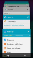

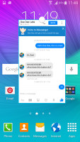
App switcher • two apps sharing the screen • a floating app
Another thing to try is to grab an app from the app switcher and pull it out as a floating window. That feature is called Pop-up screen and lets you move and resize the app out of the way as necessary, even minimize it to just a floating icon. Again, only supported apps work with this, but some might prefer it over Multi Window, which makes it a bit harder to toggle apps in and out of view.
The Motorola Nexus 6 uses the standard phone multitasking approach - one app at a time, hit the app switcher button when you need another one. As of Lollipop (and KitKat for Samsung), apps are displayed as a 3D rolodex, which is attractive but only fits a few apps even on the large screen.
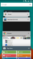
The search field remains visible in the Nexus 6 app switcher
Google has chosen to keep the search field visible in the app switcher, while Samsung offers a way to close all apps simultaneously. While task managers are not needed on Android (the OS does a great job of putting apps to sleep by itself), it can still be useful to clear up the clutter.
Staying in touch
Both companies run their own homescreens. Google's Big Data approach has led to the Google Now service that offers info from the web that you'll find interesting, show game scores, keeps track of your inbound packages, warns you that you need to early due to traffic, even keep track of where you parked your car.
All this is available as a widget to all Androids, but on the Google Now launcher it's the homescreen pane on the left. You can also access it from anywhere with a swipe from the bottom.
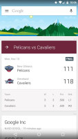
Google Now offers info you find interesting automatically
Samsung's solution is less AI and more a traditional news reader. The Flipboard-powered Briefing pane pulls the latest headlines on topics and from sources of your choosing (including your Facebook account) and is similarly available on the left.


Reading the news with Briefing
Digital assistants and search
Google Now may not have a personality like Siri, but it's really good at finding stuff. Backed by Knowledge Graph, you can ask just about anything (by voice or text) and it does an excellent job of parsing human expressions and returns just the facts.
Samsung has that, but would also want you to use S Voice - it's a little more phone-centric than web-centric and can be used to control the phone. This forms the backbone of the Hands-free mode intended for use while driving, you can, for example, enable the GPS and launch you navigation app of choice.
While Google Now likes to focus on things outside your phone, Google recently enabled third-party apps to show info cards as well. Google Now has long supported searching inside the phone, with installed apps offering suggestions including contacts, songs and others.
Samsung has S Finder for that task - it searches for files, contacts, apps and even phone settings. On the Galaxy Note 4 specifically, you can quickly scan through notes taken with the S Pen - you can look only for handwritten notes or tag notes with a quickly scribbled symbol (e.g. a star, heart, whatever makes sense for the note) and use that to recall all notes on the subject.
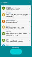
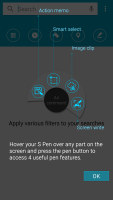

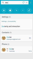
S Voice can execute voice commands • S Finder searches through your Galaxy Note 4
Text input
The stock Android keyboard used on the Nexus 6 comes in several shades (including Material and Holo looks) and is fairly simple. You get three rows of keys with the top row doubling as the number row on long press.
Samsung keeps a dedicated row for the numbers, which we think makes sense given the screen sizes we're dealing with here.
The good news is that if you go into the Google Keyboard Settings on any Android phone you can chose the PC input style and enable a fourth row for the number keys (though you'll have to disable Use system language" for that to work).

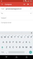
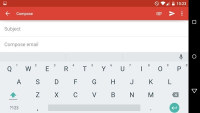
Dark and light themes for the Google keyboard
Both keyboards offer spellchecking and correction, plus prediction. You can switch the old tap, tap method with gesture input - gliding your fingers over the keys - or using voice input.
The Samsung Galaxy Note 4 has an extra option - handwriting recognition with the S Pen. Some will still find it more natural (even though pretty much everyone has gotten used to on-screen keyboards), but if you don't have to turn it to digital text. Instead you can leave it with your handwriting as a personal touch or easily include a quick sketch.
The S Pen can go half digital, half analog too. You can scribble a note with a name, phone number, email, street or web address and the handwriting recognition can convert that into the appropriate format. This makes it easy to dial a number or look up a street from a note you jotted down quickly with the S Pen.

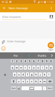

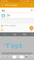
Default keyboard • one-handed keyboard • floating keyboard • S Pen input
One-handed operation
There's no going around the fact that these are pretty large devices - great to use with both hands, a bit of a challenge with just one.
Samsung has included multiple options to make things easier. One puts a copy of the hardware keys below the screen on the screen (bending your finger this far down can be awkward). Another goes and downscales the whole screen into a window you can position where you have the best reach.
The QWERTY keyboard can also be squeezed so that the keys are easier to reach. You can put the squeezed keyboard on the left or right side (whichever you prefer) or enable the floating keyboard that can be positioned anywhere.
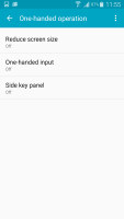
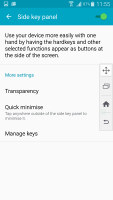
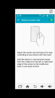
One-handed options on the Note 4 • on-screen keys • shrinking the display
The Nexus 6 is the first phablet and this was a good opportunity to give native Android some tools to make the phablet life easier. Was as there are none - you can install third-party apps (SwiftKey seems to be a popular choice with a Samsung-like squeezing option), but there's nothing out of the box to help you rein in the large 6" screen.
Winner: Samsung Galaxy Note 4. While the aesthetics of TouchWiz are not an artist's dream, there's no denying it's packed to the rafters with features. Many of them are quite useful - Private mode, Multi Window, the one-handed options.
Google has created plenty of amazing features for Android in general, but it lacks the extra device-specific features to make it stand out. The Nexus 6 is a good example of this, there's nothing in the UI or app package to suggest you're using a 6" phablet instead of the 5" Nexus phone.
You can always use third-party apps to get the missing features, but an improvement to Nexus would be an improvement to all of Android, so we're a bit disappointed.
Reader comments
- Ram0009
- 16 Oct 2017
- 7k7
Hi friends as I am note 4 user from three year I want to share my opinion I don't know why people blame but apart from may be samsung strategy note 4 is one of the best phone as I am heavy user before 2 year after updating Mr. 6 suddenly I was face r...
- DanishBeacon
- 05 Jan 2017
- nRB
I quit bying Samsung coz of their laggy software. I had s2, s3, s4, s5... Now Im om Xperia Z3 for two years, no lag at all. Upgraded from lollipop (antutu 47500) to marshmallow (antutu 57400 now😀😬😀) Its working even faster and smoother. No heav...
- devil
- 06 Sep 2016
- rAT
Nexus 6 is the best phone no issue about the phone every thing is perfect