Nokia 3120 classic review: Mid-range fighter
Mid-range fighter
Display is on the better side
The display of Nokia 3120 classic is a 2" QVGA unit capable of showing up to 16M colors. Picture quality is praiseworthy. A two-incher is just on the verge of being called small but, given the price range, it's even above average.


The display is great to look at
Typical Nokia, sunlight legibility is also commendable. The colors do get a bit washed-out in bright sun but the display remains perfectly readable, causing no usability problems whatsoever.
Texting-friendly keypad
The Nokia 3120 keypad is quite all right, with large keys that are hard to miss. The borders between key rows and columns do help touch orientation. The solid press feedback is also a welcome bonus to boost both the precision and the speed of typing.


The keypad is really comfortable
In all fairness, the rim of the D-pad rim is a bit too thin, which results in occasional wrong presses. The keys around it are also a bit hard to distinguish by touch but they make up for that with ample size.


The directions on the D-pad are not as easy to handle
The backlighting of the Nokia 3120 classic keypad is rather weak, which might turn down some users (especially seniors). Now, don't get us wrong - it doesn't render the handset that much difficult to use but it takes some time getting used to. On the positive side, the backlighting is admirably even so at least looks in the dark are intact.


The backlighting is not as strong as we would have liked
Telephony
Signal reception and call clarity have not been compromised with Nokia 3120 classic. Sound is loud and clear on both ends and you will have zero trouble with your calls. Vibration strength in the 3120 classic is moderate.

Calling Dexter on Nokia 3120 classic
We did our traditional loudspeaker loudness test to find out Nokia 3120 classic is a slightly-above-average performer. You are unlikely to miss a call but don't count on getting just everything in noisier environments. You can find more details about our test, as well as the results of all other tested handsets here.
| Speakerphone test | Voice, dB | Ringing | Overal score | |
| Nokia 3120 classic | 69.6 | 69.5 | 71.3 | Good |
| Nokia 5310 XpressMusic | 64.8 | 62.0 | 75.9 | Average |
| Nokia 6233 | 76.2 | 69.5 | 70.7 | Good |
| Apple iPhone | 67.2 | 60.2 | 66.6 | |
| Samsung D900 | 76.8 | 75.9 | 78.0 | |
| Sony Ericsson K770 | 68.7 | 68.8 | 76.2 | Good |
| 69.6 | 78.2 | 72.7 | Very good |
User interface: quick and slick
Nokia 3120 employs the Series 40 5th edition user interface. We have to say controlling the phone is almost the same as with the previous UI editions. The number of configurable options has gone up but at the price of somewhat complicated menu structure and navigation.
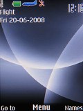
There are no changes whatsoever to the stand-by screen of Nokia 3120 classic. The display features the pre-selected wallpaper with the usual status readings, such as signal strength, battery status, ringing profile icon and time in the top bar. Beneath the top bar are the operator logo and the date. The bottom bar is reserved for the descriptions of the functions assigned to the center of the navigation key and the two context keys. The center of the navigation key opens the main menu, while the context keys can be assigned a function of your choice. The font on the main display can be of any color.
If needed, active standby mode can be activated. It consists of four parts that can be edited or relocated as users see fit. In the most common case, the top area is reserved for instant access to favorite functions denoted by their respective icons. The central area provides instant access to the music player. At the very bottom the calendar events appear for the current day. A cool S40 phones feature that even Nokia smartphones lack is the possibility to add a custom note to the active standby. Quite naturally, the two soft keys behavior can also be customized.
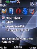
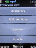
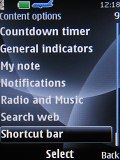
Active standby mode • Each tab can be modified to the user liking
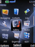
The icons themselves haven't been changed a jot, keeping the well known stylish design with animation of the selected icon. They can also be freely reordered within the grid, should the user find their original order inconvenient.
The submenus follow no consistent pattern. Some items have captions, others do not. In certain cases, you will even be able to see the selected item described in small font, so you will not need to step further into another menu level. As usual, alphanumeric keyboard shortcuts to menu items are enabled.
The menu responds quickly, without lagging or holdups. There were also no traces of system instability such as freezes or unexpected restarts for the time of our review.
There are six predefined ringing profiles on Nokia 3120. These should be enough to meet virtually any scenario. The seventh profile is the Flight mode, which turns off all transceivers where the use of mobile phones is not allowed.
Furthermore, unlike other brands, flight mode can be used without a SIM card inserted, which we find convenient.
Reader comments
- Ritchie
- 25 Jul 2012
- Nsb
The best phone for middle class
- giannis
- 02 Jul 2012
- SiP
it would be better if you cold afrofd iPhone 4 cuz that is the best option and the best phone ever:)but if not then go for HTC but only with android .i am sure you wont regret:)Good Luck
- OrocHinaru
- 02 Jul 2012
- 35t
hello friend! I need you to tell me plaese the name of the music that touches the beginning of this video. the exact name, I want this particular song, which you have. because the name, I know, but is not the same version of the video. if you tell me...
