Nokia 5 review: Numb3r5 don't lie
Numb3r5 don't lie
Latest Nougat in blue
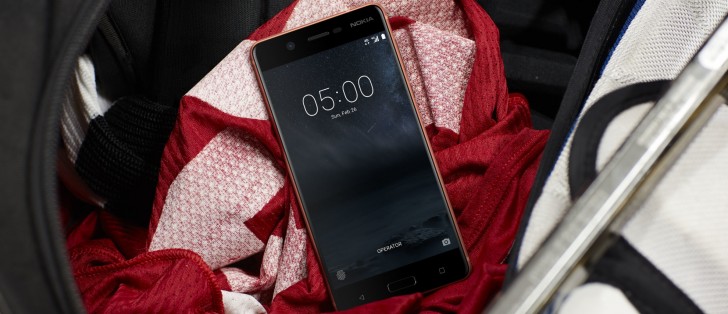
The Nokia 5 boots Nougat in the latest available to non-Google devices version 7.1.1. It's in near stock form too, with pretty much all basic tasks being handled by the Google suite of apps.
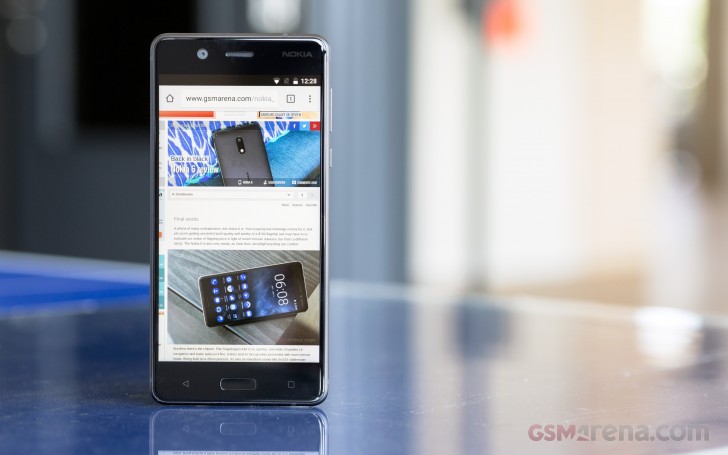
Of course, it's a Nokia, and there's a certain degree of blue accents in the interface making it distinct enough to be easily recognizable and thus good for brand awareness. However, the two-color approach is not universally appealing. It grew on us pretty quickly, but a little bit of variety and color here and there might be a good idea for future iterations. We mentioned the lack of customizability in the Nokia 3 review, and the Nokia 5 is the same with just one icon pack and overall GUI style with its default launcher.
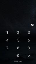
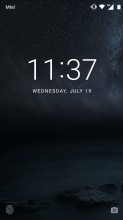
The lockscreen displays the standard Nougat notification cards, complete with grouping, expanded view and direct reply. There is a clock as well, but it lacks the weather widget and further customization that the Nokia 6 had. Then again, the Nokia 3 didn't have those either, so maybe it was only the Chinese version of the 6 that got them.
There's a camera shortcut in the bottom right, while the bottom left shows the fingerprint icon - if you have fingerprint recognition enabled, that is. These can not be changed either. While we're at it, the camera can be launched with a double press of the power button, if you enable the setting.
The homescreen is where the Nokia looks like no other. All of the system icons and pre-installed apps are painted in Nokia blue, and they're all circles. It is Nokia's way, clearly, as it's more or less the same on all three phones, and we've already pointed out that we often found ourselves scrambling to find the icon we're looking for, because we couldn't tell them apart by shape or color. Of course, once you get used to what's where, it gets easier. There are no themes - the blue color scheme is the one you get and that's it.
On the other hand, all the third-party apps retain their original icons - the launcher doesn't apply any changes to them. That makes them recognizable, but then they look nothing like the built-in ones. We kind of naturally wanted to pile them away on their own separate screen, just to keep things consistent and our OCD in check.
The Pixel-like app drawer that you pull up from the dock is your only option - you can't tap on an Apps icon to go to a separate app drawer interface with screens that you swipe side to side. Of course, since there is folder support on the homescreen as well, you can organize everything there and simply forget the Pixel-like swipe up gesture to open the drawer even exists.
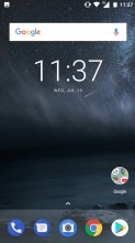
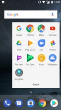
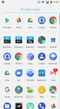
Home screen • Folder view • App drawer
Speaking of gestures, a long press on the home screen toggles edit mode on. You also get access to widgets and wallpapers. The latter can be sourced from the pre-loaded and a little bit obscure Google Wallpapers app, which has the handy option for daily wallpapers. The homescreen setting menu only has a couple of options, but both are interesting.
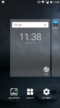
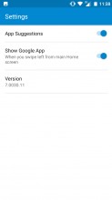

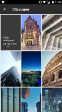
Homescreen editing • Homescreen settings • Google Now panel • Google Wallpapers app
App suggestions is the nifty first row in the app drawer, which is automatically populated with recently used apps. As for the Google App toggle, it is used to enable or disable the Google Now interface, accessible through a swipe to the right form the homescreen. There's Google Assistant too - the customary long press on the Home button summons it.
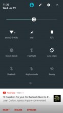
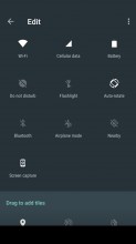
The Nokia 5's notification shade is about as stock as you get. A single pull down gets you six small toggles, pull a second time and you get a total of 9 large ones per pane, with multiple panes supported. There's also a brightness slider, but Auto brightness is only accessible through the settings menu.
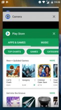
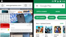
The task switcher is business as usual - the Android rolodex is present here. The 'clear all' button only appears when you scroll all the way to the top - a bit of a nuisance. There is multi-window multitasking (thanks, Nougat), but the screen is always split 50/50 - you can't resize the windows.
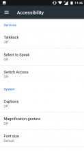
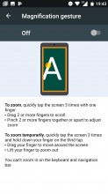
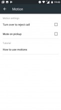
There are a few gestures you can enable on the Nokia 5, but just basic stuff, really. There are magnification gestures, pick up to mute and turn to reject call, and the double press of the power button to launch the camera counts as a gesture.
Reader comments
- Blue
- 14 Apr 2023
- NwZ
Used it from 2019 but can not send voice notes since October last year, took it to professional no luck ,what could be the problem?
- I need this phone
- 18 Jan 2022
- XG4
I like it where can I find it
- Steve
- 15 Apr 2021
- Emd
Had it for three years it's still going fine but the 16gb (really 8 after the system swallows half of it) is too small for a smart phone and the power point is had it, only works with one cable (I guess it's the original) and only on a part...

