Nokia 5230 review: Foot soldiers get smarter
Foot soldiers get smarter
S60 touch user interface
Despite being a Nokia 5800 XpressMusic twin in terms of hardware, the 5230 software is in fact identical to the Nokia 5530 XpressMusic instead. That’s simply because the Nokia 5800 UI is actually behind all other S60 touch smartphones by Nokia. So if you thought that the 5230 UI will be trimmed down or anything, you were wrong.
The Nokia 5230 behaves much better than the 5800. Some of the UI improvements we’ve seen lately have eventually made their way to the 5800 with the latest firmware updates but the 5230 has a far more polished UI and user experience.
The S60 5th edition UI
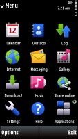
As with other S60 touch handsets, the Nokia 5230 main menu screams Symbian all over. Icons are set in a 3 x 4 grid or a list and you can freely reorder them. Screen orientation can be set to change automatically thanks to the accelerometer. The auto-rotation however doesn’t work on the homescreen.
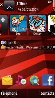
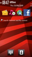
Checking out the homescreen
And it’s that same homescreen that seems to be one of the areas that has suffered from the conversion to touch operation. The six slots on the Shortcut bar are now replaced by four, so they can be more thumb-friendly, there’s no WLAN wizard plug-in (not that it matters on the WiFi-less 5230) and the addition of a contacts bar (nice as it might be) doesn’t completely make up for anything.
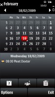
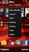
The status icons on the Nokia 5230 are located on top of the homescreen, along with the calendar and the clock. A single press on the clock starts the clock application (which is only a click away from setting up an alarm) while tapping on the date opens a drop-down menu where you can either launch the calendar application or change the currently active profile.
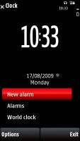
Calendar, profiles can be accessed directly from the homescreen
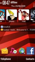
The Contacts bar follows right beneath the status icons. Each contact is represented by the contact photo and their first name - and it's possible to have three contacts displayed at a time but the list is scrollable to left and right.
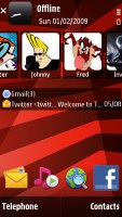
The new Contacts bar is pretty convenient
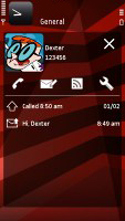
Selecting a contact from the Contact bar brings up a screen with info on the contact (different from what you get if you select the contact from the Contacts list). It has the contact photo, name and phone number.
Further down is an area that shows the communication history for that contact - both calls and messages. And finally, at the bottom there are the top two lines from the contact’s RSS feed.
We guess a nice trick is to add a contact that isn't a person just so that you'll have quick access to your favorite feeds on the homescreen.
Under the Contacts list, it's pretty much standard Active Standby but with fewer slots. You only get email notification showing the number of unread messages, along with the sender and subject of the most recent message.
The blank area beneath is reserved for the music player and radio mini apps - they get displayed when either is set to play in the background.
At the very bottom of the homescreen is the Shortcuts bar. Both the Contacts and the Shortcuts bars are optional and can be hidden.

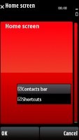
The available homescreen themes: Contacts bar, Shortcuts bar and Basic • the Contacts bar and the shortcuts tab are optional
The Media key, placed above the screen on the right, is a shortcut to the Music player, Gallery, Ovi Share, Videos, and the web browser. It's an excellent control that offers quick access to the handset's multimedia features. It's haptic-enabled too.
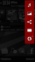
The Media menu is evoked by pressing the key above the display
Its sensitivity though is a bit lower than that of the touchscreen so you need to press it a little bit harder than you may be used to.
The UI’s other extra features
The S60 user interface has its ins and outs. Kinetic scrolling is among the nice features that actually lack on the 5800 though it has been rumored and eagerly awaited by users for quite some time now.
The flick scrolling, as Nokia marketing materials call it, works throughout the user interface - from file browser through gallery to contacts. It implementation is decent in most parts of the UI but there are gaps where it feels bumpy. Specifically, the web browser and the gallery are two places where kinetic scrolling is a bit of a downer. We feel it should gain more momentum when we make a rapid sweep across the screen and the stopping is bit too abrupt there. Not to mention that the animation is not always smooth enough.
The good news is that finger scrolling is the same as on the Nokia 5530. You push the list one way and it moves in the opposite direction as if you are pushing the actual text. Nokia still haven’t treated the Nokia 5800 Xpressmusic with this scrolling and this is probably the biggest difference between the two in terms of user-friendliness.
Unfortunately, in menus where icons are present, you still need to grab the side scrollbar or you stick your thumb on the icons and push the highlighted item in the direction you want the whole block to move, which is not only counter-intuitive, but also quite confusing (due to the inconsistency with lists scrolling).
But getting back to the updates, the Contacts bar on the Home screen has now been improved and it's now side-scrollable and thus accommodates a lot more phonebook shortcuts. A bit of nuisance we came across on the early 5800 XpressMusic is also sorted now. Turning the handset landscape in text-input mode automatically brings a full QWERTY keypad on screen.
And all the basics
S60 5th is in essence a direct translation of D-pad and soft-key action into touch. Although it has its benefits, the result is hardly the most fluent and intuitive touchscreen interface there is. Scrolling and accessing items is nothing like other touch platforms we've tried. On the other hand, soft-keys work just fine and enhance usability compared to other touch phones.
So, the user experience with S60 5th is a mixed bag and what you think of it will quite depend on your background. If you know your way around S60, you'll be quite at home with the Nokia 5230 interface. But if you come from an alternative touchscreen platform you'll be busy climbing a somewhat steep learning curve.
Opening an item in any of the listed submenus requires not one, but two presses - one to select, and another one to confirm the action. Now that's something that you don't normally see in other touch phones. You get used to it with time, but the main issue here is that the interface logic is different when you deal with icons instead of lists.
When the opened menu uses icons to represent items as opposed to lists, then only a single click does the job.
The Nokia 5230 features a task manager, which is launched by a press-and-hold on the menu key. The task manager itself is identical to what you get on Symbian S60 3.2 devices. Much like in the previous version of the UI, it appears on top of every pop-up menu. There's no C key on that one of course to close running applications - instead you tap the app's icon to display two virtual buttons: Open and Exit.
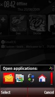
The good old S60 task manager
Reader comments
- Anonymous
- 06 Mar 2015
- fu%
I Like Nokia 5230 than the smart phone. I be happy to have it again. Its so nice.
- Anonymous
- 23 Oct 2014
- fu{
how do you download certificates
- Anonymous
- 10 Nov 2013
- t1$
m.gsmarea.com