Nokia 5250
- ?
- Anonymous
- pqy
- 24 Aug 2010
it's very much close to the dimensions of nokia 1661 and it's smaller than nokia 3110 classic!!!!! i think 5250 is the smallest touch screen mobile and with symbian. i never used gps,nokia maps or wifi. i just talk,very much talk. this is for me. bravo nokia. budget models with touch screen and symbian. bravo again
- ?
- Anonymous
- IP5
- 24 Aug 2010
A crap from a crapy manufacturer.
nokia sucks by producing capacitive touchscreens.
if u want to get a budget touch phone, then go for SonyEricsson Yendo which has good Resistive touchscreen, and gonna release in September.
- L
- LLegoLLaS
- 3cb
- 24 Aug 2010
ghhh....no use for this phone
- c
- chocowii
- vj1
- 24 Aug 2010
5233 or 5250? Nokia should break the barriers by creating a low cost smartphone. Smartphone in the sense that it packs 3G, WiFi, GPS, 4'' screen and a superb camera. I know Nokia can do that. It's just they wont do the 'first blood'. Im saving my money on the X3-02.
- ?
- Anonymous
- t7x
- 24 Aug 2010
I think nokia wants to break the CORBY hype made by samsung. But the looks isn't great. FAILED!
- D
- Dks
- TL5
- 24 Aug 2010
This is a another bad touchscreen phone by nokia
- N
- Nauman
- uWV
- 24 Aug 2010
BIG FLOP by NOKIA
No WLAN
No 3G
No Video Calling Camera
No Auto Focus
No LED Flash
No Memory card
Just a rubbish must be as cheap as Nokia 1208
Then people will buy this
Else Go for 5530 Xpress or 5235 stuff
- ?
- Anonymous
- vCJ
- 24 Aug 2010
copy of the sony erisson x10 mini
- P
- Priya
- IaE
- 24 Aug 2010
its very useful if u show the price also....
- G
- G
- uph
- 24 Aug 2010
Good design compared 5233 touch series. But very bad specifications. Small screen , degraded video recording , ... To survive in market its price must be lesser than or equal to 5233 with better headphones and a memory card.
- t
- tc18
- f3n
- 24 Aug 2010
n0 3g that is realy bad 4 a smart phone
And it dosnt even look that nice
And the lg pop lo0ks alot better then this phone (and its alot smaler then the 5250)
The 5250 should have been alot smaler (cos the smal screen
- A
- Alu
- fm5
- 24 Aug 2010
Nokia SUCKS. Why are we still getting resistive touch screens? And with no Wifi, 3g or GPS, giving it S60 is kinda pointless. Then they COPY Xperia design? What a crap device, if you want a budget touch, the Samsung Corby family or Genoa is much better. They don't multi task, but at least you get a touch screen which will still be sensitive even a year down the line. You wont end up like the countless 5800 users who after a year or so have to assault their touchscreen to get a response ( I have a couple of friends with that problem). Personally I would go for the SE Yendo if I wanted budget touchscreen, coz it's capacitive and the interface looks like it will do a little bit of multitasking with the shortcuts in the corners of the screen. I think in at least 5 years time Samsung will overtake Nokia, coz they STILL don't seem to have direction, and even in the third world ZTE is taking over the budget fone segment.
- ?
- Anonymous
- 3c3
- 24 Aug 2010
It's ok! The design is ok but if had a 3inch screen and WLAN overtaken a lot of touchscreen mid-range phones...And it's a smartphone...
- 2
- 2toyzki
- vj1
- 24 Aug 2010
People nowadays are getting d*mb.. Dis is a BUDGET PHONE! cant u understand that?! You guys are crying for a ph0ne with lots of features, this is n0t the phone you are l0oking for idi0tz!!!
**THIS IS A BUDGET PHONE!!**
St0p crying and go to your mama and make her buy you a Nokia N8 if you want more features!!
Face the fact, It is all your money can buy so st0p c0mplaining about its' specs!!
More features = Higher Price
Less features = Less Price
So st0p crying!!
- ?
- Anonymous
- q{s
- 24 Aug 2010
I was a Nokia fan for quite some time but now I'm just sick of them. Just look at their OS, it looks so cartoonish, I'm going to a BlackBerry, something more professional.
- ?
- Anonymous
- PS6
- 24 Aug 2010
nokia hired a designer formerly working for chinese mobile company..
no confirmed sources but kind obvious looking at nokia's latest phone designs..
lol
- ?
- Anonymous
- N7D
- 24 Aug 2010
Already announced!
- ?
- Anonymous
- 3ck
- 24 Aug 2010
- t
- thetimo
- MLc
- 18 Aug 2010
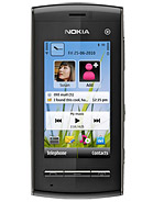
The screen seems so small, it could've been a way bigger. Both up- and downwards. Also the edges are unnecessary wide. Looks clumsy.
- ?
- Anonymous
- wuj
- 17 Aug 2010
this phone is suppose to go up against samsung corby, i think.
