Nokia 5530 XpressMusic review: Winner by design
Winner by design
Design and construction (continued)
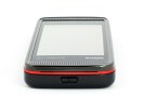
The top of the Nokia 5530 XM is quite plain and features the power button only. It's quite thin and stiff making it a pain to work with - aside from switching the phone on and off, we didn't use it much - perhaps switching profiles or locking the handset with it just isn't worth the effort.
The 5530 bottom is more crowded - from left to right you can see the charger plug, the 3.5 mm audio jack and the microUSB port. The lanyard eyelet and the stylus are in the left and right corner of the bottom respectively.
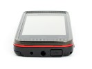
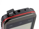
A bunch of connection ports at the bottom
The microUSB connector is hidden under a protective lid to prevent it from filling up with dust, while the 3.5mm audio jack is exposed.
Unfortunately, the Nokia 5530 XpressMusic doesn't charge off the microUSB port.
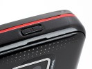
The right side of Nokia 5530 hosts the volume rocker, the screen-lock switch and the camera key. The screen lock switch is an essential shortcut - the implementation in the 5530 is quite ergonomic and friendly. Locking/unlocking of the screen is marked by a short vibration.
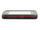
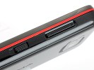
The volume rocker is accompanied by the screen lock switch and the camera key
The volume rocker - serving as a zoom lever too - is quite thin and suffers poor press. The shutter key is slightly better - the half-press is quite distinct but the button gets quite stiff towards full press.
On the left you'll find the microSD card slot and the SIM compartment - both under a single extra long protective cover. Yep, that's right - the SIM card gets in and out on the side of the handset - though you can't quite hot-swap it really.
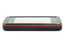
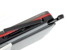
Two card slots share the same cover
You still need to remove your rear cover and battery to eject the SIM card. To do that you need the help of a sharp object such as your stylus - the SIM card just waits for a light push from the inside. Just like on the 5800 XpressMusic there's a little scheme drawn on the inside of the battery cover to explain how it works.
The microSD card is hot swappable but a bit hard to get to as it's quite recessed - the stylus comes in handy here too.
The back side of Nokia 5530 XpressMusic features the 3 megapixel autofocus camera, which comes with a dual-LED flash. The other thing of interest is the stylus compartment. The black plastic stylus smoothly slides in and fits securely.
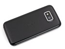
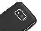
The 3 megapixel snapper and the accompanying LED flash
Removing the rear cover reveals the Nokia 1000 mAh Li-Ion BL-4U battery. To open the cover you put your fingernail in the small slit on top and gently pull and pry to lift up.
Quoted at the respectable 336 hours of standby and 4 hours 54 minutes of talk time, along with 27 hours of music playback, the battery is likely to keep you going for quite some time.
Our test revealed the Nokia 5530 XpressMusic as a gifted long-distance performer. The handset endured some good 5 days on a single charge, which included the moderate 1 hour of talk time, 30 minutes of web browsing over Wi-Fi and shooting some 20-30 photos plus some general tinkering.
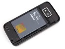
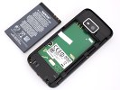
The good ol' BL-4U battery makes another appearance
The general build-quality of Nokia 5530 XpressMusic is really ok with the strange exception of the wobbly back cover. The phone is well built overall and we do think it even looks better than the 5800 XpressMusic. But the battery cover ruined it for us. It doesn't lock securely in place and wobbles all the time you're using the phone.
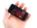
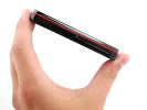
Nokia 5530 XpressMusic held in hand
Anyway, the same build issues plagued the 5800 too but the 5530 XpressMusic seems to have more excuses besides the lower price. It's obviously more compact, plus the front is framed in stainless steel, which should make it very durable and is a nice break from the all-plastic image of XpressMusic phones.
The screen is a mixed bag
The Nokia 5530 XpressMusic has a 2.9-inch display. In touchscreen terms that diagonal probably qualifies as small, not to mention that devices such as the original HTC Touch Diamond and LG Arena offer pretty much the same screen estate but noticeably higher resolution.
When compared to the Nokia 5800 XpressMusic we do find the screen a wee bit on the small side. By offering the same resolution on a smaller area has inevitably made most of the UI graphics and text look smaller. The same goes for the QWERTY keyboard as well. It's a good thing though that at least the system font size can be tweaked to the user liking - we do fancy it bumped up a little.
Nokia 5530 XpressMusic uses a resistive touchscreen as opposed to the capacitive displays in devices like Samsung Omnia HD and Apple iPhone 3G. This means there's a need for a bit of extra pressure to the screen for a click to be registered. Sensitivity is definitely better than 5800 XpressMusic, though not even near Samsung S8000 Jet levels which blurs the lines between resistive and capacitive.
Resistive screens can be used with a stylus though (or fingers with gloves). When using the stylus, the 5530 display is absolutely on par with any competing touchscreen device. On the other hand, sensitivity to fingers and the reasonably finger-friendly interface will make you forget about the stylus (unless you're really into poking at your screen).
Unfortunatelly, display legibility under direct sunlight is quite an issue. It's really poor, making it hard to find a proper angle for working with the phone on a bright sunny day.
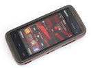
The display has remarkable picture quality but poor sunlight legibility
Vibration feedback for touchscreen control is also available throughout the user interface. The vibration strength is configurable through the Profiles menu, but even at its highest setting it's still on the low side.
Reader comments
- Cat1966
- 12 Jun 2021
- LcW
Just bought it. Great device. Easy to use. Clearly an upgrade from my iphone 6. I like the compact size. I recommend this.
- Anonymous
- 11 Feb 2014
- a3s
7.4 Features 7.3 Performance Nokia 5530
- mahzad rad
- 28 Mar 2013
- 8jp
hi . I forgot my password
