Nokia 5800 XpressMusic review: Young as you feel
Young as you feel
Symbian S60 (r)Evolution
We now come to probably the most important part of the Nokia 5800 XpressMusic performance. We do need to rethink our perspective and, instead of looking at the 5800 as a standalone touchscreen device, get to the real point of exploring the level of touch optimization of the S60 interface. How good - or bad - Nokia 5800 is very much depends on how well S60 translates to touch.
The S60 UI finally made the jump to the touchscreen world
You can go ahead and call S60 the most mature, user-friendly and stable smartphone interface but that won't necessarily make its touch reincarnation any better at this point. The pains of growth can't be helped we guess.
The fact is that Nokia have not done a great job at creating a user-friendly touch interface. At this stage we're not looking at an elaborate touch interface but the first stages of touch-optimizing an existing UI. S60 is more of a curse than a blessing at this point. Honestly, at times we felt as if Nokia is using all 5800 users as a giant focus group to test out various elements of their new interface - try this scrolling and that scrolling - which one do you prefer?
Comparing the S60 5th edition to LG and Samsung touchscreen interfaces or Windows Mobile is not in favor of Nokia. And even the mere mentioning of iPhone would be devastating on the 5800 morale.
Update, 03 Feb 2010: Nokia have slowly but steadily been making improvements of the interface usability. S60 touch edition is still playing catch up with the competition, and it's still behind.
We appreciate the effort and the recently added kinetic scrolling works pretty well, even though only in list menus. Now if they come scrolling in icon menus, it would be just great.
This was more or less expected - there aren't absolute deal-breaker issues but the interface is obviously immature and the touch implementation inconsistent. The great asset - which could prove vital in the long run - is the familiarity, predictability and comfort of the original S60.
User interface basics
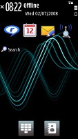
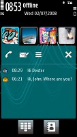
The homescreen layout of the S60 5th edition is similar to previous S60 versions - all the status indicators are at the top, plus the clock and the calendar. A single press on the clock starts the clock application (with an option for setting up an alarm) while tapping on the date opens a drop-down menu where you can either enter the calendar application or change the currently active profile.
You have three layouts for the homescreen to choose from - an active-standby kind of shortcuts bar, contacts bar or blank screen (called Basic). Activating the latter will let you enjoy your currently selected theme but the large homescreen will be quite lacking in functionality - save for the status bar and the two touch buttons at the bottom. One launches the virtual num pad, while the other opens the Contact list.
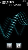
There are three available layouts for the homescreen
In fact, we can't help but notice Nokia 5800 fails to make the best use of the screen estate that's available. Not only are the available shortcuts notably less than on regular D-pad-controlled S60 handsets but some of the additional controls (like the bar for the quick WLAN search) are also removed.
Touch navigation on the homescreen boils down to a few buttons/icons. What we miss is at least a basic degree of gesture control - a finger sweep for example could toggle the main menu or an extra set of shortcuts.
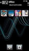
The Shortcuts bar in its current implementation accommodates four large touch-optimized icons at the top of the homescreen. Below them are the reserved lines for the search application, calendar and the currently running music track or radio station. The number of shortcuts has obviously been reduced to make each icon big enough to touch.
It still seems though there is plenty of unused space on the display most of the time so we find the decision of removing the quick WLAN search from the homescreen totally wrong. You can assign the WLAN wizard to one of the shortcuts, of course but that leaves you with only three remaining for you other favorites.
You can also access the connectivity menu by tapping around the battery status indicator, which is the quickest way to initiate a WLAN search. It is not quite as quick as the 3rd edition plug-in where you only needed a single click for the purpose but it is better than nothing.
The other option is the Contacts bar where you can place shortcuts to four favorite contacts. Given the limited number of slots here and the available space on the screen, this could've been way more convenient if displayed along with the shortcuts bar. On the positive side selecting one of the contacts brings out a list of all your recent communications.
The contacts bar
Update, 03 Feb 2010: With the latest firmware Nokia updates the contacts bar functionality as well. Now it features the contacts icons at the top and four customizable shortcuts at the bottom. The number of contacts that you can add is no longer limited to four and their thumbnails have been increased in size to make them more thumbable.
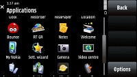
Most menus can be set to show as either a grid of 4x3 icons or a list of nine items per screen. The exception is the settings menus, which can only appear as lists.
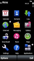
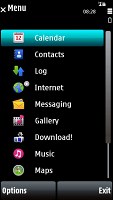
You can choose between grid and list view modes for most menus
S60 users will of course feel at home but the interface is intuitive enough as well, even if not the best in terms of touch control. Each screen and submenu comes with its contextual touch buttons, so navigation won't differ much from a D-pad and soft-key controlled device.
Strangely enough, opening an item in any of the listed submenus calls for two presses - one to select, and another one to confirm the action. Now that's something that you don't normally see in other touch phones and seems to hurt usability. You get used to it with time, but the main issue here is that the interface logic is different when you deal with icons instead of lists.
When the opened menu uses icons to represent items as opposed to lists, then a single click usually does the job fine. Sounds quite strange, right?
There's a possible reason for that - the scrolling logic used. Again we see two different implementations throughout the interface - scrolling of lists and scrolling of icons is different. And it has a negative impact on the touch usability again.
Thumb scrolling is an option everywhere but in listed menus it gets really bumpy. Instead of a smooth roll in response to every sweep (think Apple iPhone, LG Renoir, Samsung Pixon or Touch Diamond), there's a notable break as each line slowly revolves up or down. And when you stop dragging, the last item you touched remains highlighted. That's a reason why you need a second click to activate an item in listed sub-menus - to prevent accidental clicks.
But it's strange why Nokia had to use that logic in the first place, since when you scroll icon menus the last item you touch when you stop dragging doesn't get activated. So there's some intuitive solution that Nokia just didn't use for listed menus.
In the end dragging the side scrollbar turned out to be our preferred way of scrolling in all menus and we just had to put up with the double-click system in the listed ones.
The main menu and each of its submenus can be set to appear in landscape mode thanks to the build in accelerometer. Rotation is quick enough if you don't use the available transition effects (which are turned off by default).
Landscape mode is available almost through the whole menu
The only parts of the UI that cannot be rotated are the standby screen and, quite naturally, the camera interface. Unfortunately, when you rotate the handset in text input mode, instead of getting a landscape QWERTY keyboard automatically, you are still offered the regular multi-tap input keypad. To get the QWERTY out, you need to activate it from the menu - again a solution that's far behind the competition.
Nokia 5800 XpressMusic features a task manager, which is launched by a press-and-hold on the menu key. The task manager itself is identical to the one found on Symbian S60 3.2 devices. Also much like in the previous version of the UI, it appears on top of every pop-up menu.
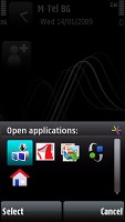
The task-manager
The 5800 XpressMusic runs on a single 369 MHz ARM11 CPU and has 128 MB of RAM. Given the high-resolution screen, you can guess this isn't the fastest Nokia handset around.
Update, 03 Feb 2010: Nokia also switched the CPU frequency with one of their earlier firmware updates. The ARM11 CPU now works at 434 MHz, which combined with some UI optimization delivers better user experience. The 5800 XpressMusic is still some way of the best in class but it is now much easier to swallow.
Major lags and holdups are still rare enough and they will hardly be much of a bother. And as to RAM - 128MB is a respectful count in Symbian terms. Depleting it is quite a challenge, unless done on purpose.
We have prepared a couple of short videos demonstrating the Nokia 5800 XpressMusic user interface. Those should give you a better idea about its speed responsiveness and organization.
Nokia 5800 XpressMusic comes with 86MB of internal memory plus the 8GB memory card that ships along. If that seems insufficient 16GB microSD cards are available and compatible. Accessing data on the card isn't any slower (not noticeably at least) than doing so on the phone memory. The phone didn't seem to slow as the memory card started filling either.
Customizing the UI
There are a number of options for customizing the interface of you Nokia 5800 XpressMusic. For starters you can change the menu view mode - the options here are pretty limited though.
You can also switch theme effects on and off. There are some really nice transition effects all over the interface but if you'd rather have your handset fast than pretty you'd be better off without them.
Finally, you can change the theme itself. From wallpaper through icons and transition effects, everything can be modified. Our unit came with a single theme preinstalled but there are already quite some of those available online.
Symbian vs. the rest of the world - the battle just begins
Before we move on, the big question is how the Symbian S60 touch-enabled 5th edition compares to the other touch UIs on the market.
For one, it is quite obvious that the S60 5th is a toddler, probably only comparable to the Google's Android OS. Some may argue that the same could be said about Apple's OSX iPhone implementation but we disagree. Apple may be blamed for being cheeky twisted snobs but hardly for undercooking the UI. There are many features that miss on the iPhone, but the ones they want to be there are there - an new ones are spawning with every other software update.
The main disadvantage of the Symbian 5th edition to competitors is its inconsistency. It uses one click here and double click there, you can flip through photos with finger sweeps but not SMS and emails - this whole thing is rather confusing, and annoying.
The other main issue is the design, which is no match for the looks of Samsung's TouchWiz and Apple's OSX, or even a plug-in like TouchFLO 3D. The Symbian S60 5th edition looks a bit too conservative for our taste and the customization options fail to address that. The added transition effects however are a nice step in the right direction and a clear indication that Nokia are about to change that.
The wasted standby screen is another thing we cannot quite accept. While every other manufacturer tries to grant access to as many features as possible straight on the homescreen, Nokia only give us 4 shortcut keys. The Contacts bar is also an option, but having both could've been way better.
The strongest point of the S60 5th edition as it currently stands is probably its structure. All the options are logically located exactly where you would expect them to be. And if you happen to disagree - rearrangement is as easy as it gets.
The file management of the Symbian S60 5th is also praiseworthy. The only other touch-enabled devices that are comparable are the WinMo crowd.
And finally, coming to third party software, Symbian touch is still too young to make a difference. The number of applications available is incomparably in favor of WinMo. Even the iPhone enjoys a larger base of available applications, even if the vast majority brings about functionality that you take for granted on other smartphones. On the other hand, the S60 already fares better than feature touchscreen phones by LG and Samsung, which are only limited to Java applications. Plus, the S60 touch is likely to catch up.
OK then, catching up may be easier said than done but Symbian Touch has one of the best reasons to think big. S60 5th - as it is now - sure needs refinement but it still steps on the market-leading smart platform. Immature, inconsistent - a beta version if that's what makes you happy - the S60 touch UI is a first attempt. We guess the verdict will be as good as the N97.
Reader comments
- Anonymous
- 19 Mar 2022
- mXD
What
- monu
- 11 Sep 2020
- YQZ
yes i one
- Sohe lsalim
- 23 Feb 2020
- 7Pv
Hi I wontNokiaphonenew5800xprss music Can have thas phon?