Nokia 6 review: Back in black
Back in black
Nougat with some Nokia blue on top
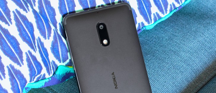
The Nokia 6 boots Android Nougat, and for our Chinese version review unit this means v7.0. The global version will ship with Android 7.1.1. In our case, there's a customized but not very customizable Nokia overlay on top.
Update (July 13): The Chinese version has meanwhile been updated to Android 7.1.1 as well. A new software update for the Chinese variant, which includes the July security patch, also brings support for Google services.
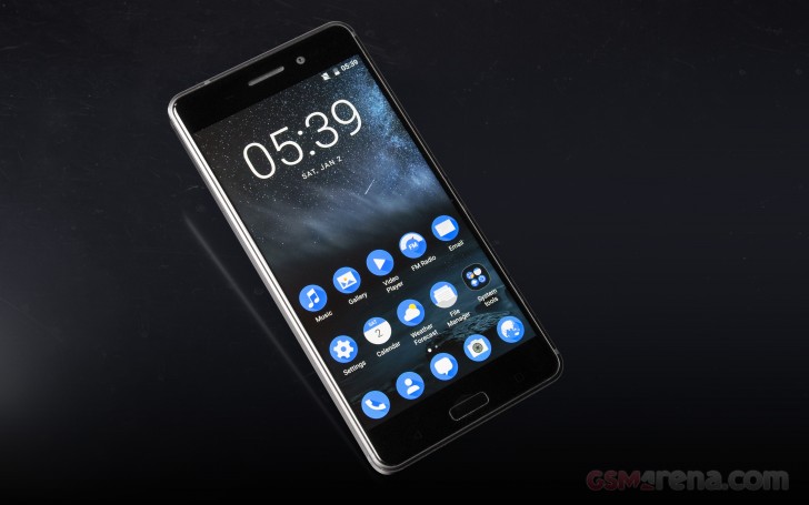
The lockscreen displays the standard Nougat notification cards, complete with grouping, expanded view and direct reply. There's a clock and weather widget, and the clock part can be changed to one of several different designs (though they don't work particularly well).
There's a camera shortcut in the bottom right, while the bottom left is home to a padlock icon that changes to a fingerprint likeness if you've enabled fingerprint unlock. We couldn't find a way to change those. While we're at it, the camera can be launched with a double press of the power button if you enable the setting.
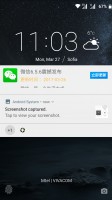
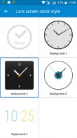
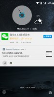
Lockscreen • Clock designs • Clock on the lockscreen
That's good, since you probably won't be seeing much of the lockscreen once you enable the fingerprint recognition. You can record up to 5 prints and setup takes a few more taps than usual. But, we feel like it's better to spend a few extra seconds initially than go mad later when the phone refuses to recognize your digits.
This one works pretty much every time, and while it's not the absolute fastest to unlock, it doesn't really keep you waiting. We may be repeating ourselves when we say that the very low position of the sensor isn't ideal, but that's very likely something you'll forget about a week into using the phone.
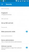
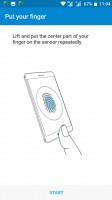
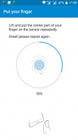
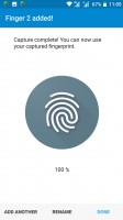
Security settings • Setting up a fingerprint
The homescreen is where the Nokia looks like no other. All of the system icons and pre-installed apps are painted in Nokia blue, and they're all circles. It's really too consistent - we found ourselves scrambling to find the icon we're looking for, because we couldn't tell them apart by shape or color. Of course, once you get used to what's where, it gets easier. There are no themes - the blue color scheme is the one you get and that's it.
On the other hand, all the third-party apps retain their original icons - the launcher doesn't apply any changes to them. That makes them recognizable, but then they look nothing like the built-in ones. We found ourselves keeping the stock icons on one homescreen and other apps elsewhere.
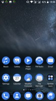
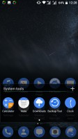
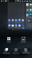
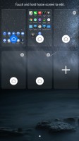
Default homescreen • Folder view • Homescreen options • Pane rearrangement
Speaking of, you can have the UI in either classic Android two-tiered mode with homescreens and an app drawer, or go with the default single-layer launcher where all apps are on the homescreens.
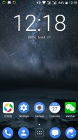
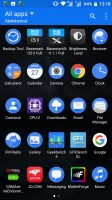
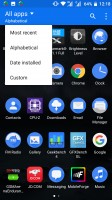
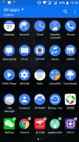
Homescreen in two-layer mode • App drawer • Sorting options • Managing apps
The notification area is a little bit different too - the toggle icons are unusually large. Pull once and you get a set of 4 toggles, pull a second time and 8 more appear, plus a brightness slider (but no Auto). A two finger pull will directly expand the entire list of toggles. The notification shade can be summoned by swiping down from an empty area of the homescreen too - you don't need to reach all the way to the top.
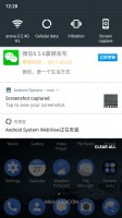
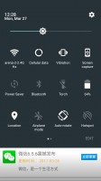
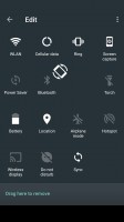
Notifications with one row of toggles on top • Toggles expanded • Editing the toggle arrangement
The task switcher is business as usual - the Android rolodex is present here. The 'clear all' button only appears when you scroll all the way to the top - a bit of a nuisance.
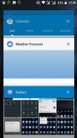
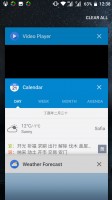
Task switcher • 'Clear all' out of reach
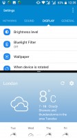
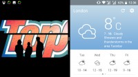
There is multi-window multitasking (thanks, Nougat), but the screen is always split 50/50 - you can't resize the windows.
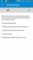
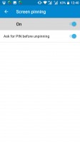
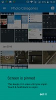
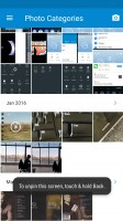
Screen pinning lets you lock the view on one app that you choose - say you want to show someone a few photos, but don't want them poking through your messages. The feature needs to be enabled in settings first, and then when you open the task switcher you tap on the pin icon to pin the respective app. To get out of the pinned app you long-press the back key, and at this point the phone will go into a locked state prompting you for a password or fingerprint. That last bit is optional, but to us it makes the most sense.
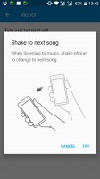
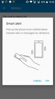
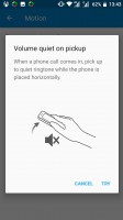
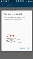
There are a few gesture controls - nothing we haven't seen before. You can enable a shake gesture to advance to the next song when listening to music. Or, turn the phone flat on its face to reject an incoming call, mute the ringtone when you pick up a ringing phone off the table, or call the person whose contact info you're looking at on the screen. That being said, we don't find ourselves using these too often. Smart alert is handy, though. If you're in the other room and you have a missed call, when you next pick up the phone it'll prompt you with a vibrating alert.
Reader comments
- Sampotbelly
- 11 Aug 2018
- pp4
Can someone help as when I try to play videos from social media they won't play
- AnonD-729383
- 14 Jan 2018
- B}r
nokia 6 or moto g5 plus ? why???
- AnonD-729383
- 14 Jan 2018
- B}r
nokia 6 or moto g5 plus ? why???
