Nokia 6110 Navigator review: Know your way
Know your way
Inspiring display
We go on and on about Nokia knowing how to make good displays, and we keep on getting proof. The one we come upon in Nokia 6110 Navigator has a 2.2" diagonal and QVGA resolution. The 16M colors are no news with Nokia phones and legibility under direct sunlight can hardly be compared to any other phone. This is a must for the Navigator, as it is likely to be placed on a car's dashboard and thus exposed to a lot of sunlight. If the phone lacked in legibility in such conditions, the navigation experience would surely be ruined big time.


The display is perfectly legible even in the brightest sunlight • This greatly enhances the navigational experience
You have a call
Not much to say about the telephony on the Navigator. As with all contemporary Nokia phones, it is but flawless. The reception is crystal clear on both ends, so you may rest assured that communication is well taken care of in this device.
When dialing a number, large and easily visible digits display.
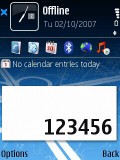
The numbers on the display when dialing are large and easy to see
Here is how Nokia 6110 Navigator ranks along some of the other handsets we've measured in our new speakerphone loudness test. It is definetely not among the loudest phones around. More info on our test here.
| Speakerphone test | Voice, dB | Pink noise/Music, dB | Ringing phone, dB | Overall score |
| Nokia 6110 Navigator | 65.9 | 65.8 | 72.9 | Average |
| Nokia E50 | 68.2 | 61.5 | 75.7 | Average |
| Nokia 6630 | 69.7 | 64.4 | 66.5 | |
| Sony Ericsson T650 | 75.7 | 75.7 | 83.7 | Excellent |
A phone with brains
Nokia 6110 Navigator is powered by Symbian 9.2 OS and uses the Series 60 3rd edition with FP1 user interface. This comes as no surprise, consistent will all recent Nokia smartphones. Therefore when used as a regular smartphone, the experience with Nokia 6110 Navigator differs little from other Symbian 3rd edition FP1 devices. Feature Pack 1 offers a couple of advantages: a repeated alarm clock and a voice recorder, which is not limited to a miserly minute, plus some interesting UI customization features.
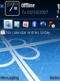
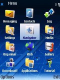
The Symbian looks are familiar
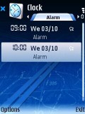
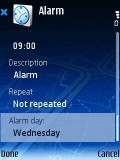
The alarms can now be any number you like plus they can be repetitive
We also find the blue circle displayed on running applications' icons in the menus useful, as it reminds you to turn off those you're not using to save some RAM. This leads us to phone speed. The Navigator's overall mark is very good. Though not as fast as Nokia 5700, it is still very quick and responsive, and you have our word that it is not going to bother you. Nokia 5700 was just a bit better. The size of the built-in memory here is 40MB which is an unnoticeable change when compared to the 38MB of Nokia 5700.
The display naturally features an active stand-by mode. You have a band with icons for instant access to pre-selected functions at the top of the display and scheduled events from the calendar, together with tasks, at its bottom. When selecting the shortcuts, you can choose any application or even a website. The two softkeys' functionality is also configurable. The handset can be configured to autolock its keypad upon closing the slider or to at least prompt you to lock. In the bottom area of the display you will also find the title of a running song or the name of the tuned radio station.
The phone has an Offline mode, switching off transceivers but allowing the use of the other capabilities of the device. It is also used if you start the handset without a SIM card. The radio is not available in Offline mode. Other functions, such as Bluetooth connectivity and GPS are usable though, but the A-GPS will naturally be impossible to use.
As with any smartphone, a Task Manager is present. It is launched by a longer press on the Menu key on the keyboard. This pop-up allows switching between applications and you can shut any application down by pressing the Clear key. In most cases the red End key closes the currently running application, but there are some cases when you have to manually close them by pressing the exit key or using the task manager, unless you want to end up with a lot of applications running, eating up your precious RAM.
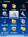
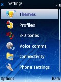
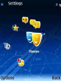
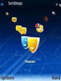
The phone's main menu has four different view modes. The first two are the well known grid of 4 x 3 icons and the list view. There are also two additional looks brought in by the Feature Pack 1. Same as in Nokia 5700, there is a V-shape and a Horseshoe mode. Both are 3D and look quite nice but are not that user-friendly . Navigation in any of them kills the joy of working with the phone. Most of the submenus also allow changing the type of view. Navigating the menus is fast with instant response to keypresses and no delays.
| The 16M colors are no news with Nokia phones and legibility under direct sunlight can hardly be compared to any other phone. This is a must for the Navigator, as it is likely to be placed on a car's dashboard and thus exposed to a lot of sunlight. | <#AdRectangle#> |
A nice addition is the My Own button, which can give you access to any application of your choice by a single press. To put it otherwise, it is another shortcut if you find the existing ones insufficient, or if you don't want the active standby ruining your phone's wallpaper.
On a different note, the voice recognition system is doing very well, managing commands fine and truly speaker independent.
The phone has the same four Main menu views and comes with four preinstalled themes. Given the Navigator alias of our device, there was no surprise that we enjoyed the default one the most. Still, if you are of a more conservative taste, you can always go for the classic Nokia theme.
Phonebook Unlimited
As you might have already guessed the phonebook hasn't undergone any changes. The entries number only depends on the amount of free memory, and you are really unlikely to go anywhere near using that up on phonebook entries.
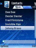
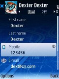
The phonebook has kept its looks
The number of fields that can be assigned to a contact is also unlimited, and you can repeat a field as many times as you like. Furthermore, you can create new fields if the existing ones do not meet your needs. Naturally, assigning ringtones, pictures and even videos to contacts is also an option. PC synchronization of your contacts works seamlessly too.
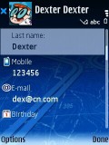
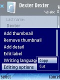
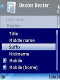
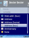
Editing a contact as usually offers an enormous number of fields
The Calls log department of Nokia 6110 Navigator can show you up to 20 records in each of the tabs for Dialed, Received and Missed calls. Should you need more information about the past days you can enter the Log application that shows all the calls and data connections for a predefined period (no longer than 30 days ago though).
Messaging Symbian style
The message editor hasn't seen any changes and, frankly, it doesn't need many.
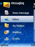
Messaging menu on Nokia 6110 Navigator
A counter of the characters left of the 160 limit shows when writing an SMS. If that limit is exceeded, the number of separate parts the message needs to be divided into for sending is shown in brackets. On request, delivery reports can be activated and then each of them will popup on the standby screen, provided that the phone is not locked. Delivery reports are stored in a dedicated folder in the Messaging sub-menu.
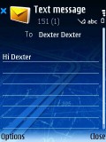
The SMS editor is once again in its well know looks
Overall, the editor is very intuitive no matter if it comes to SMS, MMS or email. Speaking of email, Nokia 6110 Navigator supports POP3 and IMAP4 email protocols. The email client can download headers only, as well as full messages. The client manages email well and is also capable of handling attachments.
Reader comments
- Dee
- 05 Nov 2020
- XMW
The original Nokia 6110 is still the best, I want to buy can I make a purchasing order, I like it with it's featurs so I wanna buy a new one since not been on market in png
- hard4rapper
- 25 Jan 2014
- NsK
when I Want Navigator Of My Car I Need To Do What
- omray
- 05 Dec 2011
- 98H
hi guys all over the glop im having probs with my network navigator nokia plz tell me what too do plz
