Nokia 6500 classic review: Slim inside out
Slim inside out
Beauty on display
Nokia 6500 classic has a display that probably won't stun you with size - the 2.0" diagonal is on the small side considering the price range. On the other hand, the image quality could probably make you forgive that. It is surely among the best on the market in any conditions - from the darkest to the most brightly sunlit spots, Nokia 6500 classic offers great quality. The QVGA resolution is not much of a boast but it does a job just good enough.
Neither backlighting, nor contrast is user-configurable. In the menu you can only set the phone's behavior in power-saving mode. An animated screen-saver can be set to appear on the display and, consequently, convert into a screen-saver showing a digital clock, the current date, and icons indicating missed events, if any. All these details are perfectly legible in any light condition. In the menu you will also find a sleeping mode option, with which the display goes out completely.
Telephony
As you might have guessed, signal reception and call clarity have not been compromised in Nokia 6500 classic. The calls are loud and clear on both ends and you will have no problems communicating with this phone. The lack of video calls can be considered a real disappointment. With 3G on board, Nokia could've enabled it without much of an effort. Video calling isn't that frequently used anyway, so it won't be so badly missed. The vibration of the phone is a bit weak but the loudspeaker is among the most powerful we have tested. It pays the price of reducing the audio quality but it will be easy to hear even in the noisiest environments.

Call clarity is remarkable with Nokia 6500 classic
Here is how Nokia 6500 classic ranks along some of the other handsets we've measured in our new speakerphone loudness test. You can find more info about our test as well as results from other tested devices here.
| Speakerphone test | Voice, dB | Pink noise/Music, dB | Ringing phone, dB | Overall score |
| Nokia 6500 classic | 74.7 | 75.7 | 83.8 | Excellent |
| Nokia E50 | 68.2 | 61.5 | 75.7 | Average |
| Sony Ericsson T650 | 75.7 | 75.7 | 83.7 | Excellent |
| Motorola RAZR2 V8 | 66.3 | 65.7 | 81.9 | Good |
User interface: Series 40, 5th
Nokia 6500 classic brings no surprises in terms of user interface. It employs Series 40 5th edition user interface. In case you are wondering what happened to the 4th edition - Nokia decided to skip it and went straight to 5th from the 3rd. Rumor has it, the peculiar decision may be rooted in the fact that the number 4 is considered unlucky is some Asian countries. But leaving the name aside, we have to say navigating and controlling the phone are almost the same as with the previous UI edition and identical to Nokia 7500. The phone still offers a vast number of configurable options but that somehow complicates the menu structure and navigation.
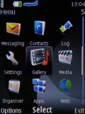
The Series 40 menu hasn't been changed with the 5th edition
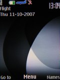
When in stand-by, the display as usually visualizes the pre-selected wallpaper plus signal strength, battery status and time in the top bar. Beneath the top bar are the operator logo and the date. The bottom bar is reserved for the descriptions of the functions assigned to the center of the navigation key and the two context keys. The center of the navigation key opens the main menu, while the context keys can be assigned a function of your choice. The font on the main display can be of any color. You can also turn on the active stand by mode if you want to. It consists of several parts that can be edited or relocated according to the user's preferences. In the most common case, the top area is reserved for instant access to favorite functions indicated by their respective icons. The central area provides instant access to the music player. At the very bottom are displayed events from the calendar set for the current day. A cool feature here, that even Nokia smartphones do not have, is the possibility to add a note to the active stand-by. The two soft keys' functionality can also be altered if necessary.
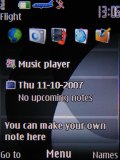
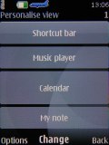
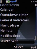
The active stand by menu icons can be changed or reordered freely
The main menu in Nokia 6500 classic can be visualized in four different ways: a grid of icons with or without captions, a list of items, and tabs. While each of them has its pros and cons our personal choice remains the typical grid view with legends. If you prefer more icons to appear simultaneously, you can go for the grid view without text, as it displays a 4 x 3 icons grid. The icons themselves haven't been changed at all, keeping the well known stylish design. The selected icon is animated. The icons can also be freely reordered within the grid.

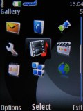
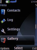
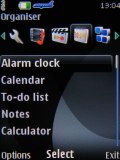
Each different menu look has its pros and cons
The submenus follow no consistent pattern. Some items have captions, others do not. In certain cases, you will even be able to see the selected item described in small font, so you will not need to step further into another menu level. As usual, the menu items are intuitively accessible through keyboard shortcuts. The color background of the entire menu, as well as the wallpaper on the display, can be easily modified by applying one of the pre-installed themes.
| The menu responds quickly, without lagging or holdups. We wouldn't expect anything else from a Series 40 device anyway. | <#AdRectangle#> |
The menu responds quickly, without lagging or holdups. We wouldn't expect anything else from a Series 40 device anyway. Also, we didn't experience any halts or unexpected restarts for the time of our review.
Themes for the thins
Having in mind that looks are among Nokia 6500 classic's strong points, it is very important that the themes follow suit. Luckily, this is just the case as all the 7 preinstalled themes on Nokia 6500 classic are fine-looking and provide the perfect finish to the handset's appearance. We personally enjoyed the default black the most. Naturally, you can also download additional themes for your Nokia 6500 classic.
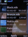
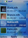
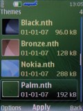
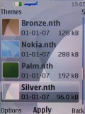
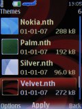
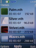
The six preinstalled themes on Nokia 6500 classic that do not appear on other screenshots in the review
There are six predefined ringing profiles on Nokia 6500 Classic. These should be enough to suit practically any situation you could possible face. There is also a Flight mode, which turns off all transceivers on the phone. This can turn out very convenient if you decide to use your phone as an MP3 player for example. Furthermore, as opposed to some other brands of phones (take Sony Ericsson feature phones for example), the flight mode can be used without a SIM card inserted, which we found convenient.
Reader comments
- sania
- 12 Oct 2009
- PId
i hav dis fone frm last 6 mths n its good.no problems yet.touchwood
- Shafi
- 28 Aug 2009
- kDS
Hai i have nokia 6500c.it was not working the mobile prople.and it speaker was not working
- Anonymous
- 23 Aug 2009
- q{K
I agree with you. Entire review does not seem to be objective. "At this stage however, there seem to be very few arguments in favor of purchasing the Nokia 6500 classic." In my opinion Nokia 6500 Classic is great if you are looking for a s...