Nokia 6500 slide review: Slide over slim
Slide over slim
Admirable Display
Nokia 6500 slide makes good use of its size with a screen of 2.2" diagonal, as opposed to the 2" display in the 6500 classic. The image quality is commendable. It is surely among the best on the market in any conditions - from the darkest to the most brightly sunlit spots, Nokia 6500 slide offers great quality.
Neither backlighting, nor contrast is user-configurable. In the menu you can only set the phone's behavior in power-saving mode. An animated screen-saver can be set to appear on the display and, consequently, convert into a screen-saver showing a digital clock, the current date, and icons indicating missed events, if any. All these details are perfectly legible in any light condition. In the menu you will also find a sleeping mode option, with which the display goes out completely.
Telephony
As you might have guessed, signal reception and call clarity have not been compromised in Nokia 6500 slide. The calls are loud and clear on both ends and you will have no problems communicating with this phone. Video calls and videoconferencing are back on track to make up for a prominent absence in 6500 classic. Vibration is a bit weak but the loudspeaker is quite powerful. The phone ringing will be easy to hear even in the noisiest environments.
Here is how Nokia 6500 slide ranks along some of the other handsets we've measured in our speakerphone loudness test. You can find more info about our test, as well as results from other tested devices here.
| Speakerphone test | Voice, dB | Ringing | Overal score | |
| Nokia 6500 slide | 74.2 | 72.8 | 78.2 | |
| 74.7 | 75.7 | 83.8 | Excellent | |
| Samsung G800 | 70.7 | 66.6 | 73.6 | Good |
| Samsung Armani | 69.7 | 64.6 | 71.0 | Average |
| Apple iPhone (firmware 1.1.1) | 67.2 | 60.2 | 66.6 |
User interface: Series 40, 5th
Nokia 6500 slide brings no surprises in terms of user interface. Series 40 looks the straightforward choice for feature phones, and we're dealing with its 5th edition. We have to say navigating and controlling the phone are almost the same as with the previous UI editions and identical to, say, Nokia 7500. The phone still offers a vast number of configurable options but that somehow complicates the menu structure and navigation.
We are already starting to get tired of the same look and feel of this user interface. What good it is to buy a new phone that has a interface exactly as the one in your old phone. Perhaps some change in graphic appearance would be beneficial.
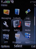
The Series 40 menu hasn't changed with the 5th edition
When in stand-by, the display as usually visualizes the pre-selected wallpaper plus signal strength, battery status and time in the top bar. Beneath the top bar are the operator logo (if any) and the date.
The bottom bar is reserved for the descriptions of the functions assigned to the center of the navigation key and the two context keys. The center of the D-pad opens the main menu, while the context keys can be assigned a function of your choice. The font on the main display can be of any color.
You can also turn on the active stand by mode if you want to. It consists of several parts that can be edited or relocated according to the user's preferences. In the most common case, the top area is reserved for instant access to favorite functions indicated by their respective icons. The central area provides instant access to the music player and radio. At the very bottom events from the calendar are displayed set for the current day.
A cool feature here, that even Nokia smartphones do not have straight out-of-the-box, is the possibility to add a note to the active stand-by. The two soft keys' functionality can also be varied if necessary.
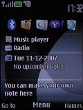
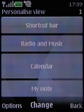
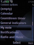
The active standby menu icons can be changed or reordered freely
The main menu in Nokia 6500 slide can be displayed in four different ways: a grid of icons with or without captions, a list of items, and tabs. While each of them has its pros and cons our personal choice remains the typical grid view with legends. If you prefer more icons to appear simultaneously, you can go for the grid view without text, as it displays a 4 x 3 icon grid.
| "...Nokia 6500 slide makes good use of its size with a screen of 2.2" diagonal, as opposed to the 2" display in the 6500 classic. The image quality is commendable. It is surely among the best on the market in any conditions - from the darkest to the most brightly sunlit spots, Nokia 6500 slide offers great quality..." | <#AdRectangle#> |
The icons themselves haven't been changed at all, keeping the well known stylish design. The selected icon is animated. The icons can also be freely reordered within the grid.
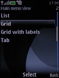
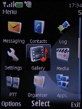
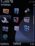
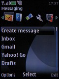
Each different menu look has its pros and cons
The submenus follow no consistent pattern. Some items have captions, others do not. In certain cases, you'll be even able to see tooltips, so you will not need to step further into another menu level.
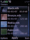
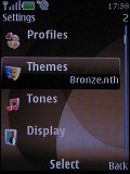
As usual, the menu items are intuitively accessible through keyboard shortcuts. The color background of the entire menu, as well as the wallpaper on the display, can be easily modified by applying one of the pre-installed themes.
The menu responds quickly, without lagging or holdups. We wouldn't expect anything else from a Series 40 device anyway. Also, we didn't experience any halts or unexpected restarts for the time of our review.
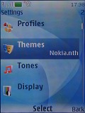
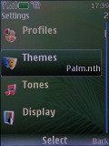
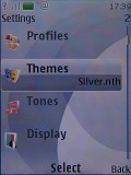
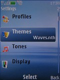
Themes galore
Having in mind that looks are among the Nokia 6500 slide strong points, it is very important that the themes follow suit. Unluckily, the preinstalled themes are just the same we've seen in previous Nokia S40 models such as Nokia 6280. Fortunately, you can also download additional themes for your Nokia 6500 slide, however they are not as nearly as attractive as some of the Sony Ericsson flash themes.
Reader comments
- Nirod
- 21 Aug 2020
- KAe
Nokia 6500 Slade mobile I love it
- JumpingJacques
- 14 Jul 2016
- PF5
I used the 6500 slide for 7 years. It served me well. Went through 3 batteries. I only found out today that it has FM radio and Tv out. I'll have to take it out of retirement to explore its futures
- John
- 28 Mar 2011
- uAi
Nokia 6500 slide is a very good phone. No matter how much I would bother trying to find weaknesses, I can only say that the only thing missing is the Symbian operating system. It looks good, it moves well, you can do with it almost everything you wan...
