Nokia 7900 Prism review: In colored light
In colored light
Keypad
The keypad of Nokia 7900 sure isn't the most comfortable around. The keys are utterly flat and it's generally difficult to find the borders between them by touch only. Furthermore, due to the unusual layout attempting to press the "1" and "3" keys often results in a miss and you press the hard surface next to them instead. This is probably not too hard to get used to but we would have preferred if we didn't have to.


The phone is not equipped with the most comfortable of keypads
The D-pad on the other hand is praiseworthy and so are the surrounding controls. They are all large enough and easy to press. The diamond-shape D-pad is quite comfortable, as the directions are clear-cut and wrong presses are out of question.

The D-pad is a pleasure to use
Another thing that deserves admiration is the backlighting and we don't mean the fact that it is even and strong. We mean that is color-configurable according to your taste. You can pick between 49 different colors for the keys and the light effects of the horseshoe LEDs on the top of the body. The colors are not very precisely rendered, but an option like this is something we see for the first time ever since we archived the Ericsson R600, which offered a choice of three backlighting colors.


Some of the available backlighting colors
Changing the keypad backlighting color
The light effects are in the same color as the keypad backlighting
Display
The display of Nokia 7900 is surely one of its most discussed features. The OLED technology has both its positives and downsides. It involves lower production costs and better power efficiency. The screens are thinner, easier to make and offer a far greater viewing angle, brighter and more contrasty image and faster response time. The thinness and low consumption make OLED screens especially suitable for portable devices. Although, already probing the TV display territory, the OLED technology is still far from full swing and the reason is the still inferior lifetime of OLED materials. However as it seems the Organic LED technology will be replacing the LCD one in the future.
All that said, one thing is nudging us about the Nokia 7900 Prism display. How impressed you are with the picture quality largely depends on the environment, in which you're using the phone. Indoors the display has incredible image quality with true black color, which is way beyond the powers of any TFT LCD screen. When exposed to direct sunlight however, the display is totally illegible, making the phone almost impossible to use.


The OLED display quality indoors is fantastic
Another flaw of the display is its size. For a phone in this price range we find 2" inadequate, OLED or else. Then, on a second thought, the luxurious Arte has the same screen size and - by far - a juicier price tag.
Telephony
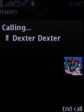
As you might have guessed, signal reception and call clarity have not been compromised in Nokia 7900 Prism. The calls are loud and clear on both ends and you will have no problems communicating with this phone.
However, the lack of video calls can be considered a real disappointment. With 3G on board, we can't help but wonder why Nokia missed including it. Not that video calling is that frequently used but it wouldn't hurt having it. The Nokia 6233 for example didn't have a video calls camera; however it allowed making video calls with the primary one.
Here is how Nokia 7900 ranks along some of the other handsets we've measured in our speakerphone loudness test. It is surely not the loudest phone around but still you won't miss an incoming call or message on most cases. You can find more info about our test, as well as results from other tested devices here.
| Speakerphone test | Voice, dB | Ringing | Overal score | |
| Nokia 7900 Prism | 66.7 | 66.2 | 69.7 | Average |
| Nokia 5310 | 64.8 | 62.0 | 75.9 | |
| Nokia 6500 classic | 74.7 | 75.7 | 83.8 | Excellent |
| Nokia 6500 slide | 74.2 | 72.8 | 78.2 | |
| Samsung U600 | 66.7 | 66.2 | 75.3 | Good |
User interface: Series 40, 5th edition
Nokia 7900 brings no surprises in terms of user interface. It employs Series 40 5th edition user interface. Navigating and controlling the phone are almost the same as with the previous UI edition and identical to the "quirky sibling" - Nokia 7500. The phone still offers a vast number of configurable options but at the cost of a little complicated menu structure and navigation.
When in stand-by, the display as usually visualizes the pre-selected wallpaper plus signal strength, battery status and time in the top bar. Beneath the top bar are the operator logo and the date. The bottom bar is reserved for the labels of the functions assigned to the center of the navigation key and the two context keys. The center of the navigation key opens the main menu, while the context keys can be assigned a function of your choice. The font on the main display can be of any color.
You can also turn on active standby if you want. It consists of several parts that can be edited or relocated according to the user's preferences. In the most common case, the top area is reserved for instant access to favorite functions indicated by their respective icons. The central area provides instant access to the music player.
| "...How impressed you are with the picture quality largely depends on the environment, in which you're using the phone. Indoors the display has incredible image quality with true black color, which is way beyond the powers of any TFT LCD screen. When exposed to direct sunlight however, the display is totally illegible, making the phone almost impossible to use..." | <#AdRectangle#> |
At the very bottom are displayed events from the calendar set for the current day. A cool feature here, that even Nokia smartphones do not have, is the possibility to add a note to the active stand-by. The two soft keys' functionality can also be altered if necessary.
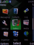
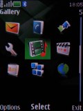
The main menu in Nokia 7900 can be visualized in four different ways: a grid of icons with or without captions, a list of items, and tabs. While each of them has its pros and cons our personal choice remains the typical grid view with legends. If you prefer more icons to appear simultaneously, you can go for the grid view without text, as it displays a 4 x 3 icons grid. The icons of the main menu can be freely reordered to suit the user's taste.
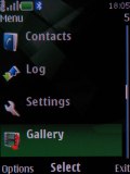
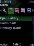
The submenus follow no consistent pattern. Some items have captions, others do not. In certain cases, you will even be able to see the selected item described in small font, so you will not need to step further into another menu level. As usual, the menu items are intuitively accessible through keypad shortcuts.
The color background of the entire menu, as well as the wallpaper on the display, can be easily modified by applying one of the pre-installed themes.
The menu responds quickly, without lagging or holdups. We wouldn't expect anything else from a Series 40 device anyway. Also, we didn't experience any halts or unexpected restarts for the time of our review.
Reader comments
- evan
- 28 Mar 2010
- uEx
can anybody tell me how to change the phone's backlight color ?
- Brian
- 29 Jan 2008
- StG
Hi, I've had a Prism 7900 for the last month and for some reason my instructions were in French therefore I can't use them. I know how to use everything but I just don't know what this living wallpaper feature is and how to turn it on? Any help wou...
- LOL
- 16 Jan 2008
- nFt
Sometimes, GSM Arena's comments made me laugh. For example, why didnt they include video calling when there's 3G technology in 7900 Prism? It wouldnt hurt if they included it. Answer: Its a Nokia 7XXX Series. That Nokia Series is not about tec...
