Nokia 7.2 review
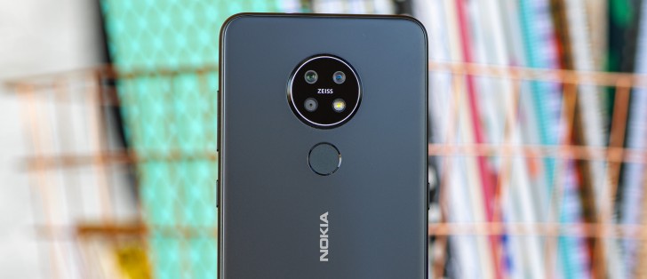
Design and 360-degree view
The Nokia 7.2, along with the 6.2 that it shares the mechanical bits with, is a modest departure from the design language we're used to seeing from recent Nokias. Most notably, what used to be vertically arranged cameras before (with the notable exception of the 9 PureView) has now become a cluster inside a shared circular bump.
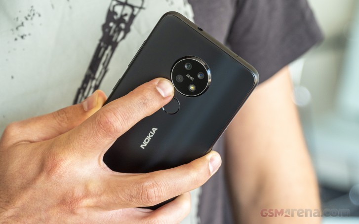
It's quite the bump sticking out by about 2mm. It does need to hold some big hardware in an otherwise quite svelte body, so it all makes sense. Mainly, we are talking about the 48MP primary cam with its 1/2" sensor, and f/1.8 lens as the modest ultra-wide and the depth sensor are generally more compact units.
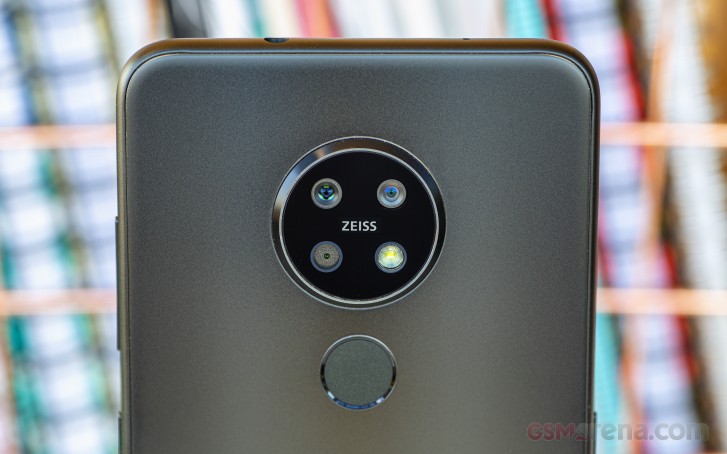
Surrounding the camera assembly is a ring made of what seems to be aluminum. A Zeiss badge completes the design touches around the camera, as the 7.2 is missing lens specs as some other makers like to stamp on phone backs.
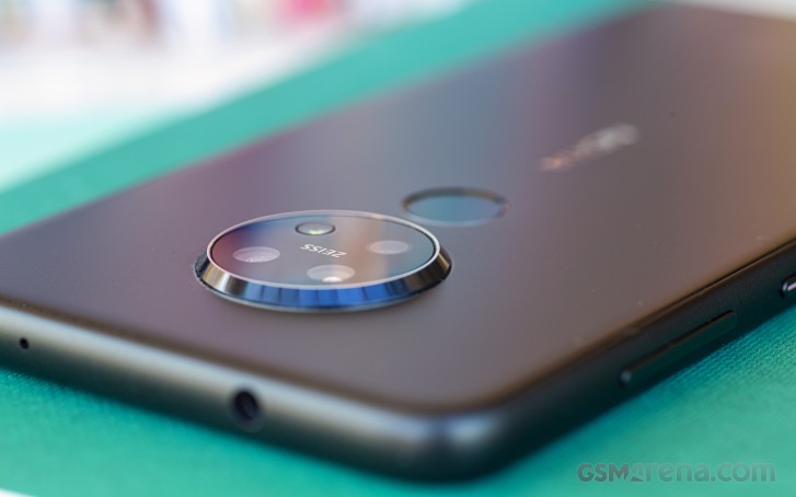
A conventional capacitive fingerprint reader is placed below the camera, slightly recessed, so you have tactile feedback as to its whereabouts. A Nokia logo in the middle of the back panel lets everyone know this isn't a Motorola phone - the circular camera could have fooled some folks.
Another logo is printed towards the bottom of the back, the Android One one, in less obvious print than the Nokia one. Thank goodness the four rows of text and the regulatory markings are in this same, less obtrusive, print.
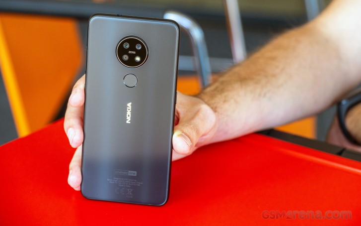
We've been rambling about what's on the back panel without touching on what that panel itself is like. It's Gorilla Glass 3 but treated to a frosted finish, similar to the Pixel 3 and 4, the OnePlus 7's and the Pro iPhone 11's. It's very smooth to the touch and isn't prone to accumulating finger grease, but it's super slippery. In all fairness, that's probably the trade-off we'd prefer if we were given a choice.
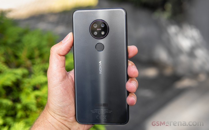
Our review unit is in the most incognito Charcoal colorway. We did get to see the Cyan Green (odd choice of name, but designers know better) at our first Nokia 7.2 encounter and that one packs a lot more flair. The Ice one we've only come across in pictures, but we can see ourselves liking that one too.
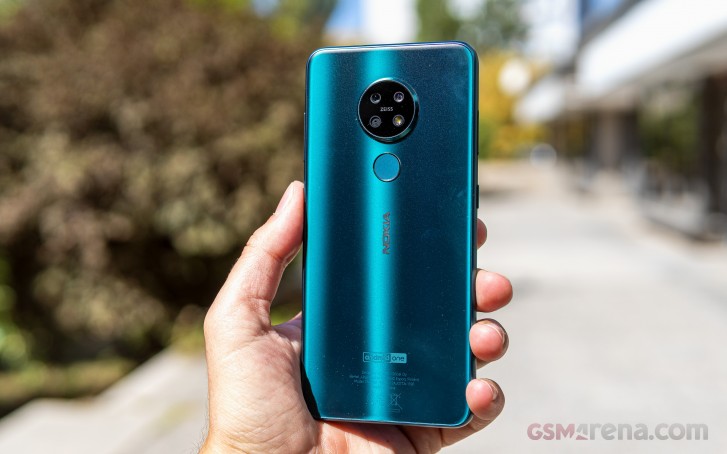
Holding the pieces together is a composite frame, which Nokia says is more durable than aluminum while also being lighter. What we'll say is that it's about in the middle on the premium scale between actual aluminum and the generic polycarbonate frames on cheaper handsets. The frame has the same matte finish as the back, so you're getting some nice design continuity.
There's a ton of things around the 7.2's perimeter, so let's start with the most exciting one - the power button. Placed above the midpoint on the right, it's no ordinary power button - there's an LED inside it to serve as a notification/status light, a solution so amazingly great that we're wondering how no one's come up with it before. Now, if only it was RGB instead of plain white.
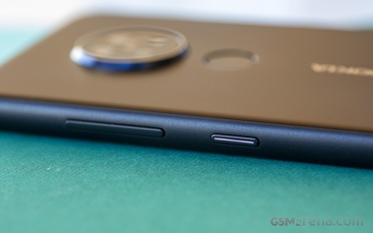
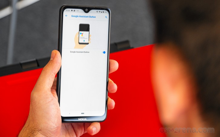
Above the power button is the volume rocker, but that's not all the physical controls you get. Directly opposite the power button, on the left side of the phone, there's a dedicated Google Assistant key. It's not remappable, which is a bummer, but you can at least turn it off in settings if you find yourself pressing it unintentionally as we did.
Above the Assistant button is the card slot and it's our favorite type - it holds a couple of nano SIMs and a microSD card all at the same time. Down on the bottom, there's the USB-C port in the middle, a loudspeaker behind twin slits, and the primary mic. Up top, you'll find the 3.5mm headphone jack and a secondary mic.
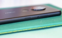
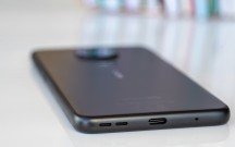
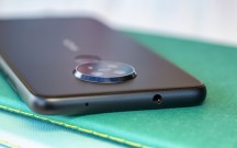
Triple card slot above the Google Assistant button • Bottom view • Top view
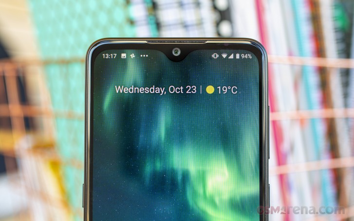
Which finally brings us to the front of the Nokia 7.2. Here, you're greeted by that 6.3-inch display, and it's an LCD with a waterdrop notch on the top. A healthy amount of bezels surrounds the panel, and they're all a different thickness - the sides are the thinnest, there's some more on top and the chin has room for a Nokia logo and then some. Not groundbreaking design, but not exactly dated either.
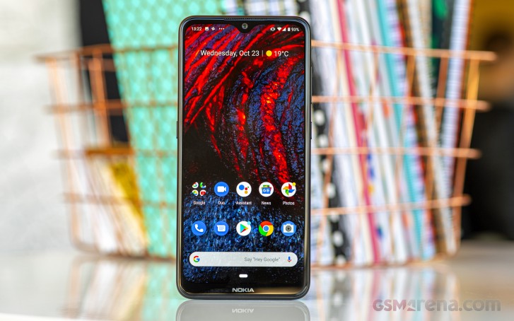
Above the selfie camera there's a fine mesh where the earpiece is, and if you hold a light to the right side of the top bezel, you'll see the window for the ambient light and proximity sensors.
The Nokia 7.2 measures 159.9 x 75.2 x 8.3mm and weighs 180g, which are all reasonable numbers for a handset in this class. The Galaxy A70 (183g) and the Moto One Action (176g) are in the same ballpark; the Redmi Note 8 is slightly heavier at 190g, while the Note 8 Pro is tangibly heavier at 200g.
Reader comments
- Jeson
- 24 Oct 2024
- P@T
After updated my camera,flashlight also not working
- MG
- 14 Mar 2024
- NHF
Still use my phone since 2020 in South Africa. Camera is good for what use it for. Value for money. Pity the free firmware updates stopped. Still a good solid phone.. Like the Gorilla glass, therefore no need to buy a screen protector.
- Anonymous
- 23 Sep 2023
- 7Xd
I think this phone runs best on older software