Nokia 7 plus review
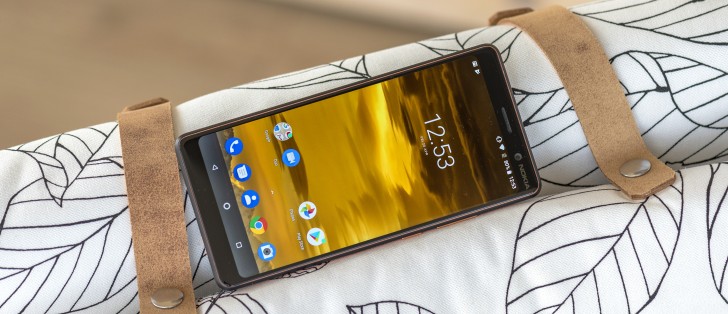
Design and 360-degree spin
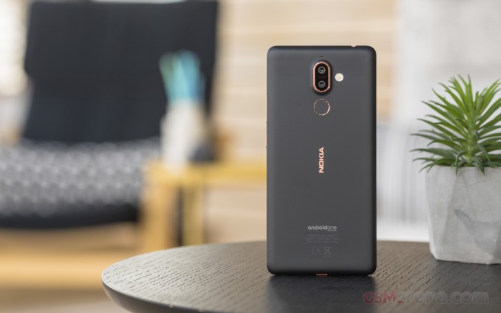
The Nokia 7 plus is machined from a single block of 6000-series aluminum - you're unlikely to miss that fact in Nokia promo materials, but you'll also feel it you hand. Well, there's a 'ceramic-feel coating' on top, whatever that may be, but you can sense there's metal in there.
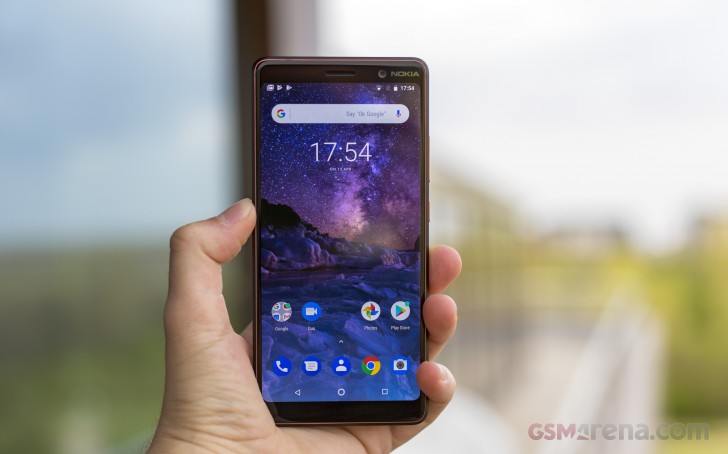
The unit we have for review is in a black and copper color scheme with a matte black back and copper frame and accents. 'Tacky' might have been what we expected from the product photos, but in person it's nothing of the sort - in fact it's quite classy.
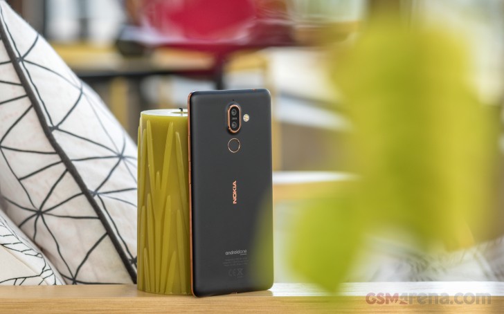
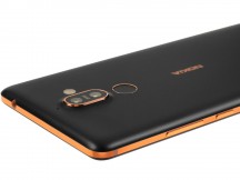
Starting at the ceramic-feel back the dual camera bump has a thick copper frame. A 'Zeiss' logo between the two lenses shows the collaboration with the German optics specialists without being overly specific with f-numbers and focal lengths like Huawei's done on the P20 Pro. Frankly, we appreciate the 'less is more' approach.
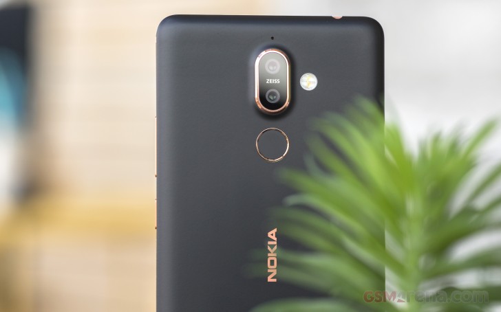
There's a dual tone dual LED flash to the right of the cameras, and one of three OZO mics is above them. Below the camera, the circular fingerprint reader has a copper ring of its own, thinner than the camera's frame. A Nokia logo in matching copper color is the last of the accents on the back.
There's a lot more text, though - an Android One logo, model number, country of origin, regulatory markings, HMD's address in Finland, the menu at the cafeteria at the company's headquarters. Well, minus that last one.
The front is much cleaner. The 6-inch display dominates, of course, and its size, rounded corners, and well, meaty top and bottom bezels, give off a very Pixel 2 XL vibe. No OLED this one, though.
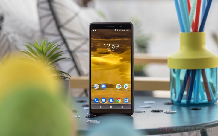
A Nokia logo in the top right corner is about as unoffensive as logos go - we're not strictly against front logos, but we've heard that some folks hate them. To its left is the selfie camera. The earpiece is in the center, but sadly doesn't double as a speaker. Right next to it is the ambient light/proximity sensors combo. There's no notification/status LED - Nokia thinks the ambient display makes it redundant. We disagree.
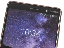
In the hand • Pixel 2 XL lookalike? • Top bezel stuff
The display glass (Gorilla Glass 3) is gently curved towards the edges, where a fine copper rim surrounds it. Fret not, there's a lot more copper on the sides - the entire frame, some 2.7mm of it, shines bright.
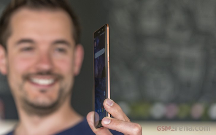
The power button and volume rocker are on the right side, in the correct order - power under volume. The buttons are metal too, and click very reassuringly. Nice. On the opposite side is the card tray - it'll take a nano SIM and a microSD. The dual SIM model comes with a hybrid slot for your choice of microSD or a second nano SIM.
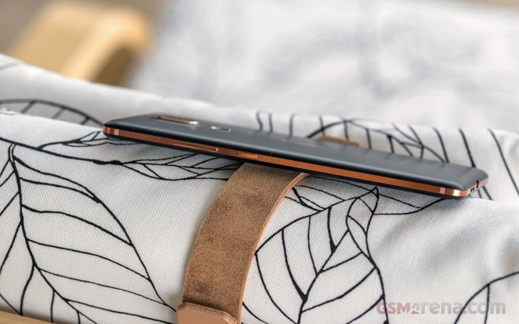
Down on the bottom, you'll find the USB-C port in the center, the loudspeaker to its right, the second OZO mic on its other side. Up top is the 3.5mm headphone jack, and... we're missing the third mic.
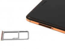
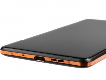
Card tray • USB-C port, loudspeaker and a mic on the bottom • Headphone jack up top
The Nokia 7 plus measures 158.4 x 75.6 x 8.0mm, which is about what you can expect for its display size. The Honor View 10 is 1.4mm shorter, half a mil narrower, and a mil thinner. The Xperia XA2 Ultra is noticeably larger, but it has to accommodate a 16:9 6-incher, which is larger than the View 10 and 7 plus' 18:9 aspect panels.
The Xperia is a hefty beast though, with its 221g - the Nokia 7 plus isn't. It weighs 183g - again perfectly manageable for a 6-incher. Though the Honor is some 11g lighter.
Reader comments
- Lalo
- 08 Oct 2022
- CSU
As others noted, great phone however the charging port gave out after a few months.
- San
- 13 Jan 2022
- XZm
The features I love the most in this phone are the simultaneous use front and rear camera, either for stills or video, though it's more useful in videos where you would want to narrate something and can either appear half screen or as a pic in p...
- Anonymous
- 22 Dec 2021
- 39y
Nokia ovo audio on video produces static