Nokia 8800 review: Exclusivity costs
Detailed accessories
You may charge your telephone in a beautiful metal stand. After the plugging its frame illuminates with a beautiful blue light. Together with the phone, you may put in the charger another battery too, in order to take it directly with you.


The table charger may charge the phone and the spare battery at the same time
We have already mentioned the cleaning and transport pouch. Another thing, delivered with the phone is a handsfree. It has a quality sound and the appearance corresponds to the one of 8800. The receiver, however, doesn't suit very well in the ear and the microphone fastener is too thick. Moreover, the accepting and ending conversation button doesn't work precisely and you have to guess whether you have pushed it or not. I think that wireless headphones would better suit such a phone.


The elegant headphone delivered with the phone • the illuminating charger edges
High resolution display
The display is virtually similar to the one of 6230i. It has the same size - 30 × 30 mm and the same resolution of 208 × 208 pixels. Higher is the number of colors, which has grown to 262K.
Anyway, the picture is very smooth, fine and rather contrast. It's a pleasure to the eye. It's a pity that the font color may be changed only for the main stand-by display, but not for the whole menu. We don't have a chance to go trough the menu comfortable in case of dark wall-papers. You just couldn't see some descriptions. The display is protected by a hardened glass, which you can't scratch just like that.
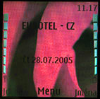
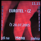

You may change the font color in the main display • in the menu you can't


The display is protected by a hardened glass • the display has high quality • the key lightning is blue white
The keyboard is plastic. It has a strong enough blue-white lightening. You don't have to wrap your thumb unpleasantly due to its high position. The keyboard is very ergonomic. Well, the buttons are placed where other phones usually have display and this is due to the protrusion. The functioning of the keys is excellent.
The keyboard is hidden under a metal cover
It took me some time to get used to the fact, that the context keys are mounted straight to the protruding roller, therefore are not part of the keyboard. At the beginning I often pushed the conversation operating buttons. There are two blind positions on the keyboard, which suit very well to the structure.

I wonder where might be the context keys. ...next to the supporting roller
The asterisks and the cross on the lower row don't work very well; the upper arrow of the main operating key, too. The confirming button is tiny and you may push all four directions at the same time. So, you have to use a fingernail. After some days working the left context keys had began annoyingly to get loose. I would feel very angry because of this fact, if I had given 800 euro for it.
You won't scratch it when it's closed
When the phone is closed, you may accurately accept conversations or identify its ringing, or receive text messages. Nothing more. I would embrace the idea of the drawing out mechanism handled in other way and the roller in the center - a real scrolling button. You won't even find volume control on the sides.


It's true that the roller is not rotating ... • there are no buttons on the phone sides
The only thing you can still use is the main switch button, its follow-up pressing allows you to list among profiles; a long press confirms the choice.

The switch button on the upper edge
The conversations with Nokia 8800 have high quality sound. There's enough bass and the voice is very clear. There is an option of sound improvement activation in the menu. I can't imagine one who will not use this function, why there is an option to switch it off?
The next drawback is the lack of the classic Pop-Port. On the lower side you'll find only a classic charger connector and a minijack socket. The handsfree output is monaural too. Over and above, the delivered headphone is nothing special. When you want to listen to the radio, you must have it connected to the phone - it serves like an antenna. Then, you may listen to a loud speaker. According to everything mentioned, the radio and MP3 player must get the stereo output only trough Bluetooth.
Icons without innovation
The promotion of the phone in April was accompanied by info about the especially modified appearance of the menu. I was very surprised to find out the same performance like Nokia 6230i when I switched the phone on.

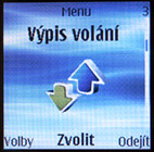
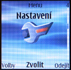
The main menu with big icons
The function of the context keys may be modified. By default the left one has the "go to" function and you may choose the function of the right one. You may set every one of the four directions of the main button with some of the menu functions.
You may set the phone to display the main menu with big icons or order it like 3 × 3 matrix.
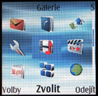
The main menu, organized like matrix
Reader comments
- nopppe
- 28 Feb 2013
- 75f
how can you assume when you never had it
- Anonymous
- 08 Jan 2010
- n$x
a gr8 looking xmas present - looks cool - worst handset as far as reliability I have ever had! battery life poor, freezes and hangs up..mine's still at the service centre 2nd time in 6 months - no one seems to give a straight answer about what the pr...
- Sho
- 15 Jan 2008
- DQn
Dont ever think of buying Nokia 8800. It doesnt worth its cost.The battery doesnt stay for long time.It dies out after few calls.
