Nokia Asha 306 review: Smartphone Ash-pirations
Smartphone Ash-pirations
Unboxing and retail package
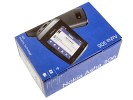
The retail box of the Nokia Asha 306 is quite modest, which shouldn't be surprising considering the price of the phone. The complimentary 2GB microSD card is in fact a nice surprise.
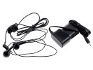
There's also a set of headphones and a charger in the bundle too. It ends up with the old-fashioned Nokia charger plug but the Asha 306 supports USB charging too. The headset has a built-in microphone for hands-free calling.
Nokia Asha 306 360-degree spin
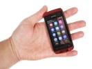
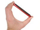
The Asha 306 is identical in size to the dual-SIM Asha 305. It's a compact set at 110.3 x 53.8 x 12.8 mm and weighs just 96 g but there's just too much screen bezel which makes you wonder whether the Asha 306 could've been a lot smaller. We wouldn't call it a slim phone either. But let's not get too greedy here - edge-to-edge screens belong to a different market segment and for it price the Asha 306 is decently sized.
Design and build quality
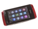
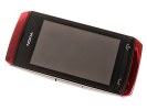
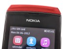
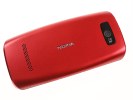
Design-wise the Asha 306 is an exact copy of the Asha 305. It comes in variety of colors including Silver White, Mid Blue, Dark Gray and Red (as in the case of our review unit). There are two glossy pieces of plastic above and under the display, while the back cover has matte finish, which we like because it isn't as prone to fingerprints. It also has e better feel to it.
There seems to be plenty of unused space above the 3" display, where the Nokia logo is. A thin strip underneath accommodates the call keys.
The display itself is not too bright and there's no brightness setting whatsoever. The low resolution gives icons a dot-matrix-printer look and scrolling is like a stop-motion cartoon. The screen is extremely reflective and colors look washed out. To be fair though, poor image quality was to be expected here.
If you are coming from a capacitive touchscreen device, you might find the resistive screen having poor response initially. Once you get the hang of it and start putting more pressure to your taps and swipes things start feeling better, though.
| Display test | 50% brightness | 100% brightness | ||||
| Black, cd/m2 | White, cd/m2 | Black, cd/m2 | White, cd/m2 | |||
| HTC Desire C | 0.23 | 186 | 814 | 0.5 | 360 | 723 |
| Nokia Asha 306 | - | - | - | 0.33 | 318 | 946 |
| Nokia Asha 305 | - | - | - | 0.33 | 320 | 955 |
| Sony Xperia go | 0.30 | 282 | 928 | 0.63 | 541 | 859 |
| Samsung Galaxy Pocket | 0.31 | 238 | 774 | 0.62 | 468 | 753 |
| Samsung Galaxy Y | 0.40 | 247 | 624 | 0.72 | 471 | 625 |
Contrast ratio
-
Nokia 808 PureView
4.698 -
Samsung I9300 Galaxy S III
3.419 -
Samsung Omnia W
3.301 -
Samsung Galaxy S
3.155 -
Nokia N9
3.069 -
Samsung Galaxy Note
2.970 -
HTC One S
2.901 -
Samsung Galaxy S II
2.832 -
Huawei Ascend P1
2.655 -
Nokia Lumia 900
2.562 -
Apple iPhone 4S
2.269 -
HTC One X
2.158 -
Nokia N8
2.144 -
Apple iPhone 4
2.016 -
Sony Ericsson Xperia ray
1.955 -
Sony Xperia U
1.758 -
LG Optimus 4X HD
1.691 -
HTC One V
1.685 -
LG Optimus Vu
1.680 -
HTC Desire V
1.646 -
LG Optimus 3D
1.542 -
Nokia Asha 302
1.537 -
Nokia Lumia 610
1.432 -
Gigabyte GSmart G1355
1.361 -
Sony Xperia miro
1.324 -
HTC Desire C
1.300 -
LG Optimus L7
1.269 -
Meizu MX
1.221 -
Samsung Galaxy Pocket
1.180 -
Nokia Asha 305
1.178 -
Nokia Asha 306
1.175 -
Sony Xperia tipo
1.166 -
Samsung Galaxy mini 2
1.114
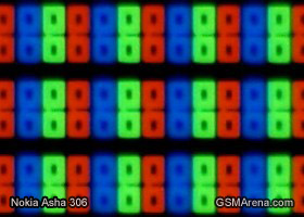
Nokia even found a way to enable multi-touch. It's limited to the gallery but pinch zooming works rather well. Here's a photo of the screen's RGB matrix under a microscope.
Above the display there's an earpiece and a brand logo. There're none of the usual sensors up there. There's no automatic screen brightness of course and no proximity sensor. The screen locks as soon as the call is connected and can be unlocked using the dedicated button. Only then can you access the onscreen in-call options.
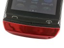
Underneath the screen you'll find the mouthpiece on the thin strip of plastic that accommodates the call and end keys. The end key will exit any currently running app and take you back to the homescreen. It's a power button too.
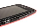
On the right side of the Nokia Asha 306 is the volume rocker and the lock button. Near the bottom you'll see a rather deep and wide slit for removing the back panel.
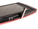
Under a sealed plastic lid lies the MicroSD card on the left side of the phone.
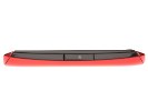
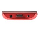
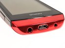
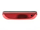
The microUSB port is placed at the top of the device alongside a 3.5 mm headphones jack and the older standard charging port. The Asha 306 comes with one of those old-school Nokia chargers but can be charged off USB too.
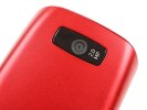
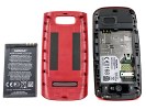
The back panel of the Nokia Asha 306 is the only place where a more conventional matte finish has been deployed. You'll find the 2 MP camera lens there, along with another engraved Nokia logo and the loudspeaker grille. The Asha 306 is powered by a 1110 mAh Li-Ion battery and inside the battery compartment is the SIM slot.
We can't say we're too fond of the Nokia Asha 306 in terms of design but the phone is certainly well put together. The handset looks like it's using parts of other Nokias and there's too much gloss. Fingerprints are too much of an issue but overall, it's the looks that raise doubts not durability.
Reader comments
- izoz
- 29 May 2016
- NYq
my phone cant save pics,downloads ,and even hard to recieve apps
- JOHN MUPWAYA
- 16 Dec 2015
- fu%
i need to download operator system 306 nokia
- Noxie
- 13 May 2015
- NmZ
It like i have no phone cnt download everything
