Nokia C3-01 Touch and Type review: The missing link
The missing link
Modest retail package
The Nokia C3-01 Touch and Type package is nothing to write home about. We didn’t expect much better in this price range, but a microSD card to ensure adequate storage right out of the box would have been nice.Otherwise, there’s only room for sixteen five-megapixel shots on the internal memory.
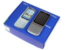
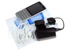
The retail package is as basic as it gets
There is also no microUSB cable included, so unless you have one at hand Bluetooth is your only option for connecting the C3-01 to your computer. All you get here is a nicely looking white hands-free set and a charger.
Nokia C3-01 Touch and Type 360-degree spin
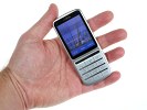
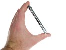
The Nokia C3-01 stretches to 111 x 47.5 x 11 mm and has a volume of 51.4 cc. That does sound bigger than the Nokia X3-02 with its 45.3 cc but the C3-01 is still one pretty compact phone. Unless you have the two of them side by side you won’t notice the difference.
The difference in weight is more pronounced though – 100 g vs 77.4 g. We for one like the solid feel of the added heft.
Design and construction
If there’s a single form factor where the Nokia designers are certainly a cut above the rest, it would certainly be slim and classic candybars. The C3-01 Touch and Type is marvelous to look at with its sleek curved lines and metallic back. We got the silver one for review, though the other versions look quite appealing too.
You can clearly see the 6700 classic (which we still find to be one of the most attractive phones ever) genes in the C3-01. The good news is that the introduction of touchscreen and larger display hasn’t done any harm to the overall look. If anything, the C3-01 Touch and Type looks better than the 6700 classic and different enough so it doesn’t get boring.
We start the hardware inspection with the Nokia C3-01 2.4" resistive touchscreen. Taking up the upper half of the front panel the LCD screen sports QVGA resolution and is capable of showing up to 256K colors. As you could imagine with specs like that the image quality is hardly something to write home about.
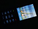
The screen ain’t much of a looker but does its job
Brightness is good but contrast is mediocre at best. We are actually not sure if talking about depth of black is appropriate here – grey is more like it.
Despite employing the resistive technology the C3-01 Touch and Type touchscreen is sensitive enough not to be bothering. Despite coming from a series of capacitive units we had very little trouble adapting to it. Plus resistive seems like a bit better match for a transition device like it (you can always employ the help of a stylus). This is also the reason we don’t object much to the relatively small display size.
The final thing we’d like to note about the touchscreen is its haptic feedback, which is Nokia’s specialty in this department. Wherever you tap on the display, you’ll feel the vibration right under your finger, unlike most competitors, where vibration seems to come from the same spot regardless of where you click.
We’ve been wondering for a while now how Nokia manages to create the illusion of the vibration feedback changing its place depending where you touch the phone but we still haven’t found the answer. Not that it really matters – what matters is the real usability bonus that this feature adds. The vibration touch feedback of the Touch and Type series is a real treat.
On top of the C3-01 display of the C3-01 we found the ambient light sensor and the earpiece.
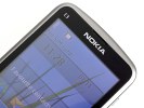
The ambient light sensor and the earpiece are on top
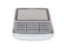
Under the display we find a silver-colored line hosting the two call handling keys. The number has been reduced since the X3-02 (music and messaging keys are gone) and that has allowed Nokia to reduce the size of this bar and free up more space for the multitap keyboard below. Since those two keys are elevated this shrinking hasn’t affected their usability too much and they are still easy to press.
The Nokia C3-01 Touch and Type packs a 12-key alphanumeric keypad with a standard layout as opposed to the odd layout on the X3-02. You are getting four rows with three icons each, rather than three rows with four buttons a piece. This means that the asterisk, hash key and the zero button are exactly where you expect them to be and you don’t need to get used to a new layout.
Keys are large enough and provide decent tactile feedback so the achievable typing speed isn’t bad at all. Still we have to admit we preferred the terraced layout of the X3-02 on this one. Nonetheless if you master the T9 input you’ll be doing just fine with the C3-01 too.
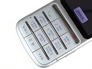
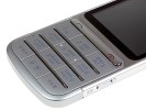
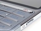
The keypad ain’t too shabby either
The mouthpiece is located on the left side of the keyboard, which leaves the bottom of the handset completely bare.
The left hand side of the Nokia C3-01 is completely bereft of functional elements too.
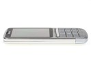
It’s plain and simple on the left too
On the right side one finds the screen lock key, the volume rocker and the the dedicated camera button. Strangely enough, there is a portion of the camera key that isn’t actually pressable and doesn’t seem to have any purpose. It might make it easier for you locate the key by touch, but then again so would have had a larger button.
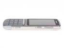
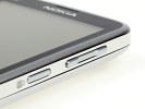
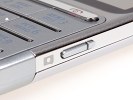
There are three keys on the right
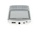
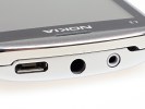
The top of the Nokia C3-01 features the microUSB port, the 3.5mm audio jack and the Nokia proprietary charger plug in that order. There is no protective cover over any of the apertures.
You’d be happy to know that USB charging and even USB-on-the-go are supported (though you do need a special cable for that). USB charging is not available on all Nokia phones, so we’re glad to see it this time around.
There are a few things of interest at the back. The loudspeaker is here and so is the LED flash but undoubtedly the star is the 5 megapixel camera lens.
Although fixed-focus, there are still some high expectations about this one – after the 6700 classic did so well in its time. But we’ll see how it fares later on.
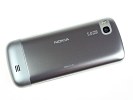
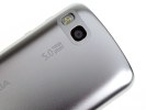
The 5 megapixel camera lens, the LED flash and the loudspeaker are at the back
Under the the steel battery cover sit the SIM bed, the (hot-swappable) microSD card slot and the 1050 mAh BL-45 Li-Ion battery. Despite the increased capacity its rated endurance is hardly much better than that of the X3-02. It goes 5 hours 30 minutes of talk time and 405 hours of stand-by on 3G networks.
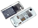
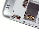
The microSD card slot is under the battery cover
Its real-life performance stands at about three days of moderate usage (30 minutes of telephony, 20 minutes of browsing over Wi-Fi per day and snapping the occasional photo).
At the end of the hardware part we are pleased to conclude that the build quality of the Nokia C3-01 Touch and Type is perhaps even better than that of the X3-02. If nothing else, the thicker metal back panel makes it look even more solid. As Touch and Type is trying to blend technology and tradition, it makes sense to give users a choice between classic (C3-01) and contemporary (X3-02).
Now off to the software part of our review. Join us after the break.
Reader comments
- Williamrhymn
- 12 Feb 2024
- atv
learn this here now galaxy swapper v2
- VictorSuisk
- 09 Oct 2023
- S43
click here for info https://ko1.onlinevideoconverter.pro/10df/download-video-instagram
- CharlesHit
- 26 Aug 2023
- yJt
see this NewYork Vacancy eBit Technology
