Nokia C7 review: Rise and shine
Rise and shine
The Symbian^3 user interface
The Nokia C7 is the second Symbian^3-powered device we get to take a closer look at. We’ve been on and on about Nokia needing to catch up with Android and iOS. The new version of Symbian is certainly a step in the right direction.
Update, 24.08.2011: We installed Symbian Anna - check out our impressions over here.
The Finnish software engineers finally realized that it’s a streamlined interface that people want and got rid of the whole tap-to-select-another-tap-to-confirm nonsense that made Symbian^1 so inconsistent.
So, Symbian^3 is a definite improvement for Nokia but it’s obvious they couldn’t have gone for a complete overhaul like Microsoft. That would’ve meant losing a lot of functionality and is probably the reason why the Finns went the evolutionary, rather than the revolutionary way.
Here's a demo video of Symbian ^3 running on the Nokia C7.
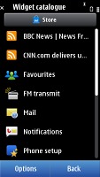
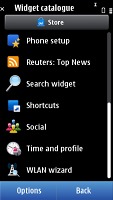
Symbian^3 does bring both visual and functionality changes. The homescreen is the most evident of those, its size now expanded to three panes worth of space. You are free to fill it up with widgets and reshuffle them as you see fit. If three panes are too much for you, you can delete the ones you don’t need.
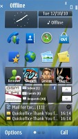
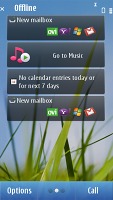
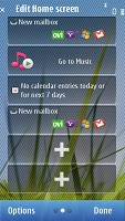
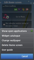
Symbian^3 comes with a new homescreen
You might notice that the homescreen panes start scrolling only after you have completed your swipe across the screen but that’s how it was designed to be and not some lag. Some of the widgets are side-scrollable and the phone waits to see if you want to use them or skip to the next screen. Nokia has plans to fix that, as we’ve heard.
Anyway, if you want immediate response you can scroll them by tapping the three dot symbol at the bottom of the screen.
The main menu structure is unchanged, retaining the hierarchical folder structure. This comes in contrast to Android, and mostly iOS, where you get a flat menu structure with all icons located on scrollable screens.
Now you are free to rearrange icons as you see fit so you might go for placing them all in the main folder and get a flat-ish menu system from Symbian^3 too. A list view mode is also available but that involves much more scrolling and that’s why we preferred to leave things in grid.
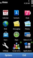

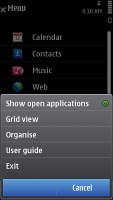
Not much has changed in the main menu
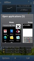
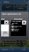
The task manager has also been changed and now shows screenshots of the running apps, instead of just icons. You also need only a single click to kill them this time.
The performance of the Symbian has also been taken up a notch with the ^3 version. The Nokia C7 feels snappy most of the time, with lags noticeable only when dealing with heavy apps or when there are a lot of apps running in the background.
And even though heavy multi-taskers will frown at the 256MB of RAM we didn’t get any “Out of memory” errors even when the camera and the web browser with two active tabs were running in background.
Unfortunately, the poor text input solution of Symbian^1 has been left unchanged by Symbian^3 and that’s probably our biggest grudge against the new OS (along with the web browser but we’ll come to that later).
We are talking about the virtual QWERTY, which takes you to a new screen to do your text input and gets you back when you’re done typing. That adds an extra step each time you need to do some typing. Not quite the simplicity we all want, is it?
Finally, we have to point out that Symbian^3 is less inclined to skimp on the eye-candy as opposed to its predecessors. There are icons bumping and revolving, menus being opened with a zoom in and out effects and the occasional fading in and out.
That’s again not quite up with the best, but considering that after some time too much effects become a nuisance we won’t be taking too many points away here.
Phonebook is pretty good
The Nokia C7 comes with a fully functional phonebook, which can easily be synced with your exchange account. Symbian has been offering users virtually unlimited phonebook capacity and excellent contact management for quite some time. Now it is starting to add some social network integration too.
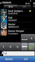
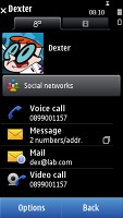
The C7 phonebook is pretty good
Contacts can be freely ordered by first or last name. You can also set whether the contacts from the SIM card, the phone memory and the service numbers will get displayed.
Selecting some of your contacts as favorites moves them to the top of the displayed list. This saves you quite a lot of scrolling.
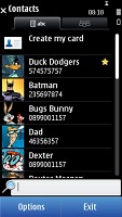
Marking a contact as favorite moves it on top of the list
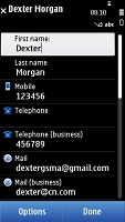
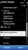
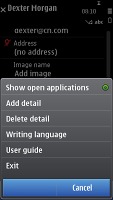
Editing a contact offers a great variety of preset fields and you can replicate each of them as many times as you like.
You can assign personal ringtones and videos to individual contacts. If you prefer, you may group your contacts and give each group a specific ringtone.
A really nice touch when editing a contact’s details is the option to enter their address by locating it on a map.
The social network integration includes Facebook and Twitter, which should be fine for the vast majority of users. However you will need to go an extra step to check out your contact’s status and then another one to see their profile. We agree it might have created a mess if that was all added to the already lengthy phonebook profile but one of those extra steps is probably a bit too much.

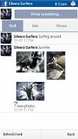
Checking out the Silver Surfer Facebook profile through the phonebook
Excellent telephony
We didn't experience any call-related issues with the Nokia C7. Reception is solid, voice quality good on both ends of a call. The earpiece is loud enough and there were no interferences whatsoever. There’s a second microphone used for active noise-cancellation.
Voice dialing is available on the C7 and gets activated by pressing and holding the call key on the home screen. It is fully speaker-independent and as far as we can tell performs greatly, recognizing all the names we threw at it.
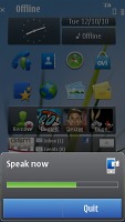
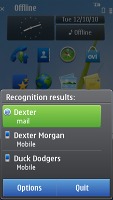
The C7 comes with pretty well tuned voice dialing
In noisier environments though, its effectiveness might suffer. Bear in mind too, that if you have multiple numbers assigned to a contact, the system will dial either the default number or the first in the list.
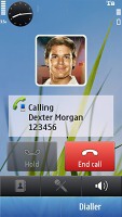
Smart dialing is also here, practical as ever. You just punch in a few letters from the desired contact’s name and select it from the list that comes up to initiate a call.
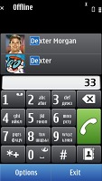
You can also use smart dialling
The final option for starting a call is via the Favorites widget on your homescreen. The C7 has the neat accelerometer-based feature that lets you mute the ringer by turning the phone face down. That same turn-to-mute trick also works for snoozing your alarm.
Thanks to the proximity sensor the screen turns off automatically when you hold the phone next to your cheek during a call.
The Nokia C7 sat our traditional loudspeaker test. The phone did well there too. The Good mark it snatched means it should be loud enough for nearly every situation. More info on the test, as well as other results can be found here.
| Speakerphone test | Voice, dB | Ringing | Overall score | |
| Apple iPhone 4 | 65.1 | 60.3 | 66.2 | |
| Samsung I9000 Galaxy S | 66.6 | 65.9 | 66.6 | |
| 68.0 | 61.7 | 77.3 | Average | |
| Nokia C7 | 66.6 | 65.8 | 75.9 | Good |
| Nokia X6 | 69.2 | 66.7 | 72.5 | Good |
| Nokia N8 | 75.8 | 66.2 | 82.7 | Very Good |
| HTC Desire | 76.6 | 75.7 | 84.6 | Excellent |
Solid messaging deserves a better keyboard
The Nokia C7 can easily cater for all your messaging needs, but chances are you will find the virtual keyboard rather annoying. It’s not so much the QWERTY keyboard itself, which is spacious and comfortable but the fact that it opens in a separate screen with a dedicated text box. There’s no multi-touch support here either so two-handed typing is likely to produce more thumbos than usual.
And that nuisance is not exclusive to the messaging department – it’s the way the keyboards function throughout the UI.
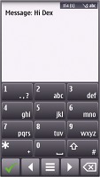
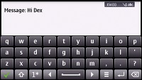
The keyboard is probably the worst part of Symbian^3
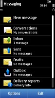
All your incoming messages arrive in a common inbox. If you like, you can also get them sorted as conversations, in threaded view.
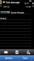
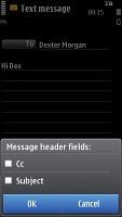
The Nokia C7 relies on a shared editor for all the types of messages. Stuff like a character counter in SMS goes without saying.
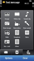
Insert some multimedia content the message is automatically transformed into an MMS. In that case, the character counter turns into a data counter showing kilobytes.
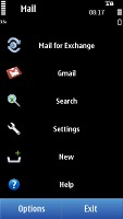
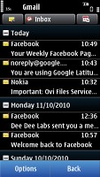
The Nokia C7 email client allowed us to setup our Gmail account quite easily, while getting it to sync with an Exchange ActiveSync server took a couple of tries. In most cases though, all you need is to enter a username and a password and you will be good to go in no time.
Multiple email accounts and various security protocols are supported, so you can bet almost any mail service will run trouble-free on your Nokia C7.
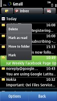
Messages can be filtered by various criteria such as date, sender, subject, priority or even by attachments, searching is available as well.
The client can download headers only or entire messages, and can be set to automatically check mail at a given interval. A nice feature allows you to schedule sending email next time an internet connection is available. This can save you some data charges since you can use the next available WLAN connection instead.
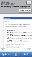
There is also support for attachments, signatures and basically everything you would normally need on a mobile device.
Reader comments
- y.msster
- 14 Jun 2021
- r3a
At where can I get this phone right now
- Siva
- 13 Apr 2017
- D0h
My phone is not charing ang working. In shop don't remadulation in this phone they told give your kind advice .I want this phone work.
- Anonymous
- 27 Dec 2016
- 354
dashing
