Nokia E75 review: Business on the slide
Business on the slide
Retail package is decently stuffed
The Nokia E75 is pretty decently equipped and that was probably to be expected considering the price tag. The phone comes with a 4GB microSD card, a USB cable and of course a DC charger.
Unfortunately we didn't find a leather carrying case in the box like the one for the E71. Quite a nice accessory, this is probably the thing we miss most from the retail package.
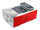
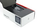
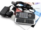
The retail package is moderately well equipped
The supplied handsfree is one piece, which means you cannot use the remote with another headset. Finally, there is a whole load of paperwork including manuals, quick start guides, a few leaflets plus the required sync software on CD.
Nokia E75 360-degree spin
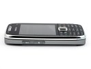
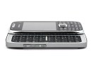
A slide-out QWERTY keyboard suggests the E75 might be a bit chunky. Not a bit of it though - at 111.8 x 50 x 14.4 mm and a volume of only 69 cc, it turned out to be more compact than we expected.
Sure it's thicker than the E71 but not as wide and so is not much more difficult to squeeze into a pocket. It is 12 grams heavier than the E71, but we doubt that will be a noticeable difference in daily use.
Design and construction
Design-wise the Nokia E75 is a phone of two faces. Its steel back is a joy to look at, even more so than the E71 because of its slender shape. However the front panel is not nearly as attractive. The number pad is made of cheap looking plastic and doesn't really ooze the style and solidity that the E-series is famous for.
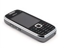
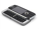
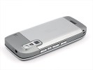
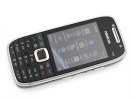
The design has its ups and downs
We certainly don't want to rekindle the debate that our conclusions on the glossy plastic used on the Nokia N96 provoked, but we are not particularly fond of the fact that an E-series device gets this kind of treatment.
Based on the tacky keypad, we were expecting to be disappointed by the slide-sliding QWERTY - but the quality took a turn for the better with a very solid looking, chrome-framed keyboard. To add to the positive impression, the phone keeps quite a compact shape even with the keyboard out, and the handling is comfortable and secure.
The ambient light sensor and the video-call camera are at the top of the front panel of the Nokia E75, either side of the earpiece. Below them is the 2.4" display, followed by the D-pad, which is quite comfortable to use. It has a programmable LED in the center that can be set to indicate missed events or simply serve as a standby breathing light.
We don't mean to sound to pretentious, but we would have liked it quite much if the E-series had finally been updated with a larger display - say, something like a 2.8-incher would have been great. Instead, here we see the same diagonal as on Nokia E66.

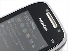
The ambient light sensor and the video-call camera
There are eight system keys, level with the D-pad, including the usual Nokia foursome - Call and End keys and two soft-keys. The end key doubles as a power switch, unlike the E71, which has a dedicated button for the purpose. Given the garish red power button they inexplicably added to the E71, this key combo might actually be something to be thankful for! On the other hand if you have a habit of hitting the End key repeatedly for going to the homescreen you might end up turning your E75 off by accident now and then.
The other four keys around the D-pad are menu, backspace and the typical E-series one-touch keys for calendar and messaging. However, these last two can be programmed to serve whatever purpose you like, two commands assignable to each of them. The first will respond to a short press, the second to a press-and-hold.
The problem with all those eight keys around the D-pad is that they are rather small and cramped. In addition, each pair of them shares a plastic knob with a rocker-like action, which can occasionally lead to mispresses.
The buttons on the inside (bordering on the D-pad) have a rather flimsy press too. To be honest, it's nothing critical and you will get used to the control pad but the form factor has inevitably led to some compromises. In short, the layout and handling of the controls on the E75 are inferior to the E71, though that's before we've passed judgment on the QWERTY keyboard.
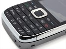

The eight keys around the display are way too tiny
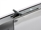
The left side of the Nokia E75 is where the microUSB port and the microSD card slot are. They're both covered with plastic lids to avoid getting filled with dust and dirt. Those fit firmly in place and can be somewhat tricky to use as they are a little stiff.
The bottom is where the standard charger port is. Next to it is the mic right at the very edge.
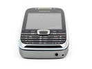
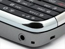
The charging port is at the bottom right next to the microphone pinhole
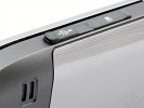
The right side of the E75 comprises four keys and the lanyard eyelet. The keys include two volume controls, a voice command shortcut and a camera key. While it has full functionality, including autofocus half-press and camera launch, it is quite poorly designed.
The camera key clicks unpleasantly every time you press it and a tangible wobble makes it less than a joy to use. But these are just minor complaints compared to the amount of time it takes for the camera to actually start.
Yes, it's a good idea they have made it resistant to accidental presses, but needing to press it for good 4-5 seconds before the camera starts is hardly ideal when you want to capture a 'moment'.
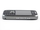
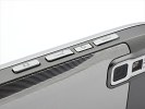
No less than four keys are to be found on the right
On the other hand, if you consider the camera handling on the E71, a dedicated shutter key is still a blessing and you might be willing to forgive some of the other issues.
Reader comments
- Kaanaismyfriend
- 01 Apr 2020
- U@G
I have this phone from a decade,works good enough until now.
- Bugged Out
- 13 Apr 2017
- Fv4
It's funny that this phone's 3.2MP camera is produce better shots than the 5 or 8MP's of most smartphones today.
- ace
- 28 Oct 2012
- KFP
have been using this fone for over 3 years now. All in all it served great to all my needs. And it was really great for those who didnt use autotype (which is obselete nowadays but still a few years back). The mail app of this phone is now obselete t...
