Nokia Lumia 1320 review: Playing by the book
Playing by the book
User interface: GDR3 + Lumia Black
The Nokia Lumia 1320 comes with Windows Phone 8 GDR3 (the Lumia Black edition) out of the box. The Microsoft-issued GDR3 release and the Nokia-made Black enhancements add a handful of new features, which we'll go through now.
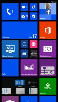
That said, the user interface still feels very familiar if you are coming from another Windows Phone device. Yes, you can fit more Live Tiles per row on the homescreen (6 of the smallest ones, up from 4), but that turned out to be a function of the screen size rather than a Lumia Black specific feature. There are a couple of other changes, we'll get to those in a minute.
Here is a quick video to get you started:
A push on the unlock button or a double tap on the screen reveals the lockscreen, which displays the current time and date and shows calendar events, emails and missed calls. Pushing the volume rocker in either direction will bring the sound switch and music controls on top of the screen.
Swiping the lockscreen up unlocks the device or you can just press and hold the camera shutter key to unlock the phone and jump straight into the camera app.
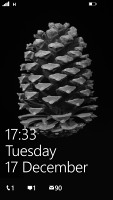
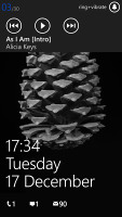
The lock screen • Music controls on the lockscreen
There's a reasonable level of flexibility and functionality to the lockscreen - the Live Apps service allows apps to display notifications and images. You can set one app to display big notifications ("detailed status") and up to five more apps to show a less detailed quick status. There are already apps in the Store that display the battery percentage on the lockscreen via those kind of notifications.
The lockscreen wallpaper can also be controlled by apps - you can let the music player replace the lockscreen image with the album art of the currently playing track, or let one of the installed apps choose the image (e.g. Bing's beautiful background images or photos from your Facebook account).
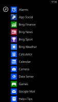
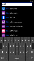
The Modern UI is a vertical grid of Live Tiles, which can be reordered any way you like. Almost anything can be pinned to the homescreen - apps, contacts, web pages and more. Unfortunately, the app launcher is still just an alphabetical list of all apps, no folders, no icon grid. We don't think it works too well on a 6" screen.
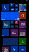
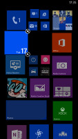
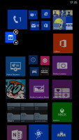
Windows Phone 8 lets you resize the live tiles. Upon a tap and hold, you'll get an extra resize button, next to the unpin one. You can opt between a quarter, normal and double size. If you select the smallest one though, the tile will be just a static icon (as is in the regular menu).
Most Live tiles display relevant info such as the current date, pending calendar events, missed calls, unread emails and more (third party apps do it too). The Marketplace tile displays the number of updates available, while the Pictures tile is essentially a slideshow of your photos. It's nice to have all that info always available at-a-glance. You can look at them as homescreen widgets of sorts.
WP8 can do multitasking, though not with the level of user control that Android allows. Apps not in the foreground are suspended, but the OS has ways to take over and carry out the task for them (e.g. continue playing music). If an app needs to run in the background (sat-nav clients, messengers, etc.) it can. Microsoft is expected to bring an even better multi-tasking with the Windows Phone 8.1 update.
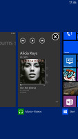
The new feature in GDR3 is that you can "close" apps by hitting the X button. It's not as comfortable as swiping apps away, but at least now you have control over the recent apps list.
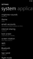
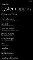
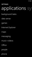
Opening the settings menu displays two sets of options: like on the start screen, you can swipe between System and Applications. System covers all the settings you can think of like sounds, color theme, Wi-Fi, Bluetooth, Accounts, etc. The Application settings let you configure each app you have on the device.
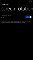
We would've liked to see some kind of quick toggles in Windows Phone 8 to spare you the need to go all the way to the Settings submenu to enable Wi-Fi, Bluetooth, GPS and the likes. There's a new Screen rotation lock feature, but it requires you to exit the app, find it in the settings, enable it and then get back to the app. The same goes for all the other settings, it's just too many steps for such a common task.
Another feature we feel is missing is a place where you can see all of your notifications from various apps. Live Tiles manage to show notifications from each app to some extent, but they don't really have enough room for things like e-mail subject and such, while Android and iOS notification areas do. Microsoft has confirmed it's working on just such a feature and that we should see it in a future update.
Android, for example, has a widget that shows you a list of emails complete with the subject and a line of the message body. You can scroll through that list and hit a specific message to read it. There are more examples of how widgets are more interactive than Live Tiles and while the difference is relatively minor on the small 4" screen of the Lumia 520, the setup feels limiting on the large, 720p screen of the Lumia 1320. Let's not even mention the split-screen multitasking and mini apps that are popular on 5+ inch devices and are certainly not present here.
The Lumia 1320 comes with the Data Sense app, which shows you the amount of data you've used. Both cellular and Wi-Fi traffic is accounted for. There are different data limit types: one-time, monthly and unlimited. The first two accept custom bandwidth limit values, while the latter is applicable if you have an unlimited data plan, but would still like to track your usage. With GDR3 there's an option to prevent data usage when roaming.
Data Sense can also restrict the background data usage for all apps, provided you're near a preset data limit. This will prevent some apps from functioning properly, though.
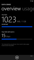
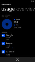
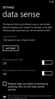
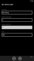
Data Sense is useful if you're on a limited data plan
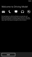
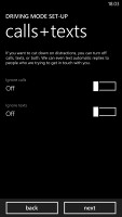
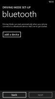
Driving Mode can be enabled automatically when the phablet connects to a specific Bluetooth device (i.e. your car's stereo). This mode mutes all notifications except calls and texts, but you can mute those too. If you do, you can set an automatic reply text.
Microsoft is trying to appeal to business users too - a company can create its own Hub where employees can find news, calendars and other info relevant to their work. Companies can also create their own apps that only employees can install.
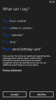
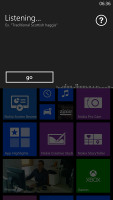
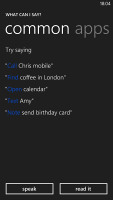
Being a WP8 handset, the Nokia Lumia 1320 also supports voice commands - you can dictate or have the phone read text out, you can initiate searches and so on. Unfortunately, the Windows assistant is still far behind the competition as far as recognition speed and accuracy are concerned. Microsoft is said to be working on a new virtual assistant dubbed Cortana, which should premiere with WP8.1 in US English in early 2014 and before the end of 2014 for the rest of the world (in 44 additional languages).
Reader comments
- Tony
- 17 Nov 2017
- CGH
I want deleted my outlooks photos and I can do it how will go
- nadeem
- 25 Jun 2016
- S9e
Thanks have a problem with my phone , the call history didn't appear
- laxman
- 18 Jun 2016
- rA{
Nokia and Microsoft has given the Lumia 1320 phone as office phone. But it does not support pendrive connectivity via OTG cable. This create difficulty to take files from phone to pen drive. If it is possible then it will reduce more efforts...
