Nokia Lumia 920 review: The Luminary
The Luminary
People Hub for contacts and social networking
People Hub is the best phone/social book up to date. The first tab shows you a list of all your contacts (phone contacts, social network friends, email contacts - everything), with a search shortcut and an Add Contact button.
Contacts are ordered alphabetically, indexed with colored letter tiles. You can tap any one of those letter boxes and the screen shows you the entire alphabet highlighting the letters actually in use. You can tap a letter to scroll to that part of the list.
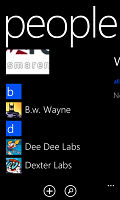
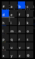
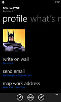
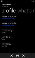
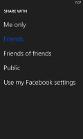
Contacts • using the index letter tiles • viewing a contact's profile
Contacts can be sorted by either first name or last, and they can be displayed as "First Last" or "Last, First" (the two settings are separate). You can also filter contacts by choosing which services are used to make the list of your contacts (so you can hide Twitter contacts, for example).
Swiping to the side brings you to the What's new tab that shows new events from all contacts in social networks. Another swipe shows the recent contacts. Instead of favorites, you can pin a contact to the homescreen.
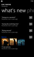


What's new • photos • history tabs
The next tab is Rooms and Groups. Groups is a handy way to organize your contacts, with "text everyone" and "email everyone" features. All the status updates from the grouped contacts are pulled in from their various social networks, and you get access to their online photo albums too. Groups can also be pinned to the homescreen for easier access.
Rooms is similar but more advanced - it's a private social network of sorts. Rooms allows group chats, but also sharing a private calendar, notes (including to-do lists), photos and videos. The default Room is the Family room and you can easily invite your relatives.
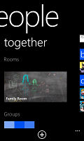
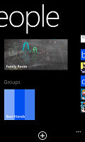

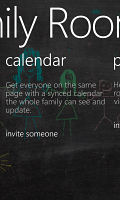
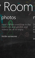

Rooms have a ton of functionality
The cool thing is that they don't all need WP8 phones to get in - Windows Phone 7 handsets and iPhones can join a room too, though they only get the shared calendar. Android users are left out. Still, Rooms is a great way to keep in touch and get organized, while avoiding the clutter of Facebook and the likes where everyone has too many friends and too many notifications waiting for them.
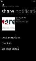
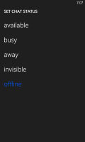
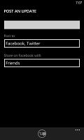
The Me card is your own profile. From here you can post status updates, set chat status, check into locations. You can also change your profile picture (only for Facebook and Live though, still not Twitter).
Another tab in the Me card lets you view notifications (e.g. Twitter mentions) and, finally, What's new lets you view your own status updates.
Much of the functionality available when viewing the list of all contacts is there when viewing a single contact. Below the contact's photo and their latest SNS update, there are actions - "call mobile", "text mobile", "write on wall", "view website" and so on. Below each action, in smaller type are the target for the action (e.g. phone number, email, site URL) and where that info came from (Google, Facebook, etc.).
The soft keys let you pin a contact, link two (or more) contacts from the various services and edit. Swiping to the side brings out the What's new tab, which shows the latest updates and events just from that contact. Pictures is where the contact's Facebook albums are.
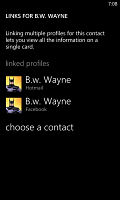
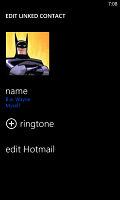
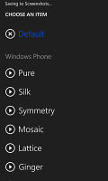
Linking two contact entries • editing a contact
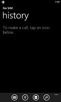
The History tab displays the complete history of exchange with a contact in one place, listed chronologically. Everything but status updates is listed here: calls, texts (actually threads from the Messaging hub) and emails.
When editing a contact, you can add multiple phone numbers and email addresses of different types (home, work, etc.), a custom ringtone, a note or a variety of different fields (like birthday, website, office location and so on).
Telephony is good, but the ringer is quiet
The Nokia Lumia 920 offered loud and clear in-call sound and we had no issues with signal reception.
The phone application shows you the call history, with shortcuts to voice mail, dialer and phonebook. The phone live tile will show the number of missed calls as will the lock screen.
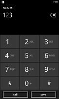
The dialer itself is as simple as it gets - a phone keypad with a Call and a Save button. The lack of smart dialing is an annoyance, but the People hub is good at finding contacts.
You could use voice dialing instead - the Microsoft's TellMe did well in recognizing our commands.
Upon an incoming call, the contact's photo will appear full screen for you to slide up and reveal the call buttons. This will prevent any calls from being accidentally answered or rejected.
A side note - status indicators are hidden by default (except the clock) but you can bring them up with a quick tap at the very top of the screen.
We ran our traditional loudspeaker test and the Lumia 920 scored an average. The loudspeaker isn't the loudest around but missed calls shouldn't be a problem. You can read more about how we do tests here.
| Speakerphone test | Voice, dB | Ringing | Overal score | |
| 61.6 | 64.8 | 65.8 | Below Average | |
| 66.8 | 66.1 | 67.7 | ||
| HTC One X | 65.1 | 66.0 | 75.8 | |
| 67.2 | 66.6 | 70.7 | Average | |
| 75.1 | 66.5 | 75.0 | ||
| Samsung Note II N7100 | 70.0 | 66.6 | 80.5 | |
| 66.5 | 66.6 | 75.7 | Good | |
| Motorola RAZR XT910 | 74.7 | 66.6 | 82.1 | Very Good |
| 74.6 | 71.3 | 82.7 | Excellent | |
| 73.7 | 73.5 | 82.7 | Excellent |
Powerful messaging
The Messaging department is excellent in Windows Phone. Threads are the building blocks of all non-email messaging. Although a sort of conversation view, threads mash together SMS, Facebook and Windows Live messages.
That's the thing about Windows Phone: the Messaging hub removes the old division between texts, IMs, social messages. The other hubs do the same for the other functionality, making the whole thing simple yet powerful.
Messaging is separated into two tabs - threads and online. Online shows you who's online with the people you've talked to most recently on top. This makes finding someone to talk to very easy.


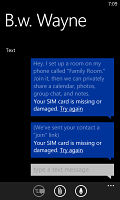
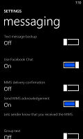
Messaging • Threads • Settings
Threads is where this hub's impressive features kick in. A new thread is created for each person you start a chat with. Messages are displayed as speech bubbles and a label on the left shows the type of message - text, Facebook or Live Messenger. Labels are only displayed when the conversation moves across platforms to avoid clutter.
You can choose which service to use to send a reply and the text box will remind you of what you're currently using with a message like "chat on Facebook". Individual messages can be copied (only the whole message), they can be deleted or forwarded. Whole threads can be deleted too.
The visual voicemail functionality is also part of the OS (but its availability is dependent on your plan and the carrier). It works as expected, letting you read your voicemail messages instead of listening to them.
Windows Phone 8 offers a unified inbox for email, a feature introduced with 7.5. You can link multiple inboxes (and unlink them individually later), so that you have a single place to check for new messages.
Linking several inboxes will also automatically combine their live tiles. You can browse individual folders for each account, which lets you view messages from only one email account even if it's linked.
The email client
Conversation view lists emails between you and a contact chronologically, grouping them by subject. It's the display style that Gmail popularized and is the best way to keep track of a conversation over email.
Each email conversation is listed with a subject and number of messages, plus how many of those are new. A tap on a conversation expands it to show the messages and a line from each message.
You can tap on an individual message to read it, as well as skip messages back and forward to navigate the conversation. You can't swipe between the messages though.
You can mark individual emails, mark them as read/unread, set flag, clear flag and more. Finally, you can search your entire mail for individual emails - it's a very useful feature, especially for those with large inboxes.
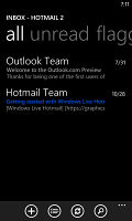
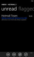

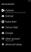
Reading through new emails • only unread emails • email folders • popular email services are supported
Text input on Windows Phone is limited to the default QWERTY keyboard and offers portrait and landscape modes. The layout remains the same across all WP devices and the only options you have are changing the language of the keyboard and resetting the dictionary that displays word suggestions. Luckily, Windows Phone 8 has way more supported languages than its predecessor.
The WP QWERTY keyboard is very comfortable to use and offers sound feedback. There's no haptic vibration feedback and there's no way of enabling it.
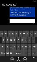
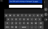
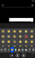
Portrait and landscape QWERTY keyboards • a ton of emoji icons
Selecting text is very simple, but does require some getting used to. You hold your finger over some text for a second or two and then release. The text area gets highlighted and then you can move the beginning and end cursors to adjust how much text you want to select. A little icon pops up with the available actions and the selected text is available to paste anywhere in the OS.
Reader comments
- 144
- 26 Jun 2023
- GXs
Nou anymore no
- Anonymous
- 17 Oct 2021
- XE$
Does it operate WhatsApp
