Nokia N1 review: Rebirth
Rebirth
User interface
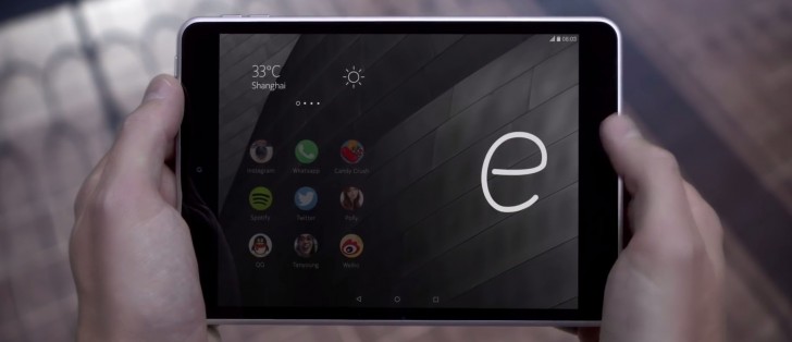
The Nokia N1 tablet runs on Android 5.0.2 Lollipop though you wouldn't know it just from looking at the homescreen. The company has customized the experience pretty thoroughly, using a launcher interface called Z Launcher. If it's not to your liking however, there is an option in Settings allowing you to switch the UI to a more traditional Android layout. Even with the custom UI set to ON however, the Settings menu, the keyboard and the task switcher look just as you would expect on Android.
We got our tablet from China and it doesn't come with Google Play, but units sold on the international market should come with the Play Store. Even the Chinese tablet has access to some of Google's apps, those can be downloaded from the Nokia Store. Those don't work without the Google Play Services, which aren't available though.
The lockscreen is pretty standard, showing the current notification and a camera shortcut. One small addition we like is that while charging the lockscreen will show a "Time until full" reading, which gives you an estimate when the N1 is ready to be unhooked.
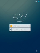
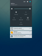
A standard post-KitKat lockscreen
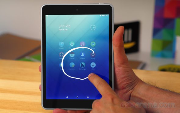
The homescreen is Nokia's Z Launcher, which is built around the idea of handwriting recognition as the way to find the app you need. There's an alphabetized list of all apps (grouped by three letters: ABC, DEF, GHI...) if you want it, but it's easier to scribble a letter or two.
One thing that needs work is that the launcher recognizes only one letter at a time. You can't write "CA" and wait for the calendar to appear, you have to do "C" and then "A" in the rare case the needed app doesn't appear. It's not just for apps, the launcher will use Google (or another search engine) to offer quick access to web search result. This is one area where multi-letter recognition would have helped greatly.
Another drawback is that while the screen is pretty high res itself, the UI icons and some system texts seem to be upscaled from a lower resolution. And that's a big turn-off by our books.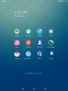
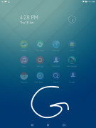
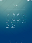
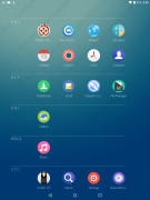
The most used apps on the homescreen • searching with scribbling • web results • all apps
The launcher learns from your use patterns and offers the most used apps on the main homescreen pane so often you don't even have to scribble search. It will even detect which apps are used together and will group them in a folder.
The latest version of the Z Launcher has a pane on the left for widgets, though our tablet hasn't gotten the update yet. The Z Launcher is available on the Play Store in its latest version so this is an annoying oversight.
The notification area is stock Android. One pull shows the notifications, a second pull reveals the quick toggles plus a brightness slider. The selection of quick toggles is a bit sparse if you're used to custom jobs and cannot be customized.
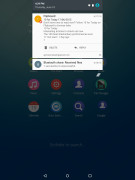
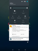
The notification area: first pull for notifications • second pull for quick toggles
The Nokia N1 software comes with full support for multiple users. You can create more than one additional accounts (the LG G4 is limited to just one extra, for example) and accounts can be of two types - fully fledged or limited. Full accounts get their own app selection, while limited accounts have access to what the owner of the tablet has allowed and seem a great match for a kid account.
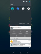
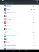
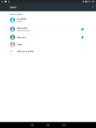
Switching between multiple users • whitelisted apps for restricted accounts • managing accounts
There's a pre-made Guest account so the tablet is ready for sharing right out of the box. Switching between accounts is pretty cool tool - when coming back to the guest account, the tablet will ask if you want to continue the old session (with the apps you had open as you left them) or start a new one. Starting anew takes you through the 30-second tutorial that explains the Z Launcher.
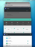
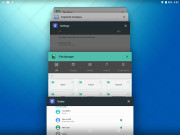
Multitasking is handled just like on other Androids with the 3D card interface. There are no split-screen options here.
The settings page fits almost entirely on a single screen. It's organized into categories (Wireless & networks, Device, etc.) and each category is listed in two columns. It's a compact, easy to navigate arrangement but you can also use the search function if you get lost.
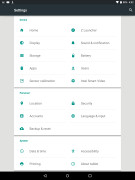
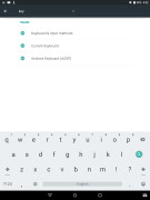
The compact Settings screen • searching though the options
The Nokia N1 comes preloaded mostly with custom apps, some are customizations of the vanilla Android apps though. The end result is quite messy at the moment - the music player looks has Gingerbread-era looks, the Gallery is in ICS Holo style while the email app is Material design.
Reader comments
- Ricky
- 26 Oct 2016
- g}u
Plzzz launch new android 4g phone.. And this phone is jhand
- Santhosh sathish
- 21 Oct 2016
- D06
Plz launched new android mobiles New feauters Tablets 3G,4G
- Rose
- 17 Oct 2016
- QSY
Cannot get the flight mode to turn off. Now what??
