Nokia N8 review: Director of photography
Director of photography
Symbian^3 user interface
The Nokia N8 is the pioneer of the new Symbian^3 OS, which according to Nokia should be the first step in the company’s fightback against Android and iOS. We wish it could somehow magically leapfrog the two currently leading platforms but those things just don’t happen overnight.
Update, 24.08.2011: We updated the phone to Symbian Anna - check out our impressions on Page 10.
Of course they might have gone for a total overhaul by starting from scratch as Microsoft did but that would mean losing a lot of functionality and that’s probably the reason Nokia went for the evolutionary, rather than the revolutionary way.
The new OS is certainly not up with the best just yet but is certainly a step in the right direction. The Finnish software engineers finally realized that it’s a streamlined interface that people want and got rid of the whole tap-to-select-another-tap-to-activate non-sense approach that made Symbian^1 so inconsistent.
There are still some traces of that illogical interface in the camera interface, but we are hoping those will be gone soon too.
Here's a short video demo of the user interface in action.
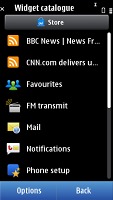
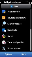
The new OS also brings some nice UI layout and functionality changes. The homescreen is the most evident of those, its size now expanded to three panes worth of space. You are then free to fill them up with widgets and then rearrange them as you see fit. If three panels are too much for you, you can also delete some of them.
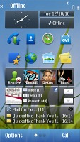
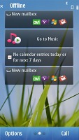
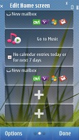
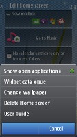
Symbian^3 comes with a new homescreen
You might notice that the homescreen starts scrolling only after you have completed your swipe across the screen but that’s how it was designed and not some lag. Because of the fact that some widgets are side-scrollable the handset waits to see if you want to browse them or skip to the next screen.
Still if you want to see immediate response you can scroll through them by clicking the three dot symbol at the bottom of the screen.
The main menu structure is unchanged, retaining the folders format. This comes in contrast to Android, and mostly iOS, where you get a flat menu structure with all icons located on side-scrollable panes. Now you are free to rearrange icons as you see fit so you might go for placing them all in the main folder and get a flat-ish menu system from Symbian^3 too. A list view mode is also available but that involves much more scrolling and that’s why we preferred to leave things in grid.
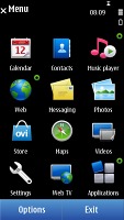
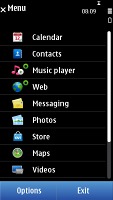
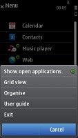
Not much has changed in the main menu
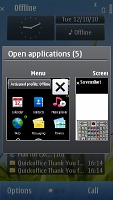
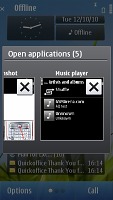
The task manager has also been changed and now shows screenshots of the running apps, instead of just icons. You also need only a single click to kill them this time.
The performance of the Symbian has also been taken up a notch with the ^3 version. The Nokia N8 feels snappy most of the time, with lags noticeable only when dealing with heavy apps or when there are a lot of apps running in the background.
And even though heavy multi-taskers will frown at the 256MB of RAM we didn’t get any “Out of memory” errors even when playing the rather demanding NFS Shift game with the camera and the web browser with two tabs open running in background.
Unfortunately the poor text input solution of Symbian^1 has been left unchanged by Symbian^3 and that’s probably our biggest grudge against the new OS (along with the web browser but we’ll come to that later).
We are talking about the virtual QWERTY, which takes you to a new screen to do your text input and gets you back when you’re done typing. That adds an extra step each time you need to do some typing. Not quite the simplicity we all want, is it?
Finally, we have point out that Symbian^3 has introduced quite some eye-candy as opposed to its predecessors. There are icons bumping and revolving, menus being opened with a zoom in and out effects and the occasional fading in and out.
That’s again not quite up with the best, but considering that after some time too much effects become a nuisance we won’t be taking too many points away here.
So generally Symbian^3 is to Android and iOS what the N8 is to their best representatives – a step closer but not quite there. Once again though, considering the pricing we would call it adequate and certainly not a deal breaker.
Reader comments
- Anonymous
- 07 Feb 2025
- gq9
Yes it can be replaced if you're handy, it's not that difficult like the current phones. A good torx screwdriver and a new battery and you can replace the battery.
- Anonymous
- 07 Nov 2024
- fnE
My Nokia N8 went off how can i recover data from its hard disk
- Anonymous
- 20 Jan 2024
- vaS
>Battery is not user-replaceable I didn't know they posted something like this. Turns out you only need to loosen 1 screw on top and the top part opens. Just be careful with the ribbon.
