Nokia N85 review: Nseries revved up
Nseries revved up
Killer display
The Nokia N85 screen sure is amazing. The 2.6" QVGA OLED unit has incredible contrast that can't be matched by any TFT display. The pitch black color the N85 renders is way beyond the reach of even Apple's iPhone.


Quite a display on this fella, isn't it?
The brightness levels are quite good though not as spectacular. This is probably one reason why the display has relatively low sunlight legibility. On the other hand the subdued brightness makes the colors even deeper and more vibrant indoors.
Adequate keypad
Sliding the Nokia N85 up reveals the alphanumeric keypad. It isn't the very definition of user-friendliness but isn't too bad either. The typing experience is by no means inferior to N96, and looks - like with all the plastic bits - are better.
The subtle ridges between rows are the better approach compared to N96. Press feedback is good. There are virtually no borders between keys on the same row. That's not such big a deal given the decently sized keys.


The keypad looks and feels more solid than that of N96
Sliding the phone in the other direction reveals the dedicated music player/gallery/gaming keys. In fact all four keys are usable in the music player mode and the gallery. In the latter case the top and the bottom are for zooming in and out, while the middle couple controls the slideshow.
The two middle keys are also the only ones used for gaming. Have in mind that people with larger fingers might have some problems with the size of those keys. N96 makes better use of the upper slide, all the space available to the actual keys. On N85 the controls are ridged by a frame and squeezed into the top part of the upper slider.


There is insufficient headroom for the keys at the top
The backlighting of Nokia N85 is fairly strong, but solid enough and looking nice in the dark. Combined with the amazing display the phone is a joy to look at.


The phone is great to look at in the dark
User interface: Cool looking Symbian
Nokia N85 runs on the Symbian 9.3 OS with Series60 3rd Edition user interface. Feature Pack 2 comes preinstalled, bringing some visual and performance improvements.
The layout is quite familiar with status icons displayed at the top of the screen and the soft key labels taking the bottom. Quite naturally, Nokia N85 also supports Active standby with two optional layouts.
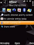
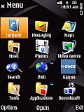
Nokia N85 runs on Symbian 9.3 OS
The active standby screen is a nice and convenient way of bringing shortcuts to all favorite applications to your home screen. You can even assign shortcuts to websites of your choice for quicker access. The screen can either be organized in vertical or horizontal tabs which can then be scrolled with the D-pad. If active standby is disabled the direction keys of the D-pad can also be assigned a shortcut of your choice.

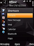
There are two available active standby modes
Active standby or not, you can always change the shortcuts assigned to the two soft keys to best suit your needs.
The active standby can also be switched off
Nokia N85 can automatically rotate the user interface thanks to the built-in accelerometer. In addition the UI automatically goes landscape if you slide to reveal the music player/gallery keys.
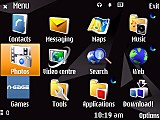
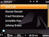
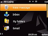
The UI can also work in landscpape mode
Nokia N85 also features the new and improved task manager that comes with the new FP. It is also now somewhat better looking and is appearing on top of every pop-up menu. The shortcut used in previous versions of the OS by pressing and holding the menu key still works.
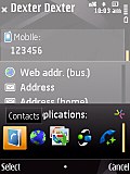
The task manager is really convenient
Finally, the S60 UI Feature Pack 2 brings some nice transition effects. The Symbian OS has been all too well known for offering little eye-candy but now it seems to be trying to catch up. It is still far from, say Apple iPhone standards, but those are too different devices for such a comparison to be fair.
The multimedia menu is another of the Nseries phones important features. It is launched via the dedicated key and provides quick access to the multimedia features of the handset with thematically sorted shortcuts. They appear as drop-down lists when the respective tab is selected. Those can also be freely reordered if the layout isn't your cup of tea.
Being one of the most important things to performance, let's have a look at the CPU unit of the N85. The handset uses a single ARM 11 369 MHz CPU with no dedicated graphic accelerator. This still fares quite well in Symbian terms, as far as UI responsiveness is concerned. The phone reacts quickly, if not instantly, to most commands across menus.
The gallery however is an entirely different story. It takes about a minute to zoom in on a photo taken with the N85 very camera and that's simply ridiculous. The video playback issues are also somewhat more frequent than we would've liked. Having dealt with other Nokia phones with similar CPUs, we've those tasks handled much better. We are therefore wondering whether some software issues are troubling the N85.
The Nokia N85 user-available memory extends to a little less than 85MB topped with the 8GB card that ships along. That should get you pretty much covered (not to say spoiled) for installing any software you like.
Reader comments
- intekhab
- 27 Dec 2010
- vw3
i have also n85 but i like its music n thie phone is differ from regular nokia phones n have u try the n gage.n wat a design of this fon the dual slid is superb....
- ashki
- 04 Dec 2010
- pT7
get it its good!!