Nokia N86 8MP review: Lens wide open
Lens wide open
Retail package - bare minimum
Having just forked out on a high-end handset you kind of feel entitled to a couple of treats in the retail package. The Nokia N86 8MP however fails to deliver, bringing only the most essential stuff along.
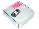
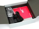
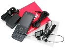
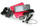
Not much to get excited about in the box
Inside the mid-sized container you will find a regular charger, a USB data cable and a two-piece headset that lets you swap the headphones and keep the remote. Nokia OVI suite (as it is now known) is also included on a disk, as well as a hard copy of a user guide.
There is no memory card supplied as Nokia probably thought 8GB of internal storage would do for a start. The thing is it does, really.
Nokia N86 8MP 360-degree spin
At 103.4 x 51.4 x 16.5 mm, totaling a volume of 69 cc the Nokia N86 8MP is a reasonably sized handset considering the feature load. If it wasn't for the dual-slide design, we bet a few more millimeters could've been trimmed here and there. As things stand now - you can easily find a more compact 8MP cameraphone or a more compact smartphone, but not both.
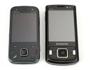
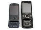
Believe it or not, the N86 8MP is heavier than the Samsung INNOV8
The weight of 149 grams though is an entirely different story, making the Nokia N86 8MP the heaviest 8MP handset to date. While there is no question about it being heavy, we did enjoy the solid and secure feel of the phone. We still suggest you check how that works for you before taking out the cash.
Design and construction
Placing the Nokia N86 8MP and the N81 side-by-side reveals striking resemblance. Although our distaste for its design is well documented, we have to admit the materials used on the casing make all the difference this time. While we are still not particularly happy with the shiny fingerprint-gathering front, the plastic on the rear feels really nice and looks just the same as Nokia N97.
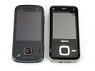
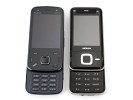
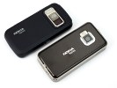
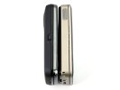
The designers must have taken the year off
We also have to admit that the fingerprints on the front panel aren't as easily visible as on some other phones. Except fort the metallic frame that is, which turns into a smudgy mess when the handset is used extensively.
The Nokia N86 8MP front panel is mostly taken by the 2.6" 16M-color AMOLED display of QVGA resolution. It looks identical to the one found on the Nokia N85 suggesting that the N86 8MP was meant as more of an update of N85 than a totally new phone.
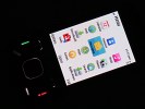
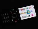
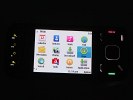
The display looks even more impressive in the dark • The backlighting is nice and even
AMOLED technology is exciting enough with all its benefits, but the QVGA resolution is starting to seem outdated. In times where LG and Samsung are introducing feature phones with WVGA screens, a high-end device with less than a quarter of their pixel count is hardly a commendable achievement.
Bottom line is, the display still offers great contrast and decent brightness but it isn't comparable to, say, the Samsung S8000 Jet, which uses the same technology.
Another issue of the Nokia N86 8MP display is its poor sunlight legibility. The screen is hardly readable on a bright sunny day and this is a major problem for a cameraphone.
Below the display there are 6 keys, three on either side of the D-pad. Those include the two soft keys, the Call and End buttons, the Menu key and the clear knob, arranged in a layout so typical of Nseries lately.
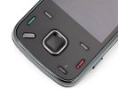
The controls below the display
The D-pad is a bit smaller than average - we guess it all started with the N85. The obvious gain is that the N85 and the N86 8MP don't have their Call and End keys so uncomfortably crammed to the sides like the N78 and the N81. At the same time, the D-pad is still quite user-friendly, with nice and solid press in both confirm and scroll.
At the top end of the front panel is the earpiece, surrounded by the ambient light sensor and the video-call camera.
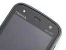
The ambient light sensor, earpiece and video-call camera are as usually up there
The alphanumeric keypad uses a standard 4-row 12-key layout. There is quite enough space between the different rows and columns. The keys could've been bigger though and press feedback is slightly on the squishy side.
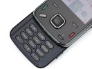
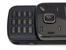
The numpad could've made better use of space
Sliding the Nokia N86 8MP down reveals the four multimedia keys. You use them to control the music player or the gallery. The middle pair can also be used for gaming and is quite handy with some of the N-gage titles.
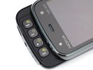
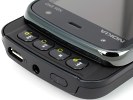
Nokia are pretty keen on those multimedia keys
The left side of Nokia N86 8MP hosts a tiny keylock switch. It's not essential on a slider, to say the least: sliding up and down does the locking job. Releasing the lens cover automatically unlocks the phone too.
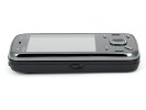
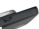
The lock/unlock slider is pretty useless on a slider, if we're to be asked
The shutter key on the right side is comfortable enough, with distinct half and full press. The volume rocker above is equally pleasant to use.
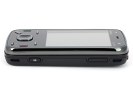
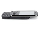
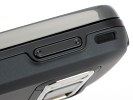
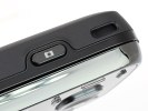
The two controls on the right are pretty comfortable
The power key is on top, along with the microUSB slot and the 3.5mm jack. None of the two connection ports is covered, probably due to the limited space.
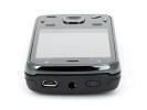
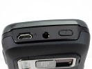
The 3.5mm standard audio jack is flanked by the power key and the microUSB slot
The Nokia N86 8MP back side owes its sleek looks and comfy grip to the plastic used - think N97. It hosts the 8MP wide-angle camera lens and the dual-LED flash, hidden under an active cover.
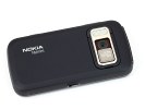
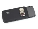
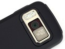
Nokia N86 8MP looks pretty good from the back
As already mentioned, the lens cover is active and will automatically start the camera or unlock the handset. When you are done with it you can close it and the handset will return to the exact same state it was before you began shooting.
Reader comments
- AnonD-572864
- 16 Aug 2016
- 7tK
Very nice set
- Anonymous
- 12 Jan 2011
- 3Ir
best phone ever, king of 8mp, the first wide-angle lens, it Rocks baby
- Rajesh Pratap
- 01 Oct 2010
- t@J
Comparison between Nokia and Sony ericsson (SE) : I bought SE W995 two weeks ago after going behind the highly over lighted advertisement of SE w995. And now, I replaced with Nokia n86_8mp. I’m discribing the details that happened between this 2 we...