Nokia N97 review: Lock, stock and touch
Lock, stock and touch
Widget-happy UI
We stand by every word we said about the S60 5th and its approach to touchscreen. Long story short, the direct translation of D-pad and soft-key action into touch has its benefits but the result is hardly the most fluent and intuitive touchscreen interface there is.
Scrolling and accessing items across the interface is nothing like any touch platform we've tried. On the other hand, soft-keys, which in touchscreen terms are another Symbian quirk - if you will - work just fine and enhance usability compared to other touch phones.
So, the user experience with S60 5th is a mixed bag and what you think of it will quite depend on your background. The best thing is though, that a Symbian touchscreen will hardly leave you indifferent.
If you know your way around S60, you'll be quite at home with the N97 interface and you'll swear by it. But if you look at it more objectively maybe, just maybe, you will realize some things come out a tad better on other touchscreen handsets than they do on S60 5th.
Back to the point, the only significant change since the 5800 XpressMusic is widgets. They are the fad these days and their usability is unquestioned. They can't be the dramatic improvement you've been waiting for though.
It is also worth mentioning that, compared to the 5800 XpressMusic, Nokia N97 has a tad snappier UI (thanks to the faster ARM 11 434 MHz processor perhaps). There weren't any major lags or holdups for the time of our review.


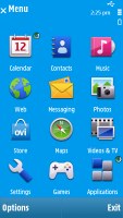
The S60 UI has made another go at touchscreen
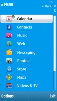
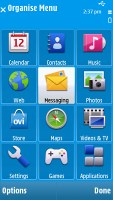
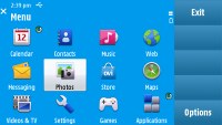
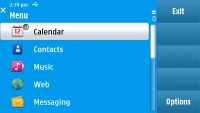
While the widgets are something new for the S60 5th edition, the menu structure is a déjà vu - the same as in Nokia 5800 XpressMusic. Icons are organized in a 3 x 4 grid or a list and you can freely reorder. Screen orientation can be set to change automatically. Sliding out the QWERTY keyboard makes the screen rotate as well.
Opening an item in any of the listed submenus calls for two presses - one to select, and another one to confirm the action. Now that's something that you don't normally see often in touch phones. You get used to it with time, but the main issue here is that the interface logic is different when you deal with icons instead of lists.
When the opened menu uses icons to represent items as opposed to lists, then a single click usually does the job. There's a possible reason for that - the scrolling logic used. Again we see two different implementations throughout the interface - scrolling of lists and scrolling of icons is different. And it has a negative impact on the touch usability again.
The explanation is simple: on S60 5th the touchscreen is doing the job of a D-pad with confirm action. You scroll a selector down a list rather than dragging the actual list as in other makers' solutions, which we find much more fluent and intuitive. One benefit of course is that the touch-optimized S60 stays absolutely faithful to the original, so users feel so much at home. But the drawback is the steep learning curve for anyone that has experience with other touchscreen phones.
Thumb scrolling is an option everywhere but in listed menus it still gets bumpy. Instead of a smooth roll in response to every sweep (think Apple iPhone, LG Renoir, Samsung Pixon or Touch Diamond), there's a notable break as each line slowly revolves up or down. And when you stop dragging, the last item you touched remains highlighted. That's the reason why you need a second click to open an item in listed sub-menus. The benefit of that is accidental taps are ruled out. The drawbacks - well, we've already pointed those out.
In the end dragging the side scrollbar turned out to be our preferred way of scrolling in all menus and we just had to put up with the double-click system in the listed ones.
Meet the homescreen
The homescreen layout of the N97 (not counting the widgets) is similar to the Nokia 5800 XpressMusic version - all the status indicators are at the top, plus the clock and the calendar.
A single press on the clock starts the clock application (with an option for setting up an alarm) while tapping on the date opens a drop-down menu where you can either enter the calendar application or change the currently active profile.

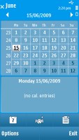
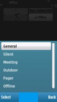
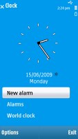
Calendar, profiles and clock just a touch away
Now, let's take a closer look at the widgets. If they are hidden, just sweep a finger across the screen and they'll show up. Another sweep will make them disappear.
You can have up to 5 widgets at a time displayed on the homescreen and you can arrange them according to which you use most. For now, there is a slim choice of widgets for N97 but the number will grow. We tried to download new ones at the Ovi Store but there wasn't even a Widget directory.
Along with widgets that get you access to websites and services like Amazon, Facebook or AccuWeather you can have your favorite contacts (up to four in a widget, up to two Favorite contacts widgets on screen), e-mail inbox, calendar, music player or the FM transmitter app right on the homescreen. It is possible to go for one or even two widgets each consisting of 4 of your favorite applications so you won't have to enter the menu to access them.
Arranging widgets is easy and fun. You can remove some of them, add or download new ones (if available), change their order (just drag and drop). If all 5 slots have been taken, you have to remove one or more widgets to make room.

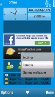

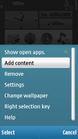
Arranging the widgets is easy and fun
Nokia N97 comes with 8 preloaded themes and most of them are really appealing. You can also download third party themes from the internet. As before, you can switch the themes effects on and off. Unfortunately, even if the transitions look kinda cool, they cause occasional lags when browsing the menu.
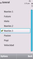
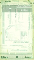

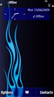
Some of the preloaded themes are a real eye-candy
Nokia N97 features a task manager, which is launched by a press-and-hold on the menu key. The task manager itself is identical to the one found on Symbian S60 3.2 devices. Also much like in the previous version of the UI, it appears on top of every pop-up menu.
Reader comments
- Yuri
- 04 May 2022
- 69p
My first smartphone I use well I study high school.
- Yorcharturo
- 17 Jul 2020
- LtJ
No, you need at least 1ghz SoC, and 8gb of memory, it can only handle symbian
- NAM ^_^
- 03 Aug 2015
- vx6
i have his phone. :3
